Fascinating… “MITSU-BISHI” instead of “MITSUBISHI.”
2 Likes
5 Likes
https://buyee.jp/mercari/item/m28887893279?lang=en
I don’t think it’s this one but I’m pretty sure @drifand has a white one that is BEAUTIFUL and I wish I did too! For less than this!
2 Likes
I finally got one of these in black at a decent price. @ulfesharpe pointed it out as a pinnacle of lead holder design so I had been looking for one for a while. Hasn’t arrived yet, but I am eager to get my hands on it. Pretty unique design - and with bells and whistles too!
2 Likes
I’ll find one in time
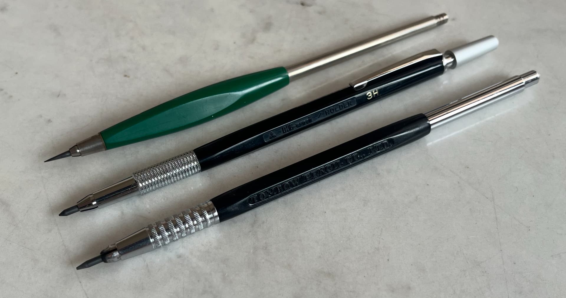
Though I do really like the Tombow one I just received!
1 Like
I think of that Tombow as a sophisticated sibling to the Tekagraph. I wonder which came first.
That must be what I love about it, it was familiar and I didn’t pick up on it.
I tried a quick search through the past posts and I don’t see any quick answers.
I’m not even sure who to guess
(I love the green tekagraph, but secretly, the Tombow is more comfortable)
1 Like
I have this guy, I’ve honestly never taken him for a spin…
I don’t know how much it compares to the one in the post
3 Likes
Yes, this is the one you want to find in white, right?
1 Like
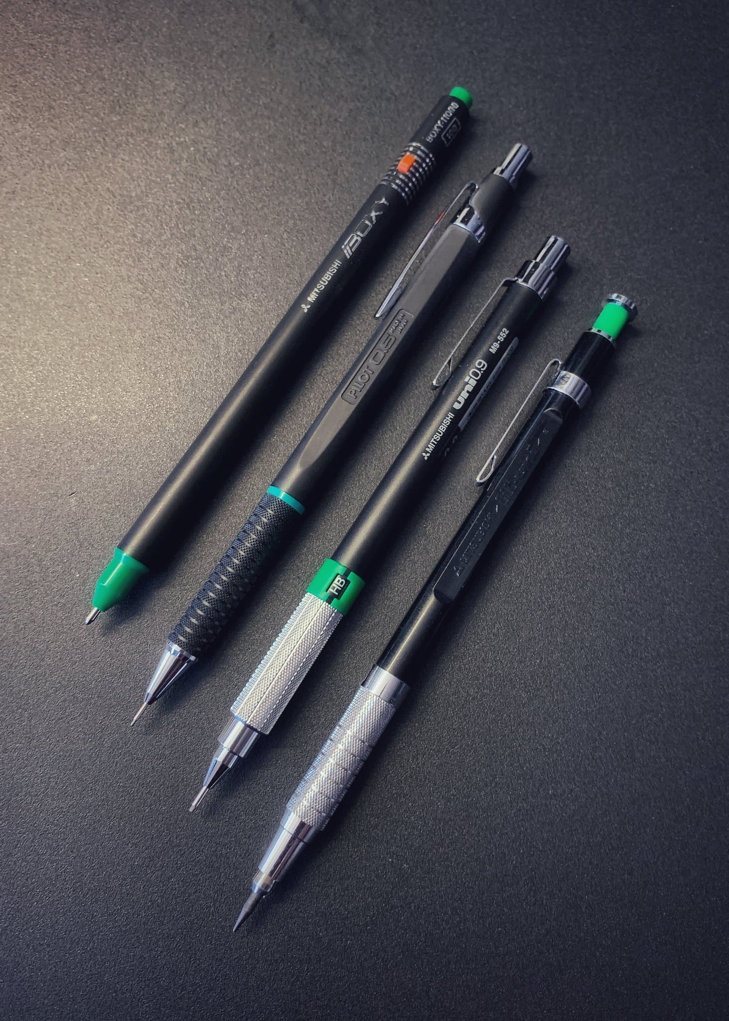
This is an old photo you have probably seen already. I wish I could add the round 9604 to this set (and a black 9603).
10 Likes
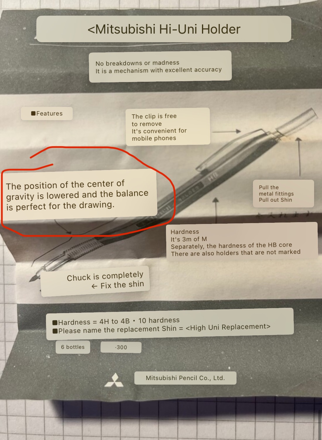
By the way, the centre of gravity is approximately in the middle of the leadholder. – I don’t want to make a mockery of this, but at first I thought it was about lowering the centre of gravity and was surprised to find that it was actually in the middle.
1 Like
Mitsubishi still uses this (older?) spelling on some products, e. g. on many of their woodcased pencils.
2 Likes
It is a bit confusing. For lead holders mid-point balance is quite common - Caran d’Ache and Koh-i-noor certainly produced millions of holders with this characteristic. Staedtler and FC seem to have preferred a 1/3 balance, or so.
But the note says the balance is lowered. Somehow, the holder does not achieve this objective, which makes me wonder if a designer came up with the tail and everyone loved it but to balance it out they added a lot of metal up front, lowering the balance back to center.
1 Like
That’s basically what I deduced. Mitsubishi at that time didn’t have resources to waste on ‘aesthetics’. The hi-uni brand was young, and reserved for their best pencils. So for a metal button to be elongated like that, I figured, it had something to do with weight and balance…
3 Likes
I updated my note above. The packaging does say ‘lowered’, which may suggest a certain design sequence.
2 Likes
This and “standard” black version are newer version of Hi-Uni Holder.
1 Like
11 Likes
I haven’t seen it but yes, that is the one I want to find. VERY nice picture.
I see black 9603 all of the time, I can message you when I see more.
2 Likes
Mmm… Tempting.
I have never tried this one; anyone here recommends it wholeheartedly, or are there better choices around? I have a burgundy Uni holder (both new and older, tapered versions, both nice but I prefer the slimmer one, very nice), a black Tombow holder (very nice), and various from Uchida (Drawing Holder S-metal grip, S plastic barrel, D, the last two very nice), plus other classic ones (some Steadtler, some Faber-Castell, some rOtring etc.).
2 Likes
@ulfesharpe gives it three thumbs up. Mitsubishi Hi-uni leadholder - #4 by ulfesharpe
1 Like