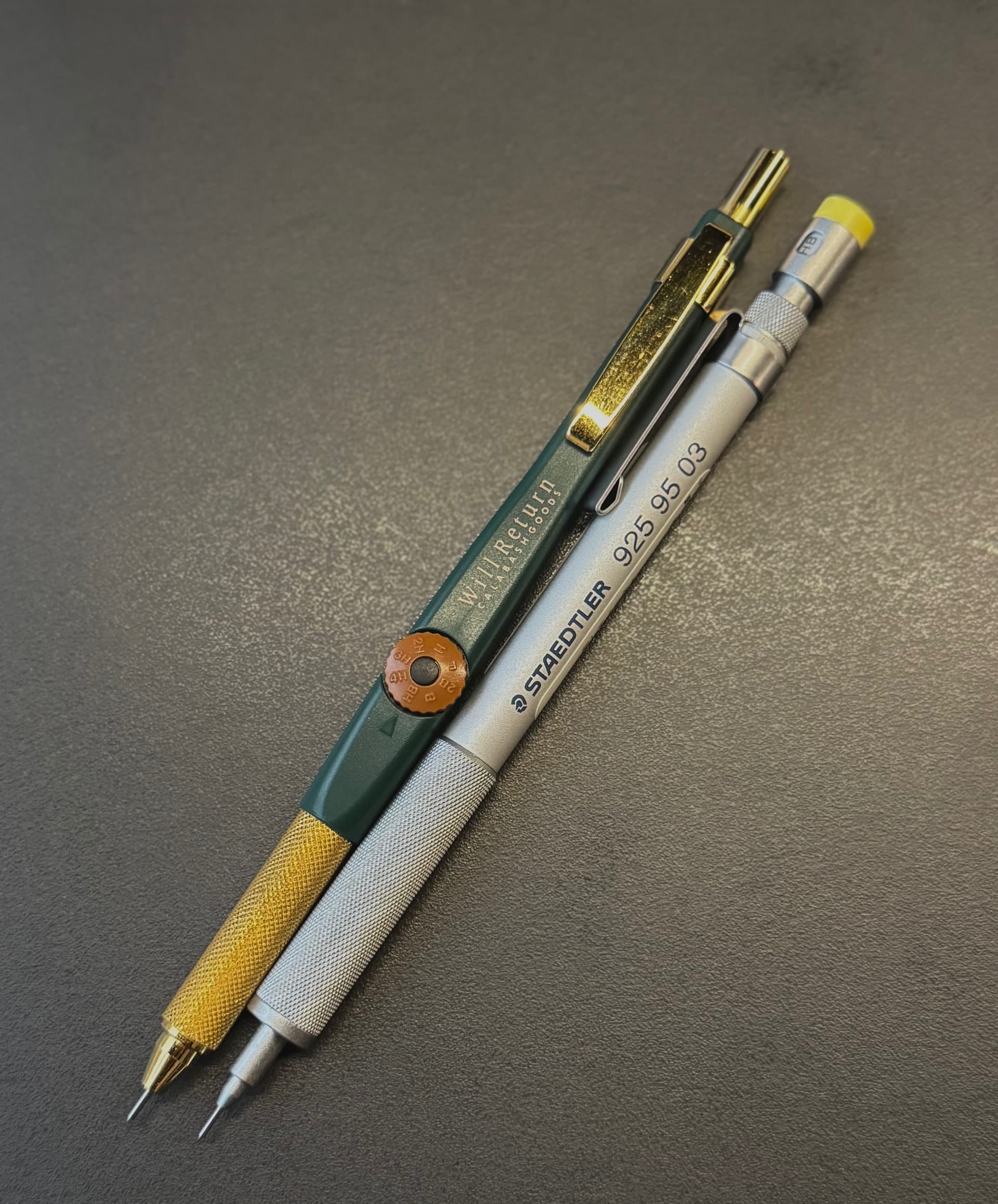
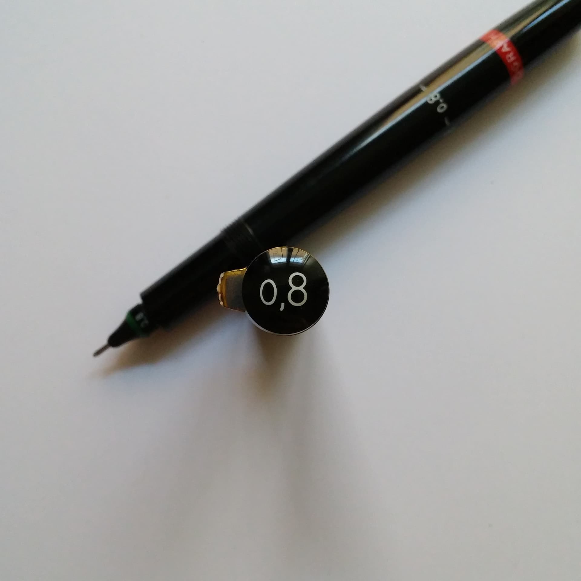
I searched for a long time to get their specially-elastic nibs for expressive calligraphy (S series for freehand writing); I found some specimens, but I am always afraid I have too few, as they are terribly fragile. One day I will start playing with the Graphos, but I need a bigger desk, and possibly a drafting table.
1 Like
I was very sad when I looked through all the nibs and didn’t find any S nibs (most of them are T, O, A, N), they are also the ones I want the most. Do you know any place selling multiple of them? I searched through eBay and Mercado Libre (Argentine eBay) at the time but there weren’t any S type nibs available.
Playing with it is fine I think, while the nibs are fragile they are also pretty cheap (when they are available) the main problem is how rusty they are nowadays, cleaning up all the rust was very annoying.
1 Like
Unfortunately, the only purchases of Graphos nibs I have aced where I had real control over what I could pick — and the pieces were all NOS — were in-person missions to physical stores in Northern Italy (I was always looking for something else, but I always took some time when I spotted the Graphos logo). In the back of those shops I could find very dusty but very complete display cases of nibs with some S specimens intact. Still, you are right: S nibs are way harder to find, and one has also to look for specific “hardness/stiffness” labels on the nibs themselves.
If I visit any of those places again, I’ll look for S nibs for you as well, and spoil every opportunity to gather more elements for the set. Also, I’ll check my drawers to see if I have some spares I can let go, since here they are just waiting a day to shine which might never come.
Shipping to South America may not be cheap, but maybe I can beef the parcel with some pencil, and you can find tradable pieces to close a deal. I will DM you if anything interesting pops up. ![]()
1 Like
The most reliable way to find graphos S nibs is probably the rotring 60-fold work set that contained all four, but these sets are hard to come by, not to mention quite pricey.
Pelikan also used to make glass-fronted retail displays with a grid of wooden compartments for all the nibs, a bit like letterpress type drawers in appearance. Each display would contain hundreds of nibs.
There was a flurry of these on ebay a few years ago at relatively affordable prices, but I never quite managed to buy one.
Returning to the subject of technical pen jewel points, I would recommend buying unused specimens whenever possible. The etching ink that was often used on film can be almost impossible to remove once dried up, even with noxious solvents in an ultrasonic cleaner.
2 Likes
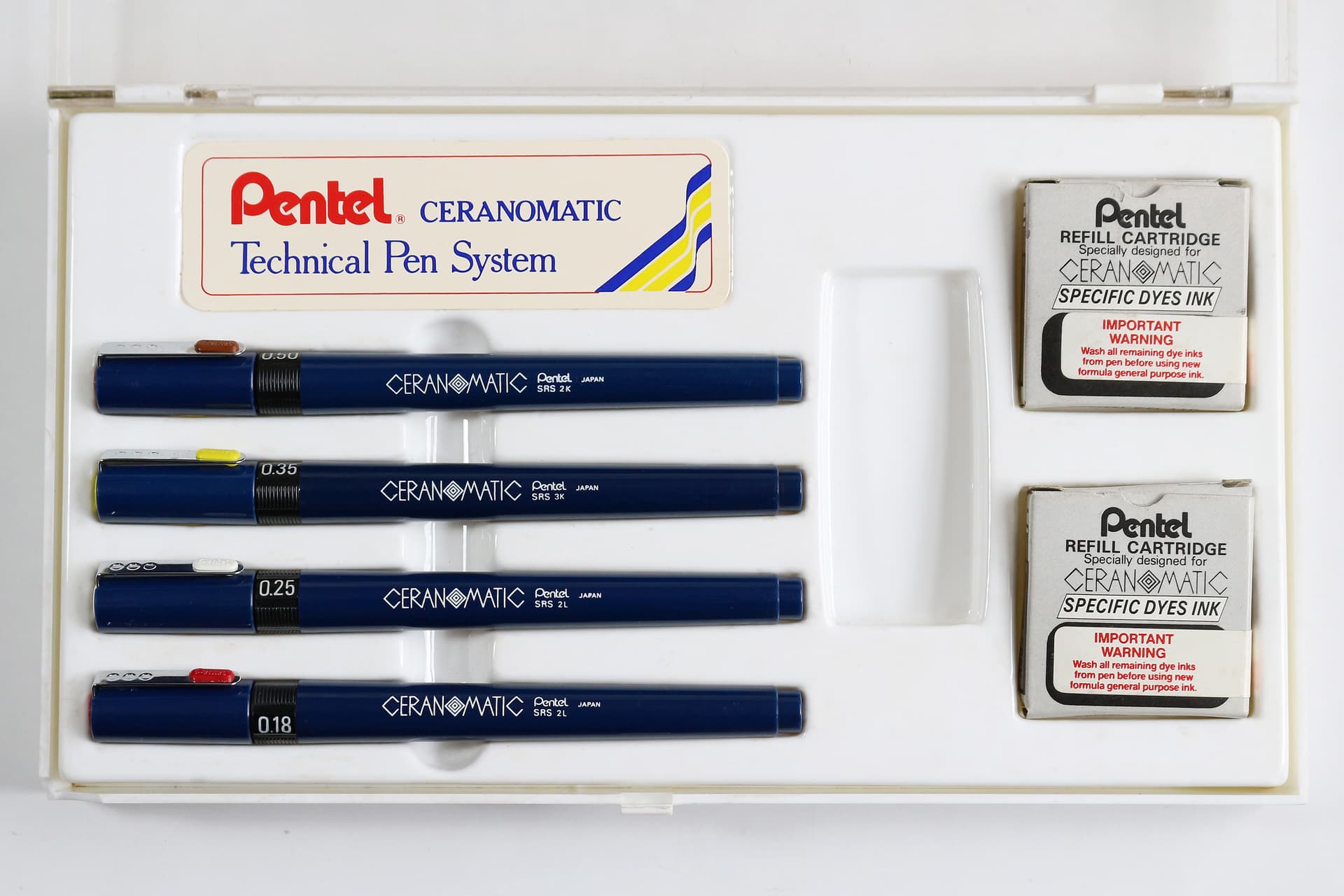
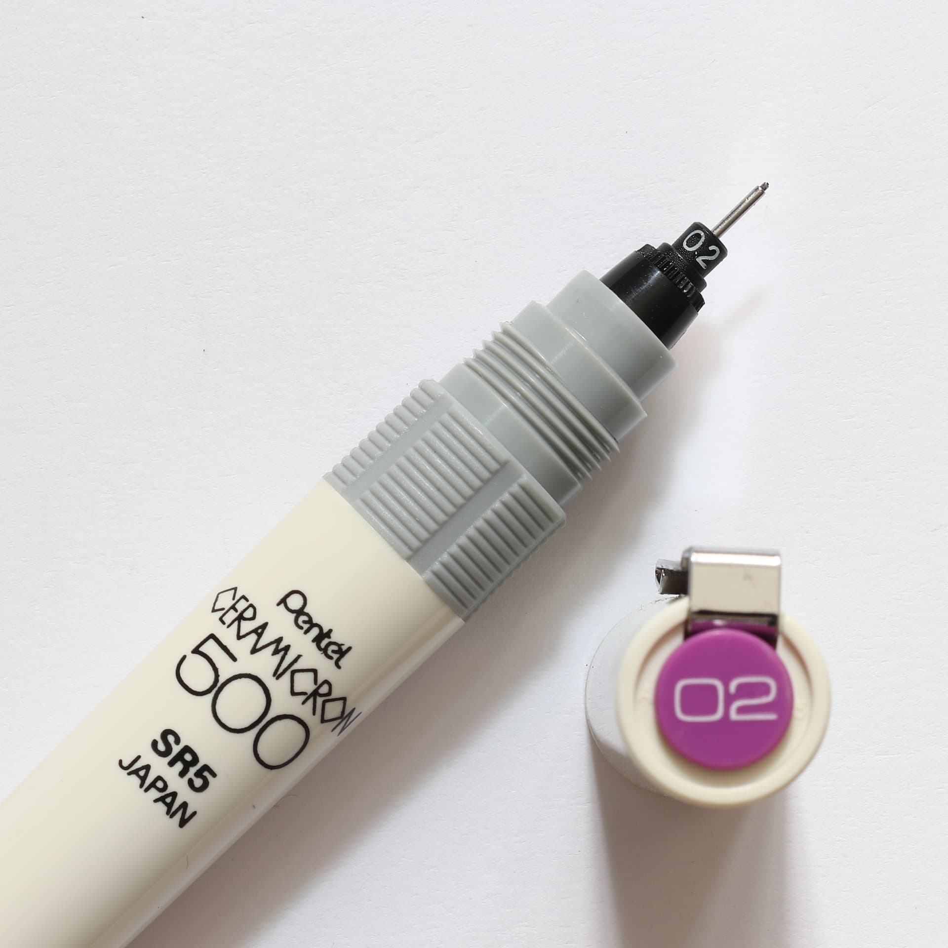
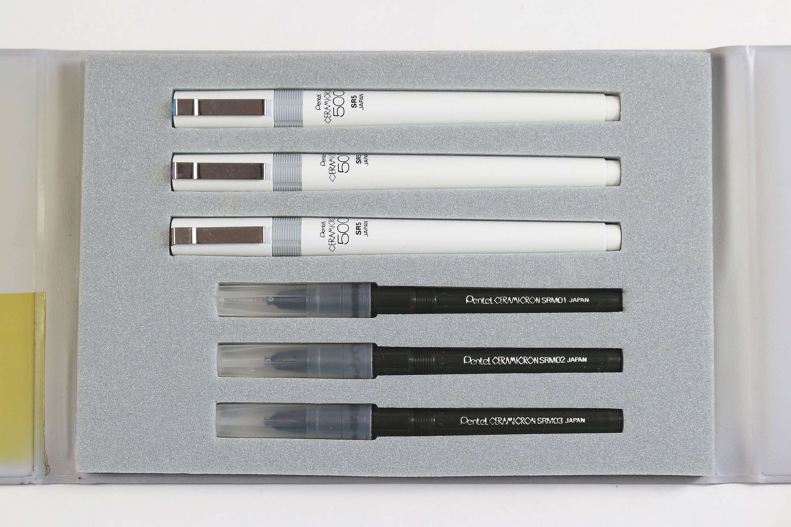
I have a set of Pentel Ceramicron in off-white and gray. It is reminiscent of IBM Model M keyboard.
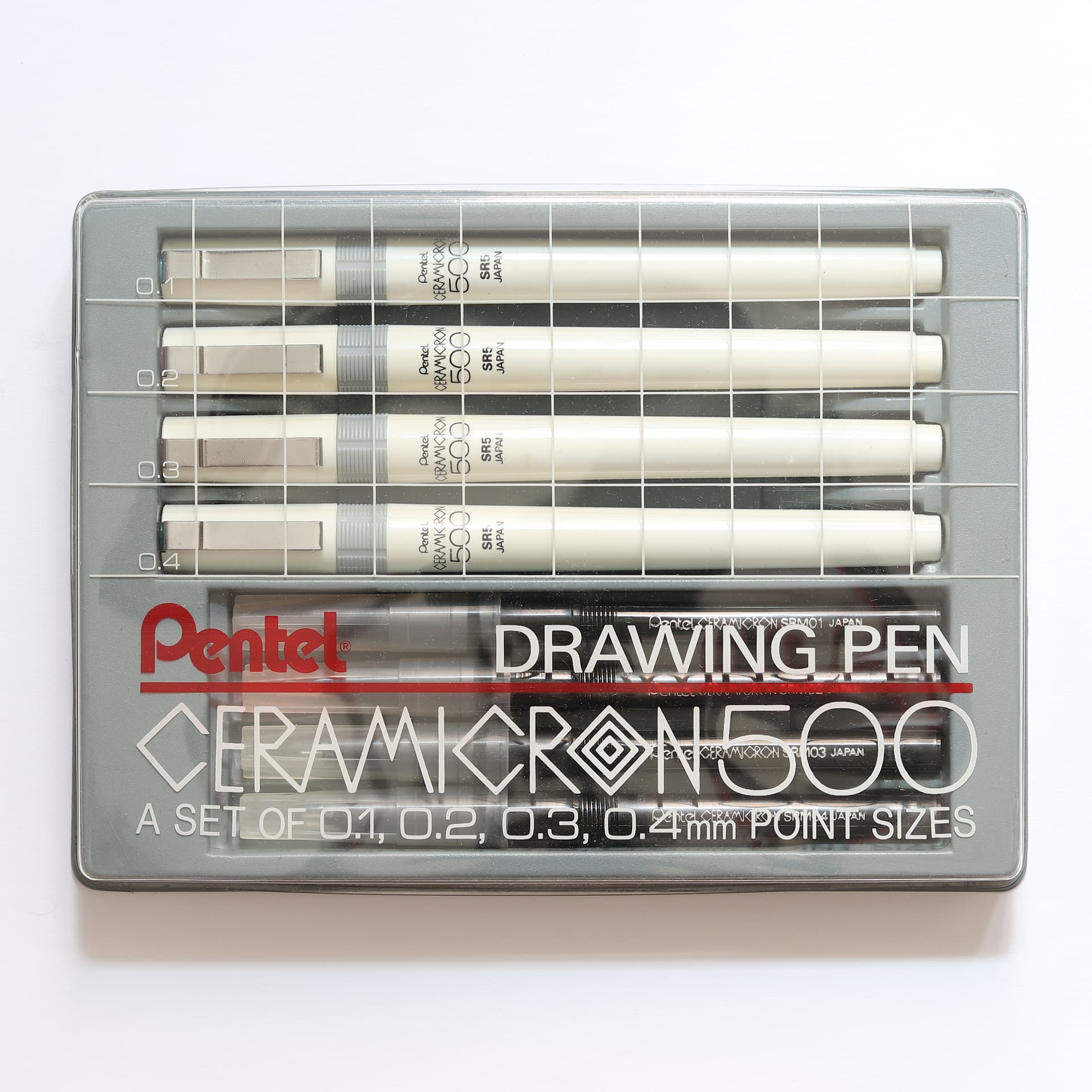

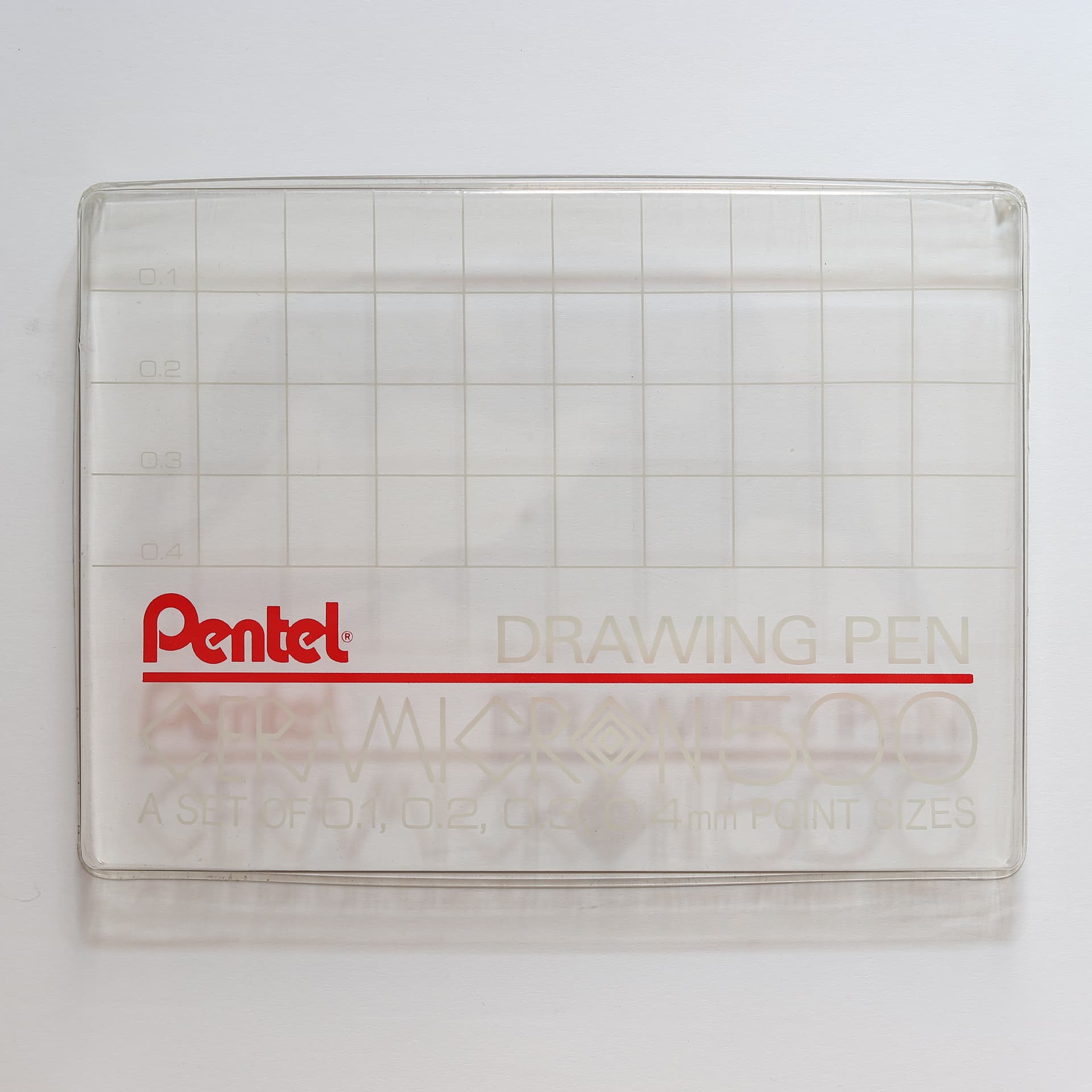
I like the graph paper design of the transparent box cover:
5 Likes
Yes, Pentel’s grid aesthetic really captures that early eighties look - I particularly like the way that the grid lines up with the pens beneath, each row annotated with the corresponding line weight like a graph.
Funnily enough, Pentel’s design may have predated the IBM Model M keyboard (1985), as the Pentel Ceramicron was available from 1982 (at least in the metal body version, the Ceramicron trademark having been filed in 1981) and the Ceranomatic - also featuring the grid on its packaging - from around 1983. This was soon followed by another grid design of sorts that appeared on Pentel’s “for pro” pencil products.
I have a different Ceramicron three-pen set, housed in a plastic wallet also used for pencils (a matching set contains P205, P207 and P209, plus lead refills for each):
It seems that Pentel was in the habit of reusing the same packaging for technical pens and mechanical pencils, such as this P200 four-pencil set that matches the Ceranomatic set I posted above.
One difference I noticed between the Ceramicron and Ceranomatic ranges, apart from the obvious disposable refills vs cartridges, is that the Ceramicron uses DIN line weights (0.1, 0.2, 0.3, 0.4) while the Ceranomatic uses ISO (0.13, 0.18, 0.25, 0.35, 0.5, 0.7); I don’t know if this was always the case. Maybe they were aimed at different markets, with the Ceranomatic going head-to-head with Rotring, Staedtler and the like.
The Japanese JIS technical drawing standard apparently specifies three main line weights: thin, thick and extra thick, in the ratio 1:2:4, and recommends the use of ISO line weights to achieve this (for example, 0.25, 0.5 and 1.0, or 0.18, 0.35 and 0.7). Maybe someone with drafting experience in Japan could confirm that this is indeed the case.
I find it interesting how many different drawing conventions existed in parallel worldwide. The line weights of technical pens in the USA seem to have been based on rotring’s original 1953 rapidograph numbers 1 to 3, later expanded to include 0 and 00 (or 2x0 in USA).
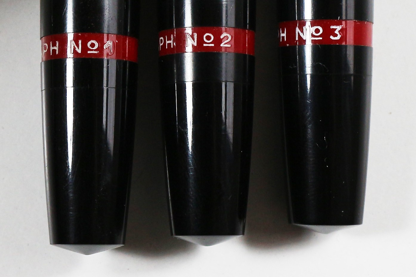
The millimetre equivalents can be seen on this mid-1950s rotring instruction sheet, issued during the transition from the old numbers to the new metric sizes:
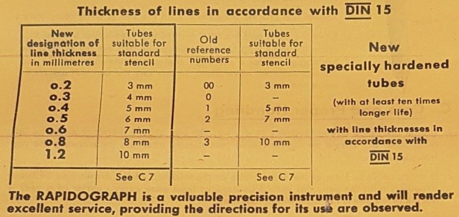
It also explains why 0.6 mm and 0.7 mm pens are labelled “2 1/2” in America. However, what is really strange is that the first generation rapidograph instructions give completely different thicknesses for numbers 1 and 2 (including the bizarre width 0.45 mm that, to the best of my knowledge, never appeared again, anywhere!):
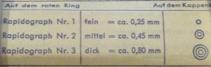
Whoever can explain this deserves a prize!
7 Likes
You articulated its beauty into words! Thank you!
I sometimes find it hard to translate ineffable beauty into words.
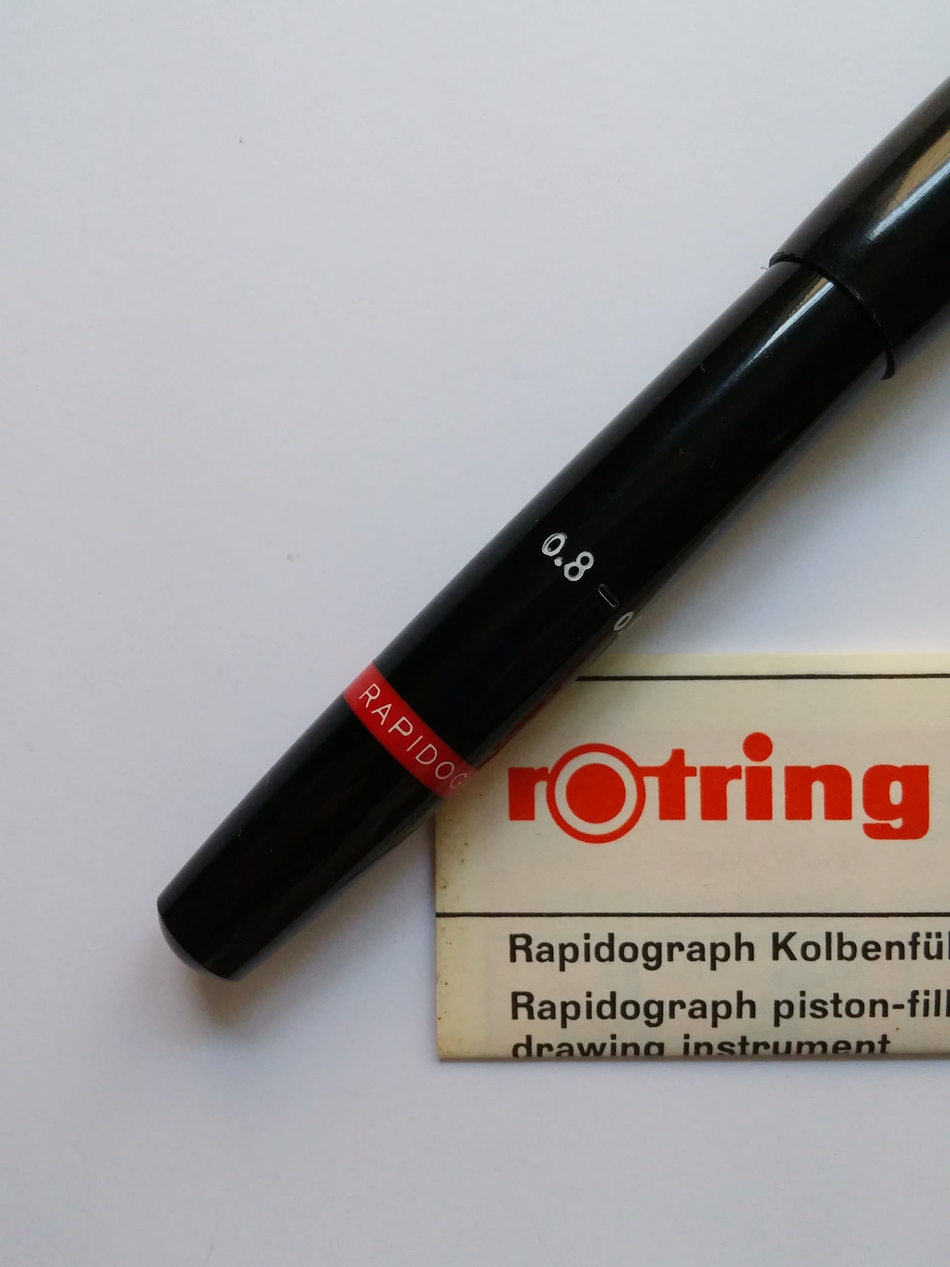
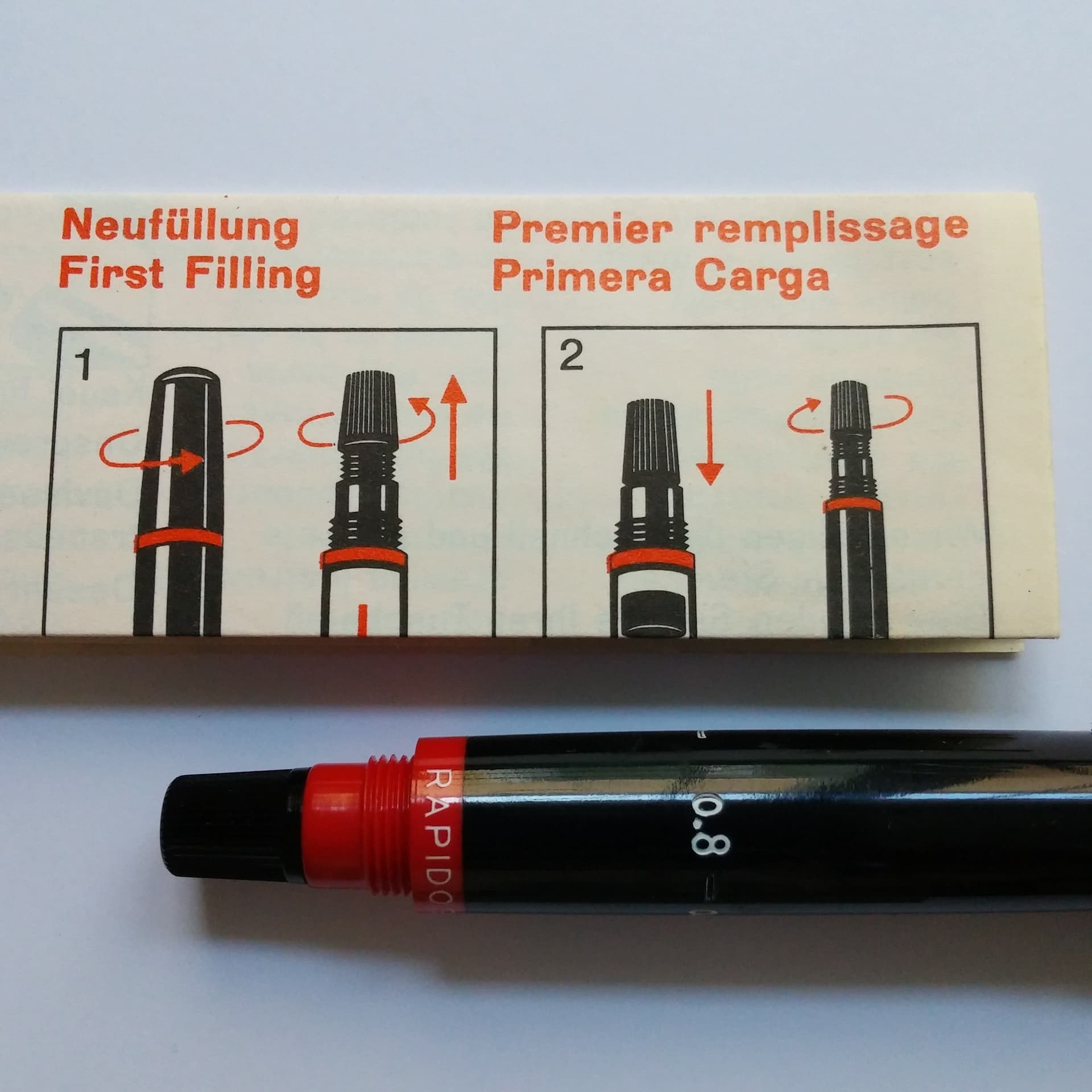
Let me just upload few old pics of the instrument from Germany here:
7 Likes
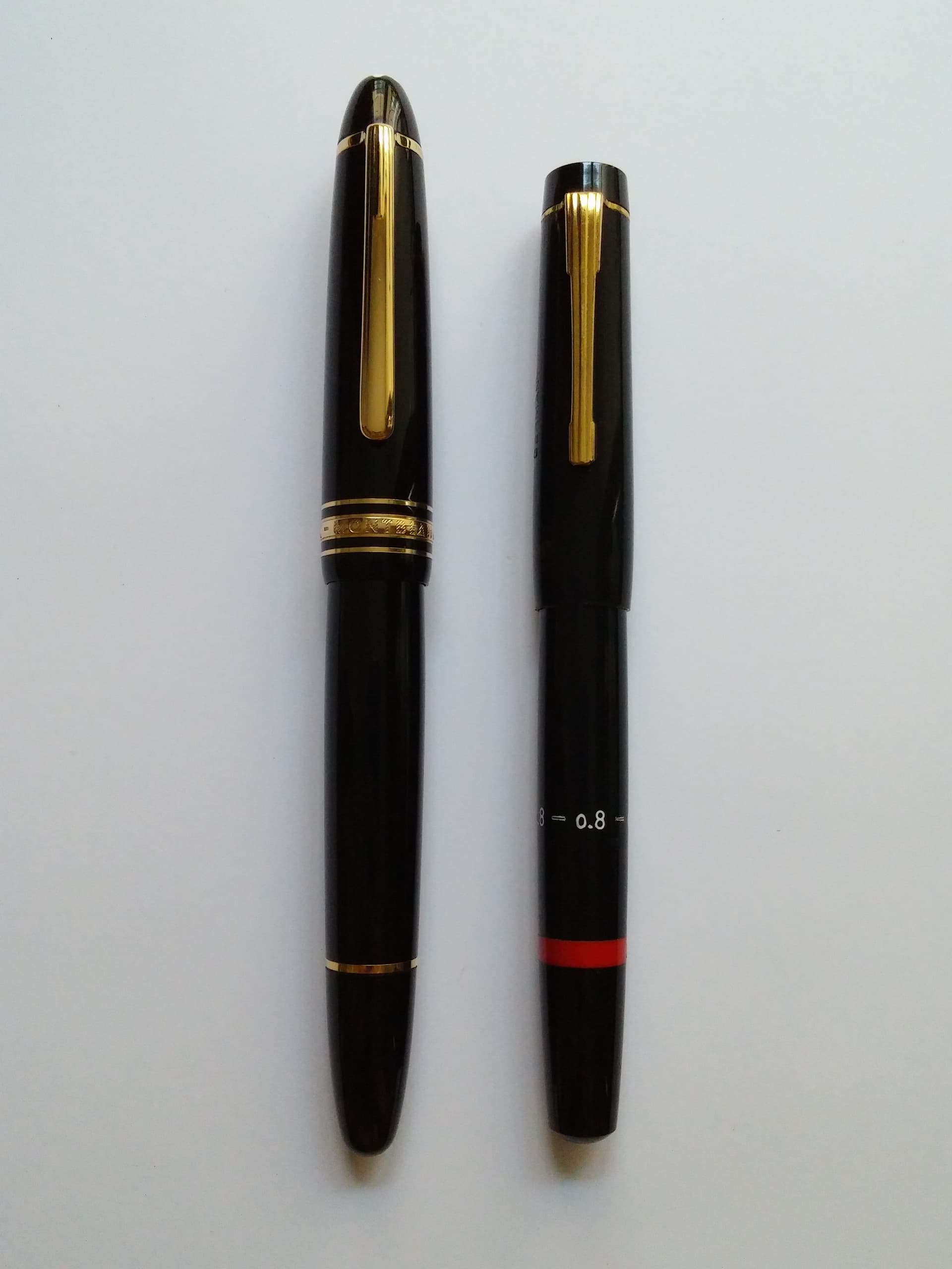
The piston-fill rapidographs are such elegant pens, even alongside your Montblanc!
A detail I enjoy from the first generation is the representation of their numbers by subtle concentric circles engraved on the cap finial (in the next iteration the circles were filled with white paint).
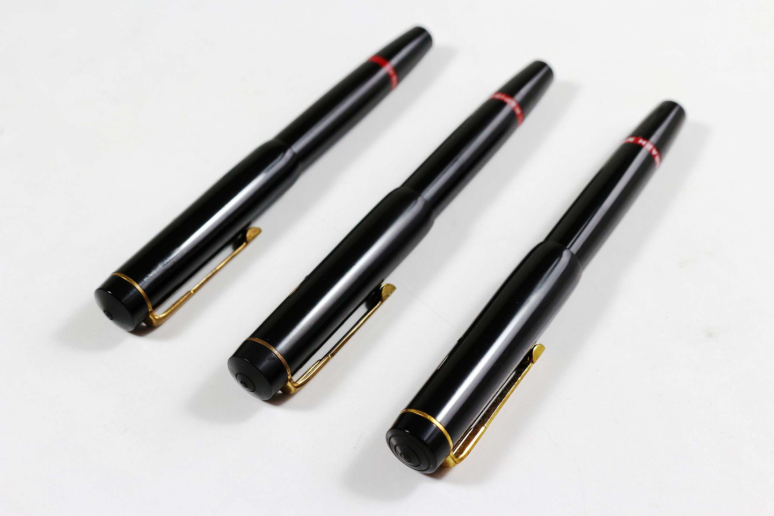
In spirit, it reminds me of Staedtler’s later pencil nose cone rings, found on the Micrograph, Micro and others.
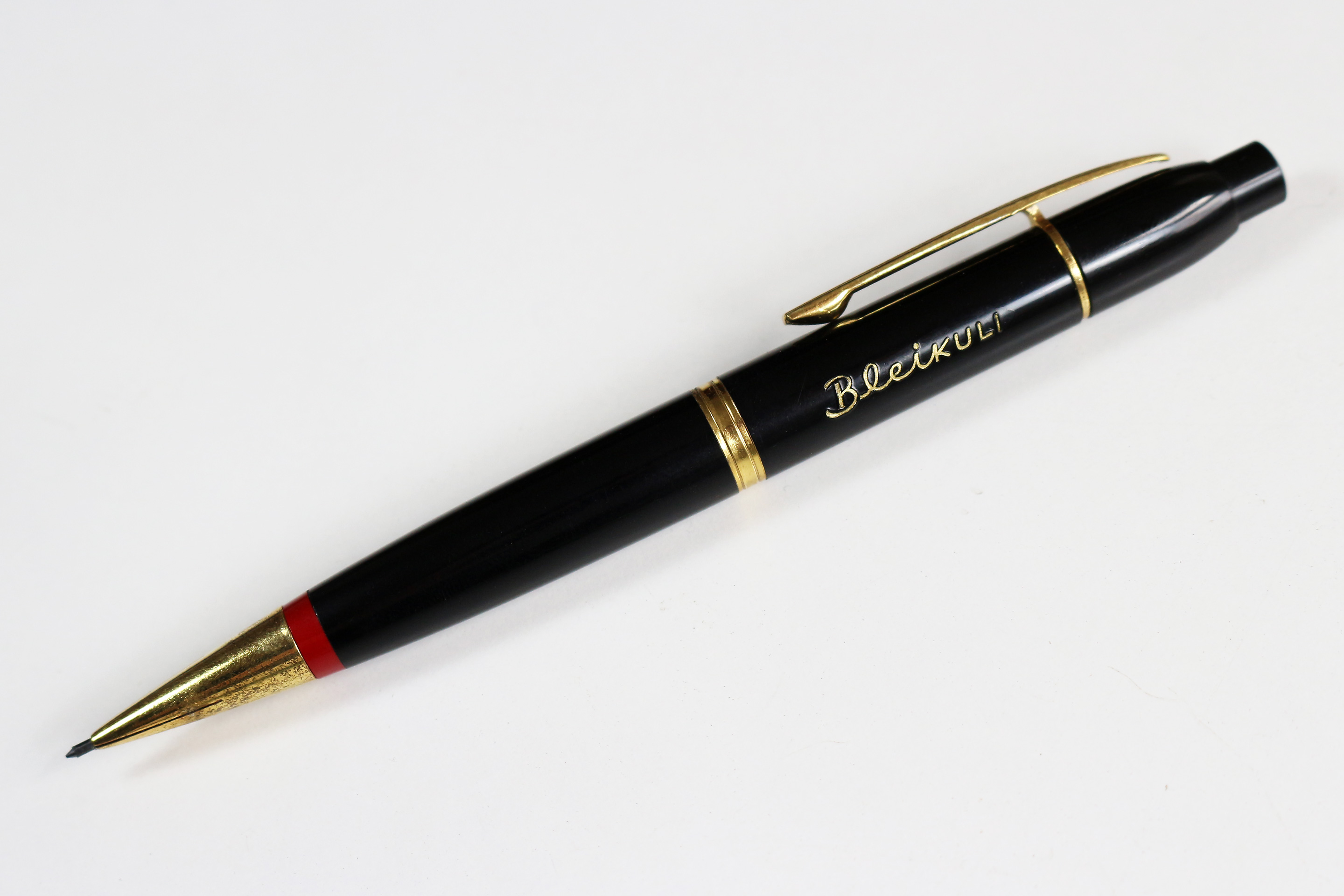
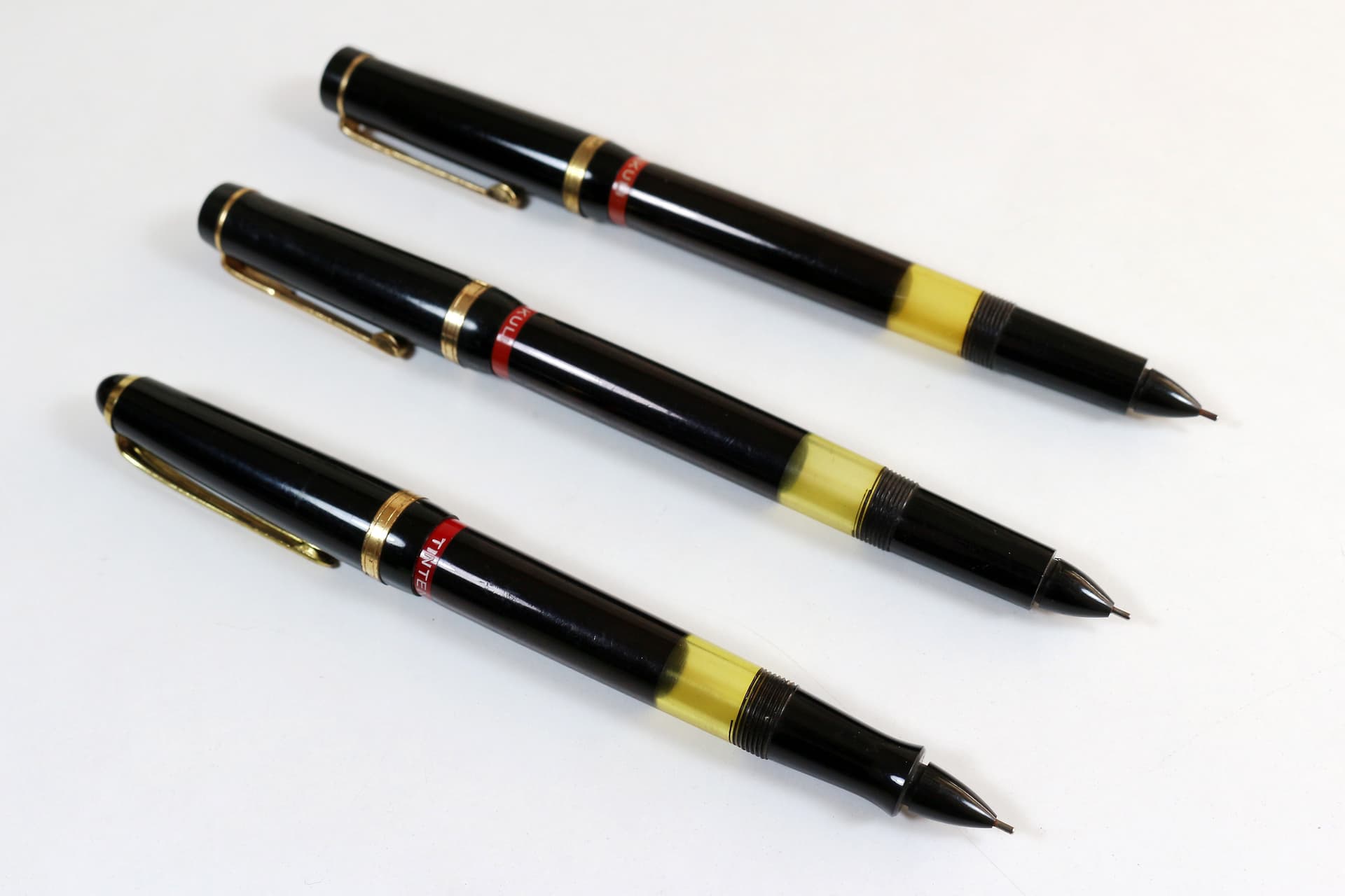
And although rotring was not known for its mechanical pencils until much later on, I feel that the Bleikuli from the same era complements the early rapidographs perfectly:
If only I had the box!
8 Likes
WiLL Return is a whole other rabbit hole that I’ve gone into… ![]()
2 Likes
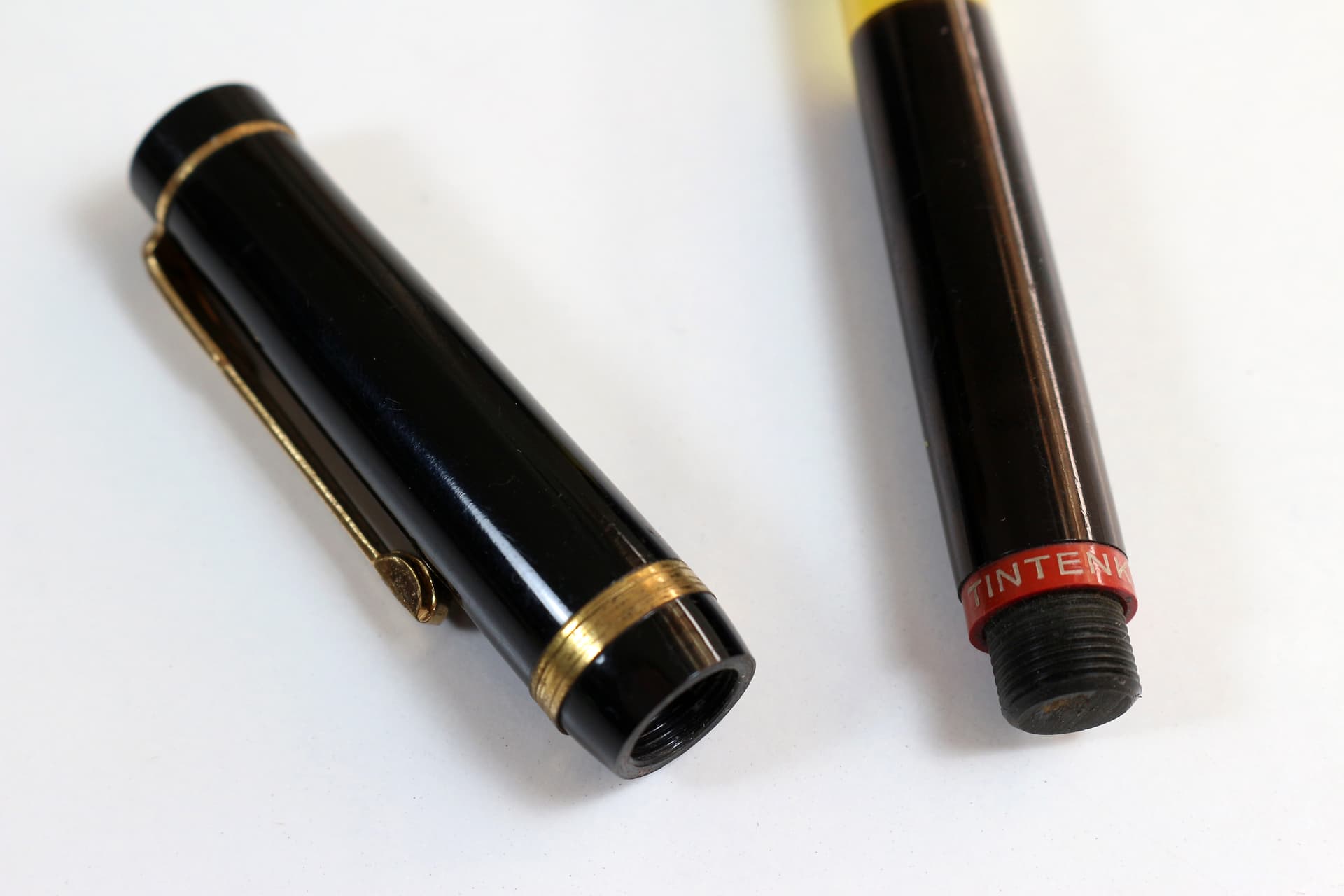
Oh wow! Look at that lettering for 'BleiKULI" !!!
2 Likes
Yes, and on this version (I assume it is an earlier design, but can’t be sure) the red ring is at the writing end, rather than the knock end. I assume this was so it would align with the red ring of the Tintenkuli when they were sold together as a set, with the clips aligned. The same logic also applies to the 1930s Farbstift-Kuli and its postwar descendant the 4-Farb Kuli.
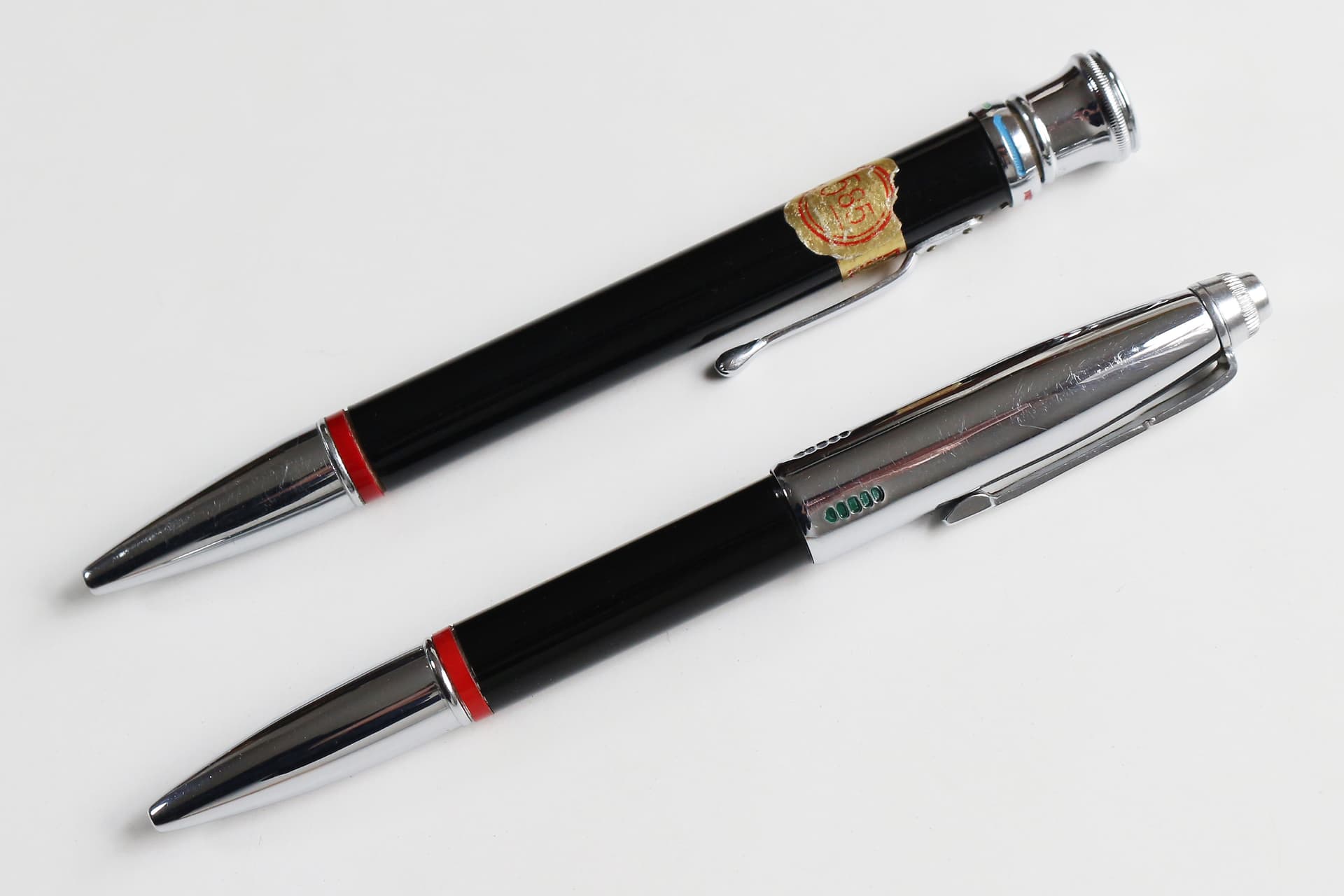
Presumably rotring moved the red ring to the clip end when the Tikk-Kuli (ballpoint) was introduced, as it became apparent that brand identity was more important in writing position than when stowed in a case (this also applied to the Tintenkuli/rapidograph, although ironically the red ring was not visible if the cap was posted).
5 Likes
The red ring reorientation reminds me a little of Apple’s decision to turn their laptop lid logo from user-facing (when opening the laptop) to public-facing (when the laptop is in use).
https://medium.com/@robertirish/evolution-of-the-apple-logo-on-laptops-a-visual-journey-67e64a3a2a6f
4 Likes
Unless, of course, that Tintenkuli was a showroom dummy, in which case the red ring was always visible.
5 Likes
7 Likes
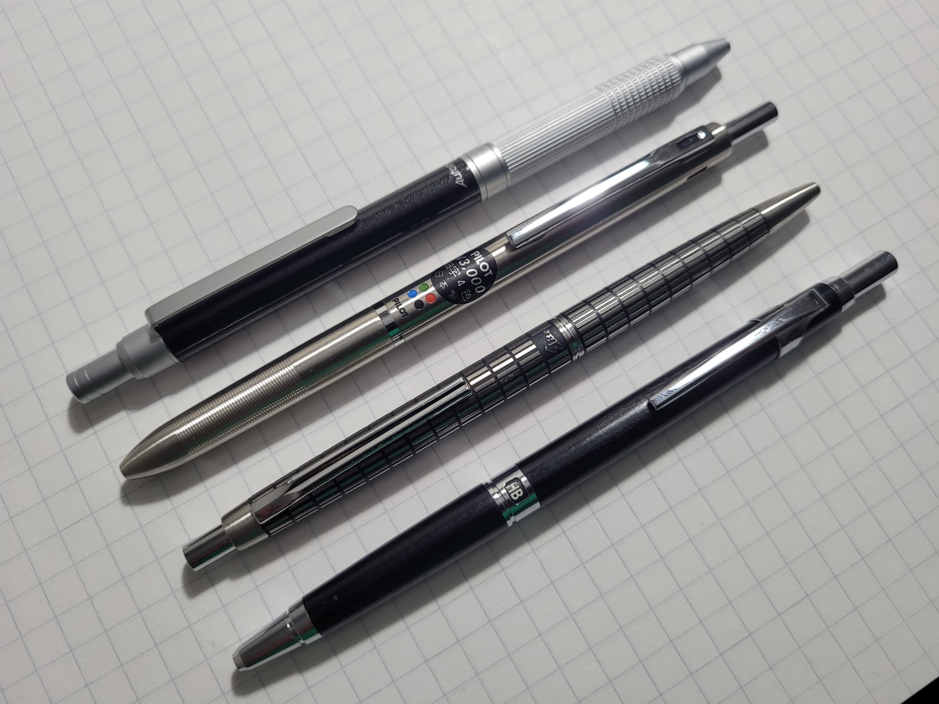
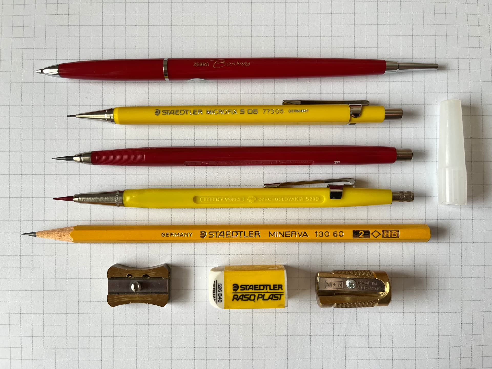
Is that Zebra a ballpoint pen?
1 Like
Yes, it is!
1 Like