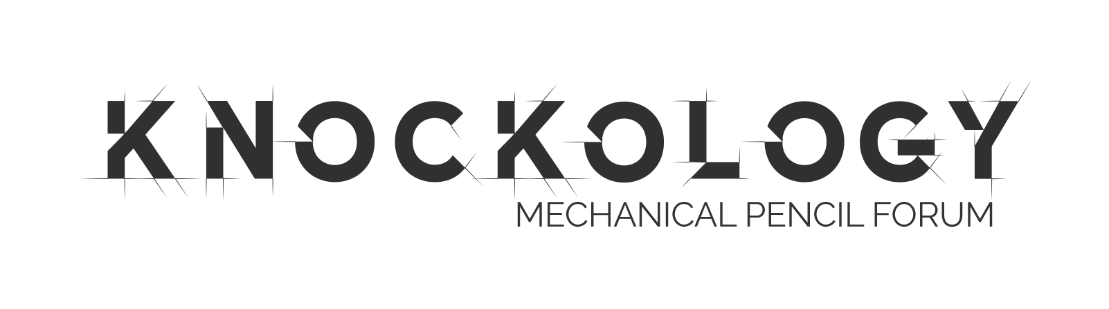
I’m introducing a temporary new logo for Knockology, and I wanted to share a bit of context behind the change.
I’ve always loved the original logo, and I still do. It had a unique visual character and an intentional ambiguity that made it feel like a secret handshake. When we were a smaller, tight-knit group, the <nockology read was part of the charm. We all got it.
But the community’s growing. We’re getting more attention, more new members, and more eyeballs. And with that growth comes the need for clarity, especially for those just discovering Knockology for the first time.
So I’ve created a new logo that keeps the spirit of our mechanical, drafting-inspired roots—but makes sure people can actually read the name without having to squint or second guess it.
This new look isn’t necessarily permanent. Think of it as a field test while I figure out what the long-term visual identity of Knockology should be as we continue to grow.
Thanks for being part of this community! It’s been amazing watching it evolve.
Just noticed. New one looks good. Prefer the old. But things grow on me.
I think that the name itself is obscure, not just the graphic/font of the old logo. I love the name and it is here to stay. Still, ‘Knockology’ means nothing to people who are not deep in the weeds of Japanese MP nomenclature. Thus, clarifying the spelling of the logo waters down the brand without adding meaning.
I would not let the fact that the logo contains the name of the forum force the logo to be super-intelligible.
More thoughts: Since this forum is more about collecting, identification, and history, the logo should reflect that. If it was a forum about drawing and drafting, the logo should reflect that (as I believe the current logo does).
Well, all things considered, yours worked fine for the smaller membership. I was thinking long term, but then, all things in due time. Your new one looks really good!
So, I like the new logo and the idea behind it. Also, the “thumbnail” in the webpage close to the page title looks much crispier now. Very, very nice.
What I probably missed is the notification about the update to the general appearance of the colour palette/ CSS setup; when my browser (Safari) renders the site as a whole, my impression is that of a somewhat flatter UI.
I think I remember more contrast throughout the pages, while now everything seems “more white”, and more uniform (was there some pink, perhaps? And some gray, maybe?). Not sure this was part of the plan, or it is my html parser which is playing tricks on me.
Don’t get me wrong, I love black letters on white background (the other way round would make this site impossible to navigate for my eyes), but maybe in the previous iteration there were other graphical elements marking the separation between general background, thread title upper band, background for the very posts, and further specific areas of the page. Those I probably miss, by the tiniest bit, but it is entirely a “me-problem”.
Thank you for the excellent work, and for offering this space for us to meet and discuss our favourite hobby.
I don’t dislike the new one, but if I had to choose between the 2, I’d take the old one. I can see your logic though.
Also, since we’re all members, are we all knockologists? Or just you? Perhaps we’re all small k knockologists, whilst you are the big K. This has probably already been discussed and I’m just late to the party, as always.