Just a little brainstorming here. I like the concept of the logo… but, for the uninitiated, it’s confusing. I thought maybe it could be tweaked a little. Here’s what I’m thinking:
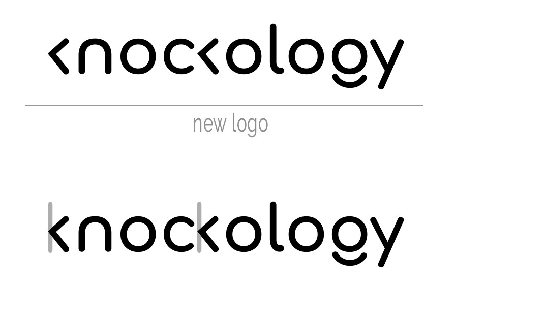
In this version, you have the left angle sign representing the knock, but it’s against a surface, the gray line… to demonstrate the knock “principle”, while also completing the shape of the K.