Knockologist and Knockology Update

Dear Knockology Community,

I hope this message finds you all in good spirits. As some of you may remember, last year I set out on a journey to create my very own line of mechanical pencils, which was to be housed under the brand name Knockologist. This venture began with a lot of passion, patience, and precision, hand-turning materials such as wood, resin, and hybrid substances into remakes of widely-loved models including P200, Orenz, PG5, rOtring 600, as well as 2mm and 5.6mm lead holders. The intention was to establish a foothold with these known designs, and over time, introduce our own bespoke and proprietary models.

Alongside the pencil-making initiative, I had a vision to solve a problem that we, as collectors, often grapple with: devising the perfect way to display and store our cherished collections. I made some good progress in designing out some display and storage solutions and identifying manufacturing resources. However, after much thought and a review of my broader professional portfolio, Iā€™ve opted to reorient and focus my energies into other thriving ventures. These are primarily in the tech sector, my creative agency, and a new jewelry design company.

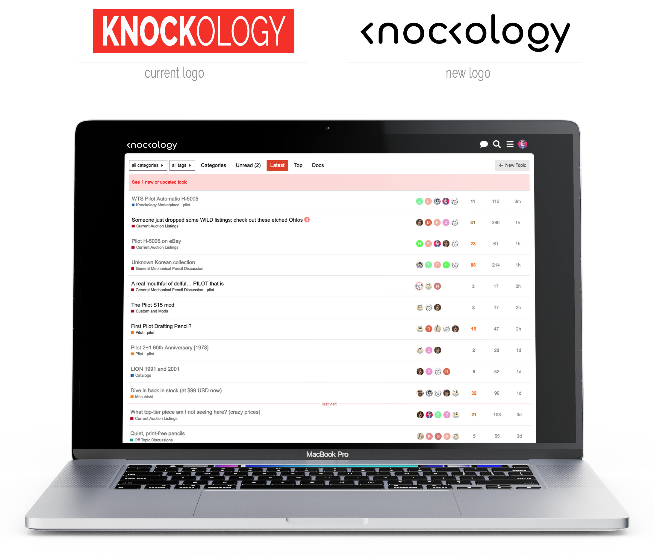
In light of these changes, I wanted to inform you all that www.knockologist.com will soon be retired, and the Knockologist logo will transition to Knockology, albeit with a minor update. Below, you will find a preview of how the subtly updated site will look.

I want to extend my heartfelt thanks for the unwavering support that each one of you has shown to both Knockologist and this incredible platform, Knockology. Although my pencil-making journey has taken a different turn, I remain committed to this community. I look forward to continuing our shared passion for this space and working together to make this forum an even better place for us all.

P.S. I need to make Knockology t-shirts. That would be :fire:

8 Likes

Pencil-making journey pivot: A stainless steel double-knockā€”ideally with etchingā€”at a target $99 MSRP.

Aside from that, Iā€™m digging the course-correction and new logo!

5 Likes

Love it! Iā€™ll take a size M.

4 Likes

Iā€™ll take an XL.

And I do like the logo.

4 Likes

Oh man! I am really disappointed youā€™re not going to pursue making art pieces and launching them into space instead :stuck_out_tongue:

Iā€™m just really glad I had an opportunity to get one of your creations.

And finally, thank you for starting and keeping this forum going! As always, if you need help donā€™t hesitate to reach out.

5 Likes

Just a little brainstorming here. I like the concept of the logoā€¦ but, for the uninitiated, itā€™s confusing. I thought maybe it could be tweaked a little. Hereā€™s what Iā€™m thinking:

In this version, you have the left angle sign representing the knock, but itā€™s against a surface, the gray lineā€¦ to demonstrate the knock ā€œprincipleā€, while also completing the shape of the K.

2 Likes

Would need to be tweaked because the width of the k would then not match the rest of the typeface (itā€™s far too narrow).

Plus, the ā€œdog that didnā€™t barkā€ is precisely whatā€™s unique and cool about this logo. The motif appears on both Kā€™s and the G.

Well, that space was already short on the slot, because of the angle alone, without the vertical line of the K. But yeah, it could be adjusted to compensate. It doesnā€™t need to be touching the line anywayā€¦ so things could be spaced out a little moreā€¦ and the lines softened further, to be more subtle.

1 Like

Iā€™m not against adding the light gray stems to the ā€˜kā€™ letters. I tried that when I was working up the Knockologist logo but decided I liked the theatre of the missing/suggested elements, especially since this is such a niche thing.

However, Iā€™m curious to hear what the rest of you think. If thereā€™s one thing I know about us mechanical pencil lovers, itā€™s that weā€™re never short of opinions!

3 Likes

Not helpful, but I like them both!

3 Likes

Got it. Interesting to know that you had flirted with the idea.

I do get the minimalist / suggestive element idea. Itā€™ll be something only people in the pencil world getā€¦ and only a portion. So many people who enjoy pencils donā€™t even know ā€œknockā€ is an associated word, because itā€™s a Japanese assignment. I showed the original logo to my housemate who is graphically minded. She didnā€™t have a clue what it was supposed to say. Itā€™s a bit more abstract than the average person may grasp.

3 Likes

Kind of dorky, but maybe they can be light gray pencils?

4 Likes

Please leave.

LOL - kidding

5 Likes

Make it two silver rotring 600ā€¦ :wink:

4 Likes

No, rOtring 600 wouldnā€™t workā€¦ itā€™d have to be a double knock, because there are two arrows! :smile:

3 Likes

Ask Drifand to get some magical shots of the retro de luxe!

Seriously though, @Knockologist thanks for the forum and good luck with this endeavour. While the logo is a bit confusing as soon as anyone enters the site they will understand.

3 Likes

I just thought of somethingā€¦ maybe just 1 gray line, instead of 2ā€¦

Because HEREā€¦ you already have a ā€œhelperā€ for knowing what that angle bracket is to mean. For the next one, you donā€™t need the line because you know what it is. And then the whole word is abutted to a surfaceā€¦ which is what pencils are all about, contacting a surface for writing.

Thoughts?

4 Likes

pls show with the grey vertical at the 2nd k. i have the feeling that looks more balanced ā€¦

4 Likes

3 Likes

I like the new logo without the vertical lines on the Kā€™s. It has style and visual appeal.

2 Likes