I didn’t know it back then but in 1978/79 BMW launched its most beautiful failure of a supercar. Having created a dedicated and separate company—
BMW Motorsport— to create a halo product in the form of a
real racing car that normal people could buy, the M1 was—Surprise!—yet another wedge-shaped beauty designed by Giorgetto Giugiaro.
As a kid growing up in the 80s, I had no inkling of all this secret DNA threading across so many of my favorite sports cars! In fact, my first contact with the M1 was at school when a classmate showed off a ‘Scaletrix’ type motorized miniature. That little M1 came in white with 3 distinctive bold color stripes running diagonally across the body, and while I didn’t know what model or make it was, it left a strong impression on me.
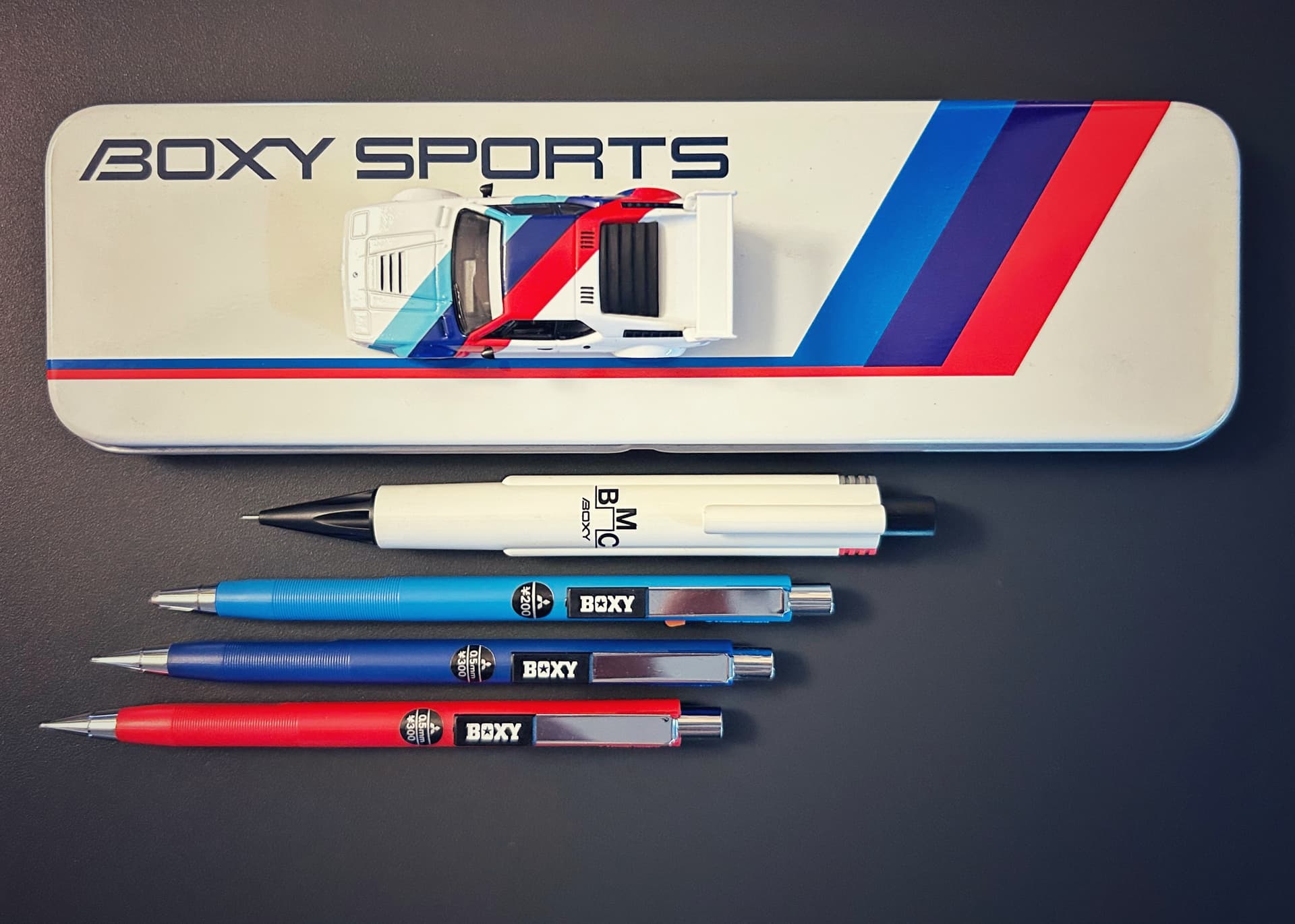
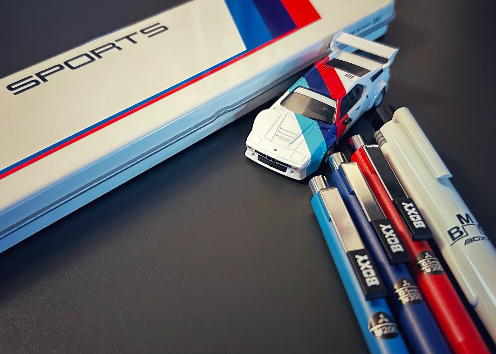
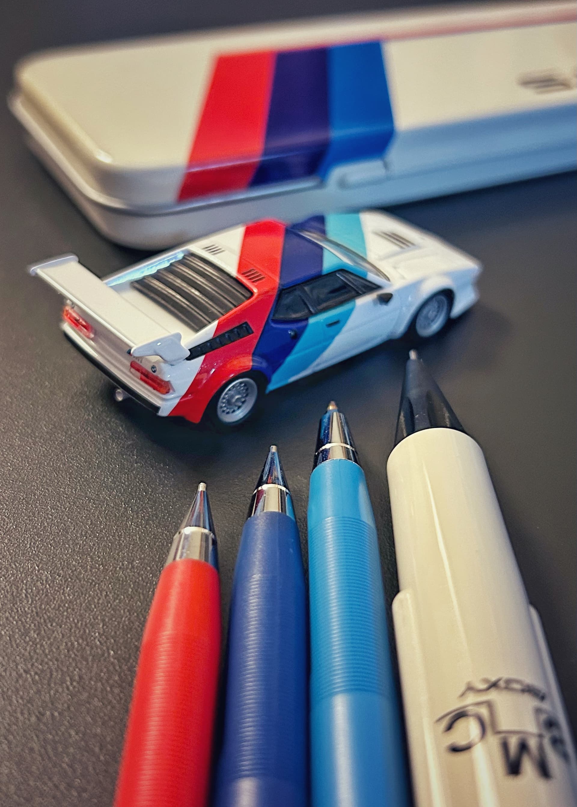
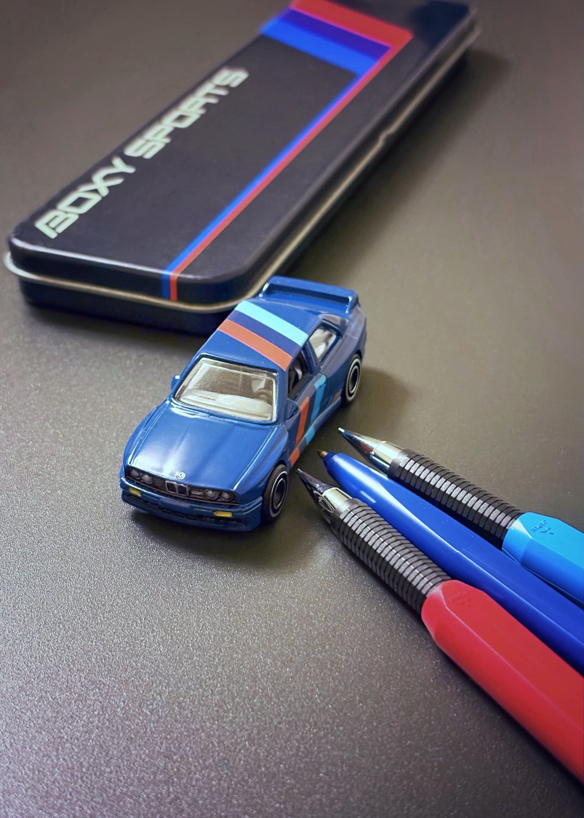
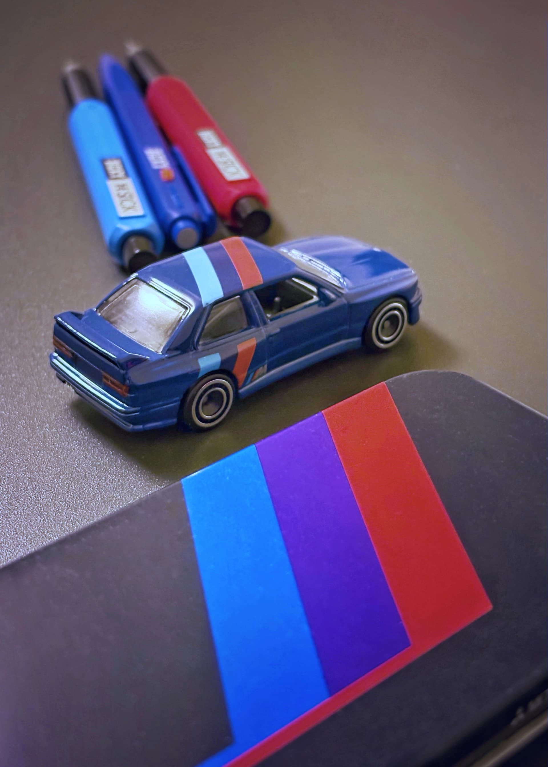
Fast forward a couple decades and now I’m collecting BOXY stationery in earnest. When I laid eyes on this BOXY SPORTS pen case, that vestigial memory of the M1 came roaring back like a tornado. I knew I had to get the case even if I didn’t know what it was supposed to represent.
Sharing a picture of it soon elicited responses from more knowledgeable folks: the white-blue-purple-red scheme was an obvious ‘tribute’ to BMW Motorsport. And so I set about looking for a nice miniature of that same
Group 5 ‘Pro Car’.
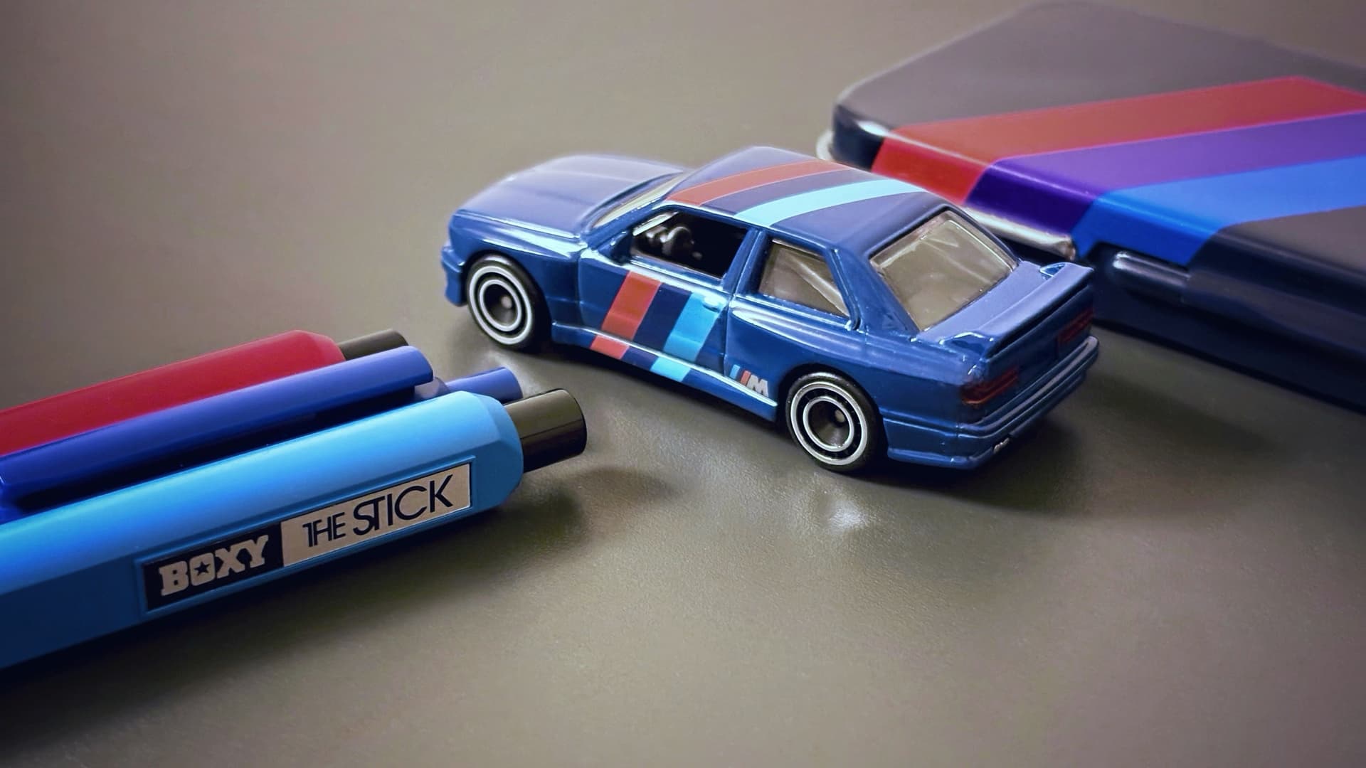
To match up with the Kyosho made 1/64 scale M1, I picked out several BOXY pencils, one in each of the signature colors (or as close as I could get to it):
• BOXY BMC M5-527 multipen in white
• BOXY-200 ballpoint in light blue
• BOXY M5-300 in dark blue & red
As for the real life M1? It was a business failure as the stand alone BMW Motorsport company couldn’t quite balance the production numbers with cost and lack of actual demand. It turned out that while normal drivers liked the idea of owning a racing car, the actual cost in terms of price and relative lack of comfort was a losing proposition. They were losing money on every car they sold, and they had to try to sell as many as possible in order to meet the regulations for Group 5 racing.
Today BMW has learned its lesson and the famous stripes are simply a ‘badge’ worn by tuned-up models that do not sacrifice luxuries. And that was all customers really wanted: to be seen as owning a powerful car even when it wasn’t all that spectacular at all. Oh well!
15 Likes
I really enjoy the Boxy models you’ve been sharing. That line appears to be very broad and eclectic. You’re going to pull me down this new rabbit hole. lol
3 Likes
Come on in… there’s plenty of room in the BOXY!
6 Likes
I’m a fan of the older BMW M3… back when the platform wasn’t unduly heavy and saturated with too many unnecessary features. Loved the white paint job with light blue, navy blue, and white stripes, though. So nice that BOXY made a Motorsport themed tin box.
The M1 road car was really nice looking… but quirky as all hell. The 840/850 seemed like the logical step forward. Unfortunately, very overpriced and complicated… repairs on those can be painfully expensive. But the body design… still one of my favorites.
2 Likes
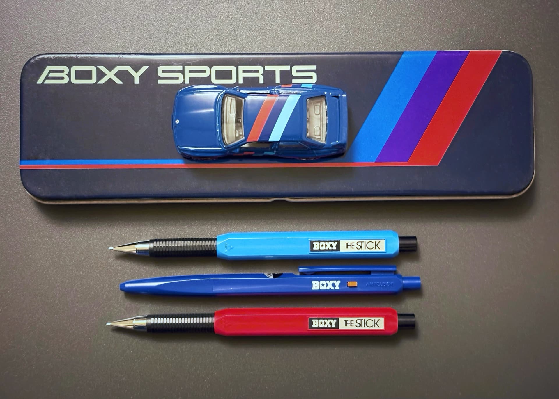
PART 2 is here!
It was a lot harder finding a mini car in this alternate Motorsport color scheme… I was really hoping to find another M1 model but the only version I came across was a very pricey collectors edition of the
1982 Suzuka winner. And it was a larger scale at 1/43.
Luckily I chanced on a Hot Wheels BMW M3 in a similar scheme! However, as this was not one of Hot Wheels’ ‘premium’ offerings, the entire front fascia was unpainted. I dug out my Gunpla toolkit and carefully dabbed some silver, yellow and red paint on the front lights, grill, turn and signal lights. I think I did a reasonably clean job! Not much more to add this time as I saw this as more of an aesthetic exercise…
13 Likes
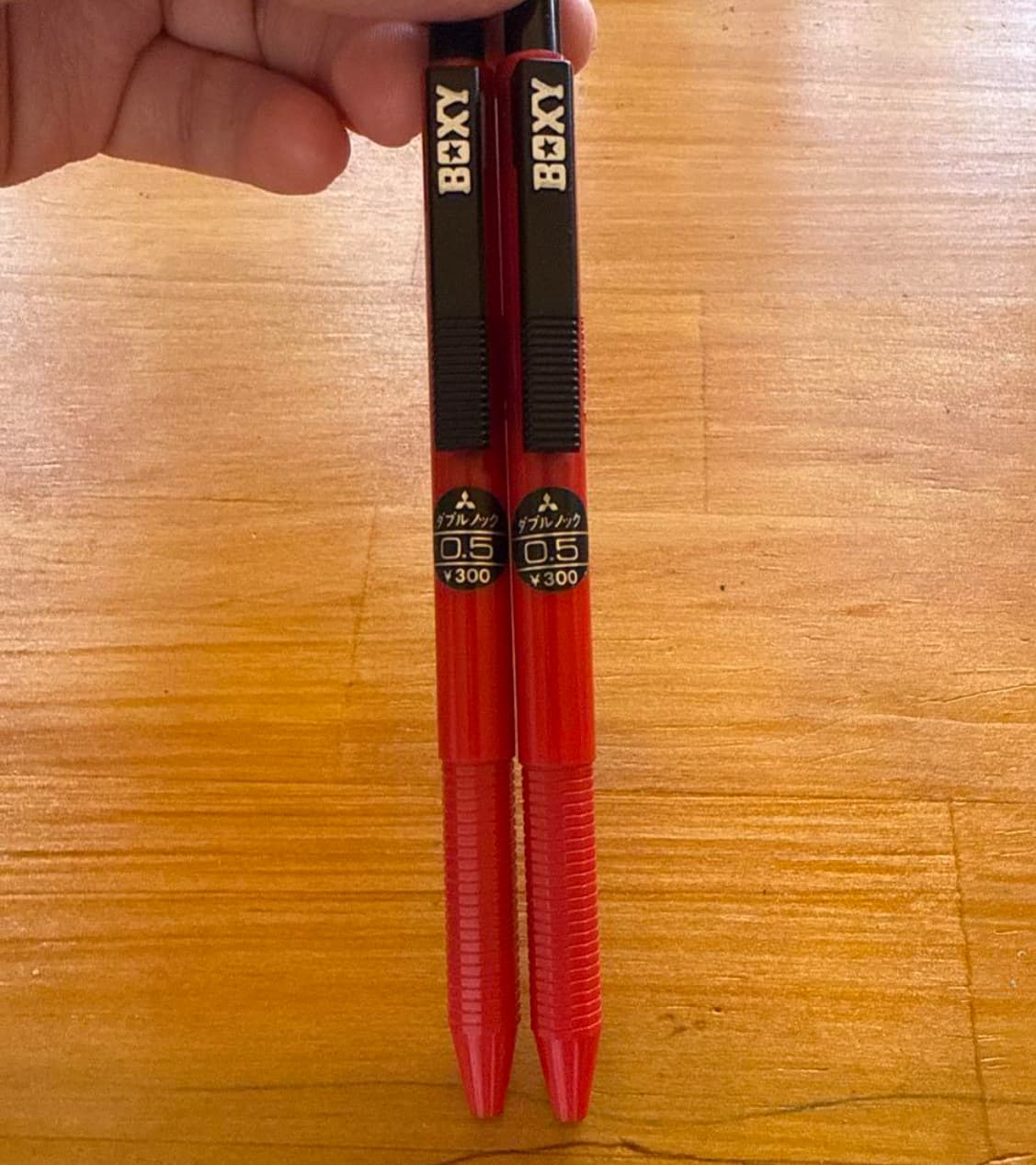
I have never seen “the stick” before. The shape reminds me of the Kohinoor 5613 with the slimmer grip to the much wider body, though I will pay attention to seeing one and maybe trying to add it to my collection, is its quality similar to the ¥300 (i think) double knock plastic tip boxy?
These…(not my photo)
The more I look into your past “BOXY Files” posts, the more I want this thing!!
3 Likes
I think of BOXY as an 80s stationery designer’s playground. The brand was started in 1975 (!) targeting the taste of school boys with colorful spring loaded ballpoints that could be used to launch equally colorful sports car erasers for desktop races.
So, unless a BOXY pen is obviously sporting some metal construction, I’d just lower my expectations. You are indeed correct that the all plastic M5-330 W-Knock isn’t all that great of an experience. It feels a bit squeaky and ‘hollow’ but their original target audience wouldn’t have cared. THE STICK fares better in that it is a basic clicker MP. The clutch and feel are pretty normal. In BOXY land, FORM ≥ FUNCTION
3 Likes
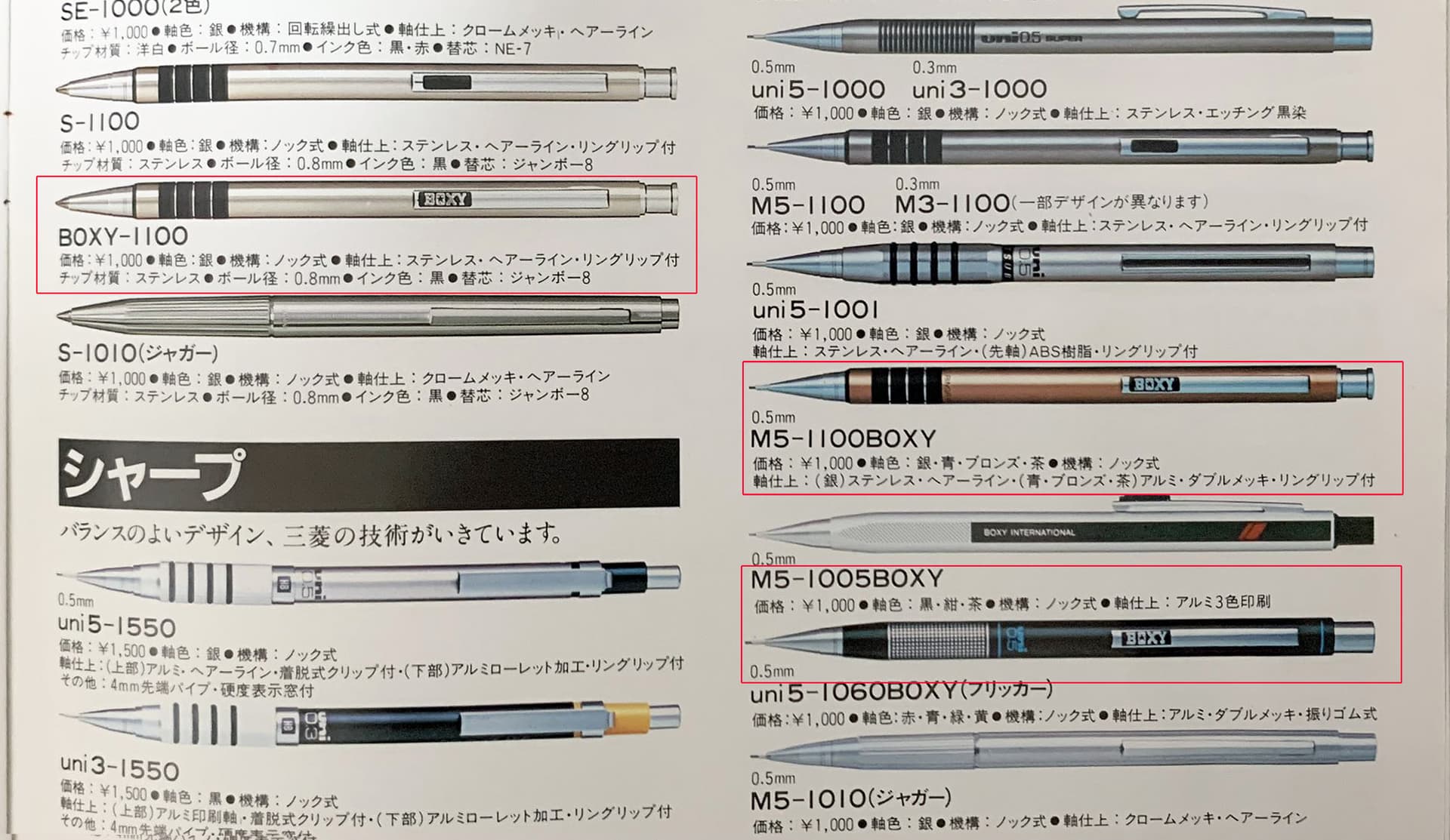
Sounds very plausible. BOXY certainly started out as catering to a younger audience. How long did BOXY last? Seems like quite a long time, given how much ephemera you’ve accumulated, Kelvin! I have to wonder if some designs were made as an attempt to reach the early audience that aged. Like taking the standard M5-1100 model and simply affixing an embossed “BOXY” badge on the clip. The catalog snapshot below shows the BOXY badge applied to a standard model, like the M5-1100. And it was done in a variety of colors.
EDIT: Here’s a colorways image I finally found:
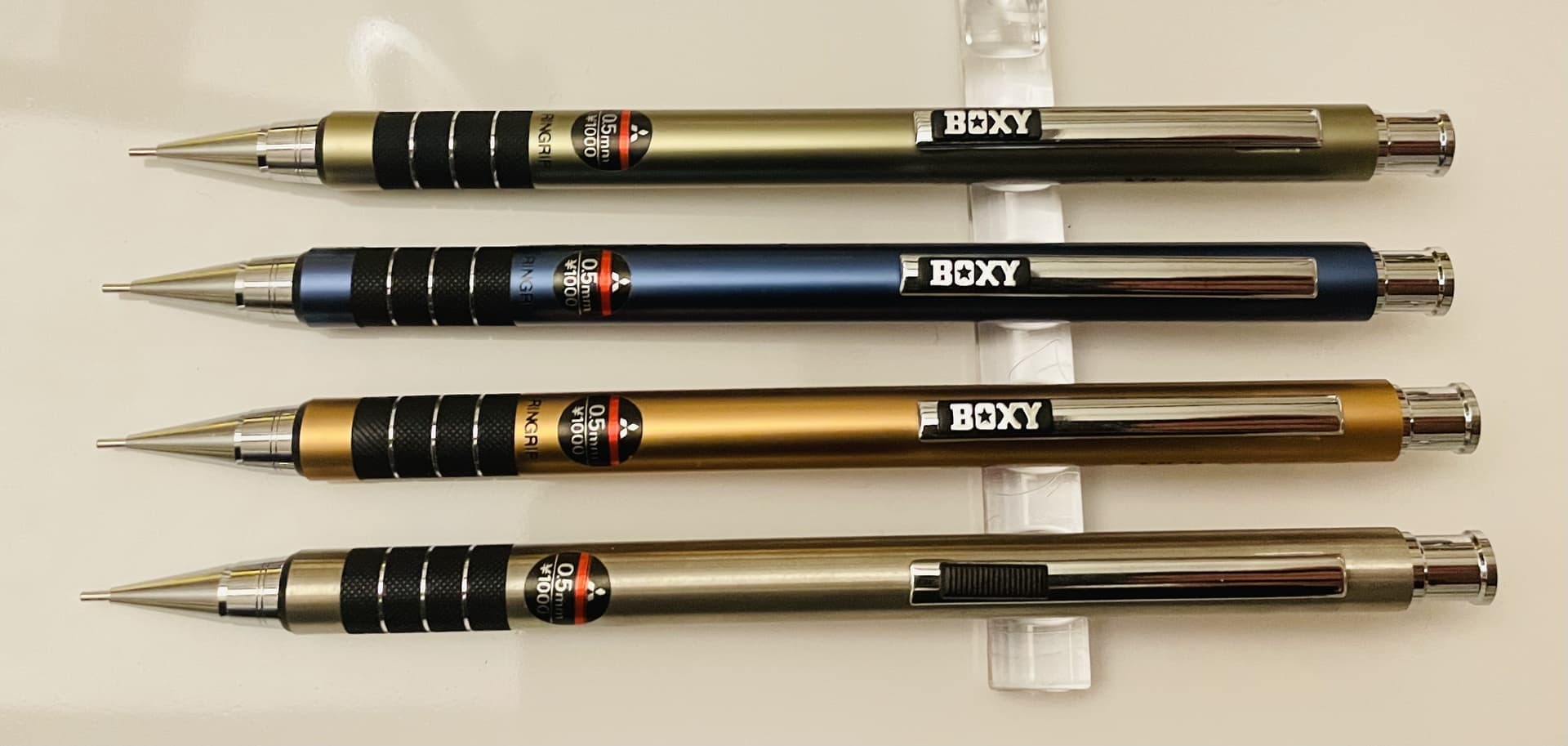
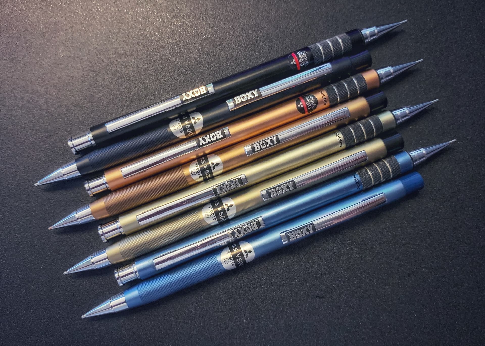
But you have much better photos
HERE, Kelvin:
The International and Nero models also look far more conservative and targeting young adults versus teens.
4 Likes
Forgot to point out… about BOXY starting in 1975 – there was another Boxy that appeared on the scene, in 1978. Well, actually spelled “Boxey” but sounds the same:

3 Likes