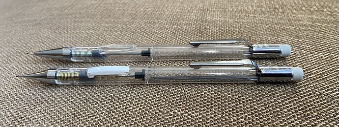
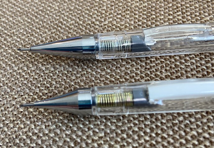
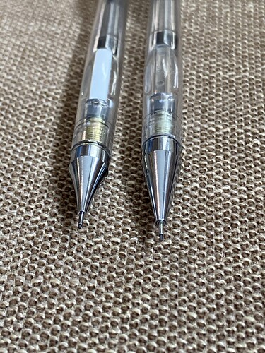
Which tip do you think looks better?
11 Likes
That one.
![]()
8 Likes
I like the straighter one - the non-Tradio tip.
5 Likes
I like the Forte tip but something isn’t quite right with it… almost too long.
5 Likes
I didn’t like writing with it as much as the Tradio tip. I don’t know if that’s because it is longer and/or because it is lighter in weight.
5 Likes
I have to vote for the Tradio tip. The Forte looks too big.
3 Likes
Shorter one
4 Likes
Curves deserve curves
3 Likes
Tradio☝️
3 Likes
I back the curved tip, hands down.
3 Likes
The Forte has a very common shape. I like the concave curves of the Tradio. It’s also more conducive to a forward grip. And my own personal like about it is a slight echo of the old 1970’s Koh-i-noor Rapidograph stylograph nibs.
3 Likes


