https://x.com/ThebestFigen/status/1799944004982935856
Welp, now I want stencil templates for all my favorite fonts ![]()
https://x.com/ThebestFigen/status/1799944004982935856
Welp, now I want stencil templates for all my favorite fonts ![]()
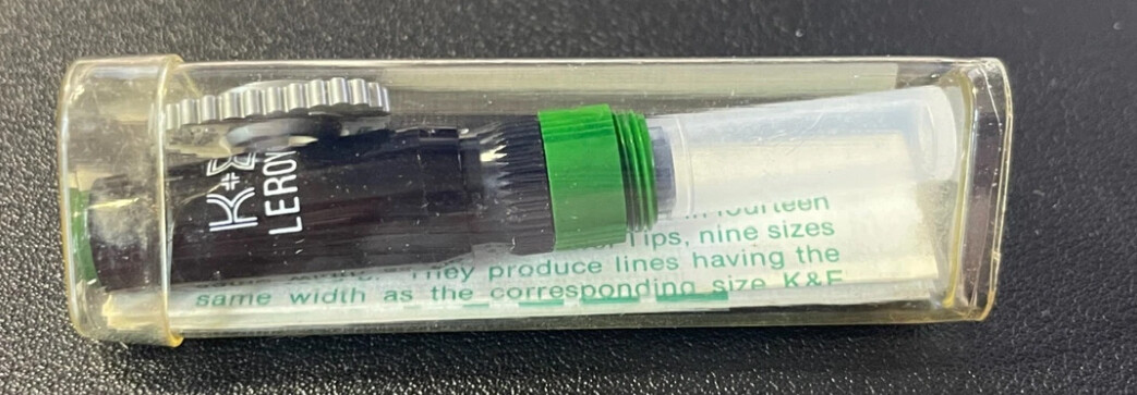
Been there, done that. It’s a delightfully effective Keuffel & Esser (K+E) “Leroy” lettering set, I think originally designed so that every technical drawing in the US had the same font and standard symbols, regardless of who was in charge of adding the specifications to the blueprints themselves.
A little mechanical marvel bringing the delicate technology of pantograph industrial machines into the hands of any drafter, it was made of essentially two components: the writing tool, and the template; by changing the template, one could get any sort of different style transferred without variations on a writing surface. The company which patented the idea ended up providing thousands of templates, for any possible use — math symbols, Greek letters, Hebrew characters, Cyrillic script, electronic gates, backwards-composed fonts to be written on film, electric symbols, UNI specifications, arrows, many variants of italic, freehand and medieval gothic scripts, etc.
Regarding the writing bit, there were fixed-arm, pivoting-arm, large-pivoting-arm and even fine-tuning-arm models, with the most advanced one allowing for modifications on the fly to both the slant and the dimension of the characters (by regulating a swivelling and sliding knob, it was possible to make an upright font as if it were slanted, or bigger, or smaller).
The company, Keuffel & Esser, was a manufacturer and importer of fine German drafting tools, with an impressive catalogue, and the “Leory lettering” division had a story of its own; it even produced templates based on people’s signatures, so that a secretary could apply the signature of a CEO or any other high-level big wig without having to bother the person directly.
I think that a former employee of the company wrote a short but exhaustive pamphlet describing all the production processes and the plants, and even putting together a comprehensive list of the available range of products; I found it in pdf format on the web a few years ago.
K+E was not the only one offering this type of writing system: I know for sure that it had been made available by Standardgraph, rOtring, Faber-Castell and Staedtler in Europe, and by Teledyne Post and other manufacturers in the US or in Japan; I stil think, however, that it was just a case of rebranding of K+E’s original lineup, save perhaps a few minor supplies from earlier eras and much smaller producers.
Case in point for this board, it was even possible to attach a thin-lead MP attachment to the writing arm, in place of the ink pens seen in the video; the original one was the tiny “Leroy .022” (wood body with turquoise lacquer, twistaction lead feed, metal tip with extra slim tip to be gripped by the tool handle), then a newer version (knock action, black plastic barrel, metal tip, 0.5mm standard lead mouth), and finally a full-metal version, probably made by Pentel and rebranded for K+E.
At any rate, this is clearly yet another rabbit hole, I’m warning you all: enter this path at your own peril. I started my journey by buying a tiny pencil, and in the blink of an eye I found myself striking down product codes on an old scanned catalogue, and angrily asking myself why nobody in Italy ever amassed a stock of Cyrillic and Hebrew templates, in all possible font sizes, for me to find it… ![]()
The stenciling arm has a metal collar that clamped onto the tubular tip of inking pens. This was the inspiration behind the innovative design of the KIN Rapidomatic and subsequently, the rOtring 500 series.
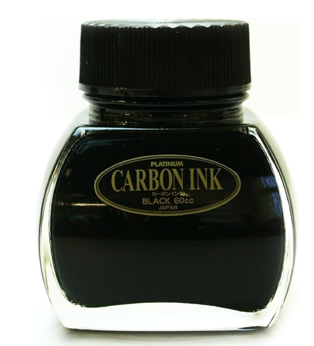
Can someone recommend an ink that I can use with my K & E Leroy Reservoir Pen set?
I use Platinum Carbon Black in my fountain pens - will this work?
@Dux might know?
Generaly you shouldn’t use fp ink in tech pens.
Dries too fast and may produce issues.
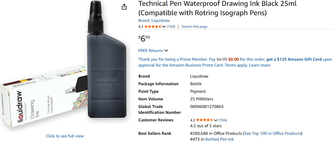
can you reccomend something I could get on Amazon?
Just search for technical pen ink…should get you some results.
Rotring drawing ink. Dont use fp inks it will clog tech pens, especially that one. Platinum Carbon ink has micro particles and it will clog the feeder pin.
order placed! Also - any reccomendations for waterproof ink? I’m using this with my watercolors - The platinum is really good at being waterproof -
I have this is my basket
I believe that Rotring’s is waterproof
Edit: although some people on reddit say it’s not…
A little over 40 years ago, I did an internship in the physics laboratory of the car manufacturer Opel and designed a form to record the results of low-temperature tests on plastics. For these, I used technical ink pens and a very similar ink. From today’s perspective, it seems like the Stone Age ![]() but I’m glad to be reminded of it and to see such things in use again!
but I’m glad to be reminded of it and to see such things in use again!
Speaking of Platinum Carbon ink: Does anyone use the now discontinued Platinum Carbon pen? I still find it amazing.