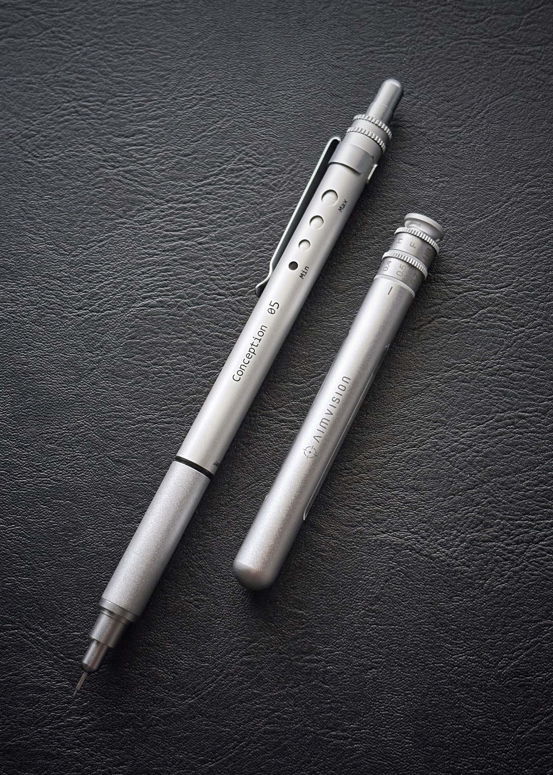
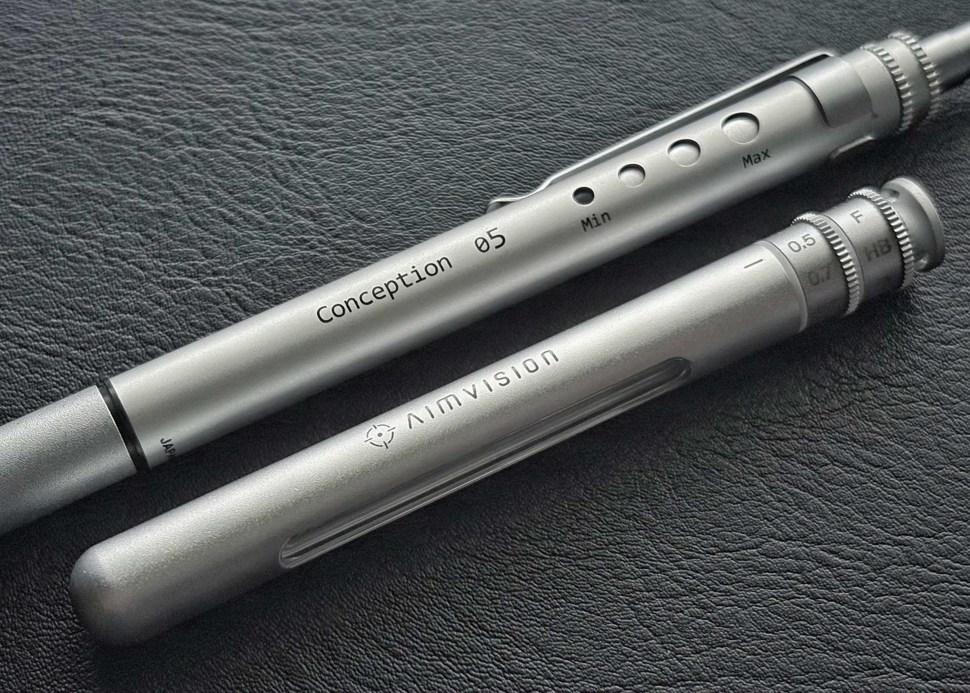
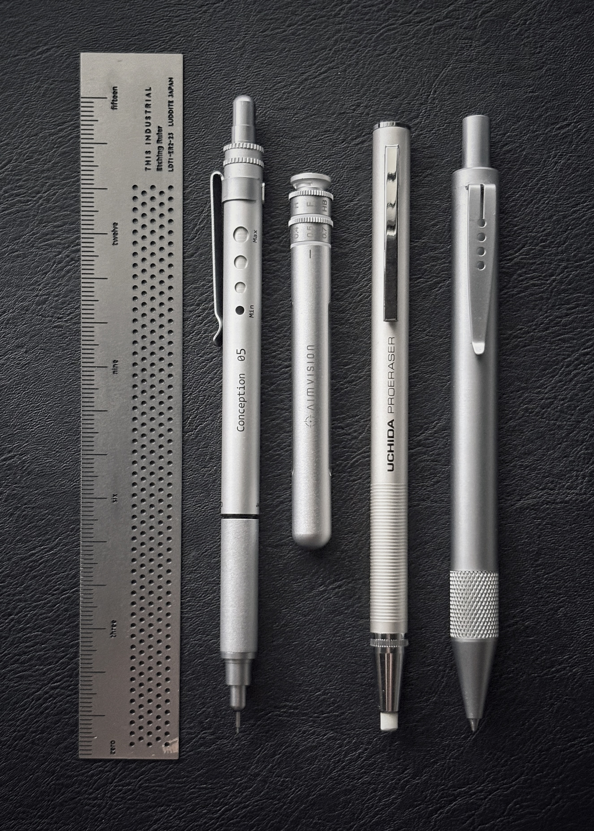
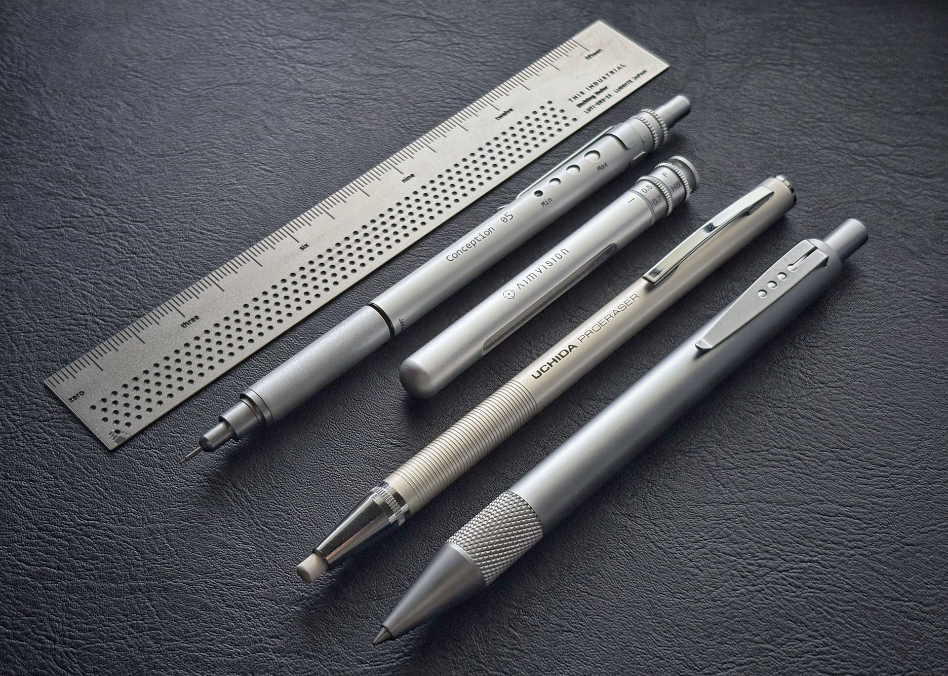
The moment I laid eyes on the Aim Vision lead case, I thought to myself: Why does this design not evoke the Aim Vision pencil but the clunky OHTO Conception instead?
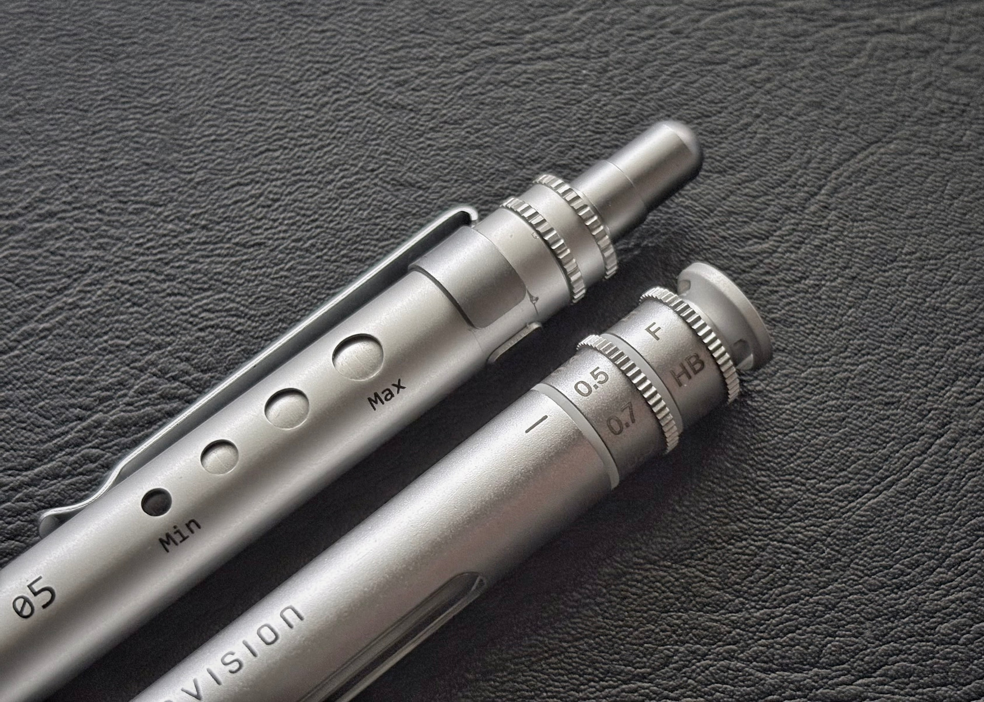
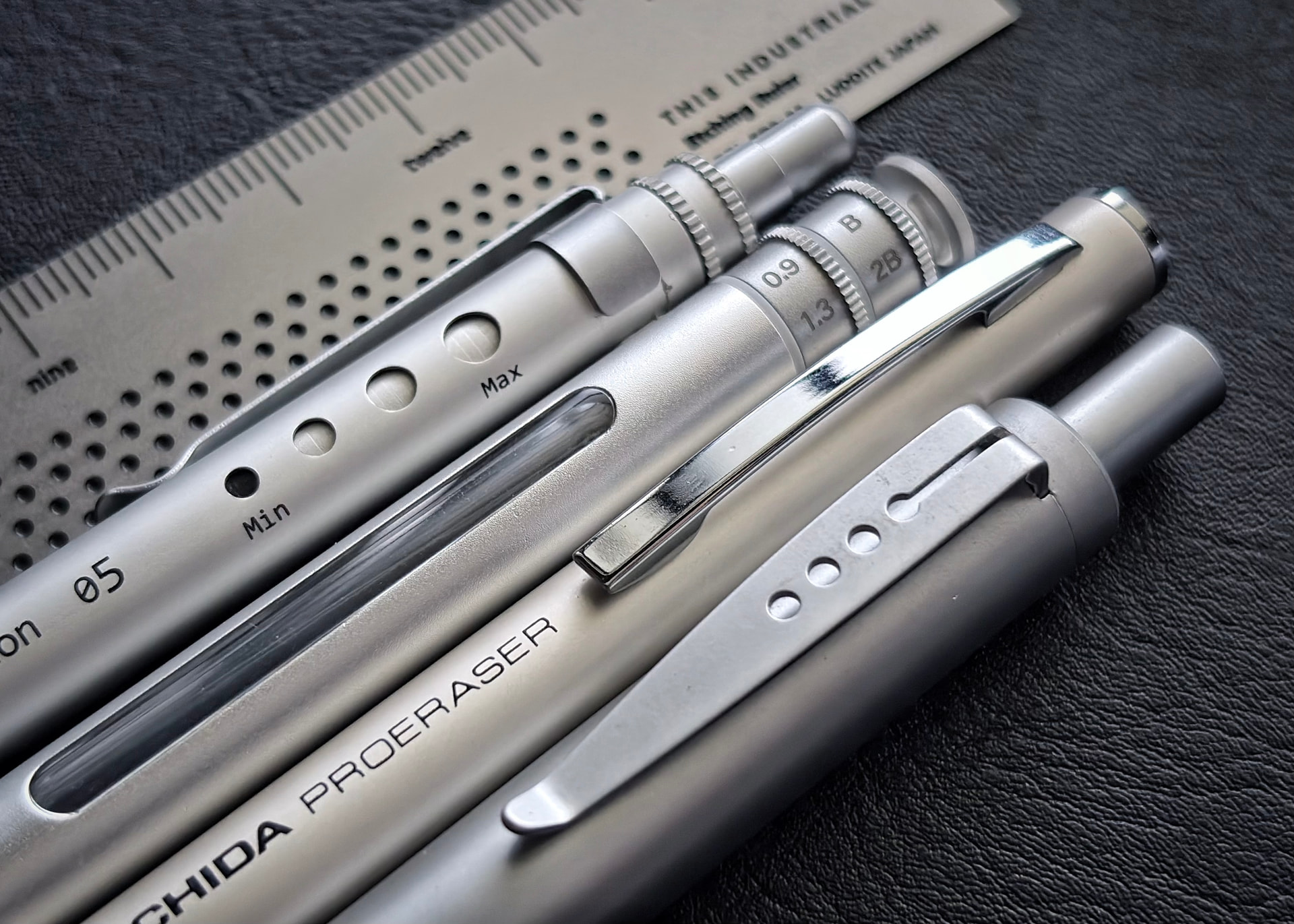
The fiddly nature of the two milled dials for the lead degree settings perfectly mirrors that of the Conception’s regulator dial.
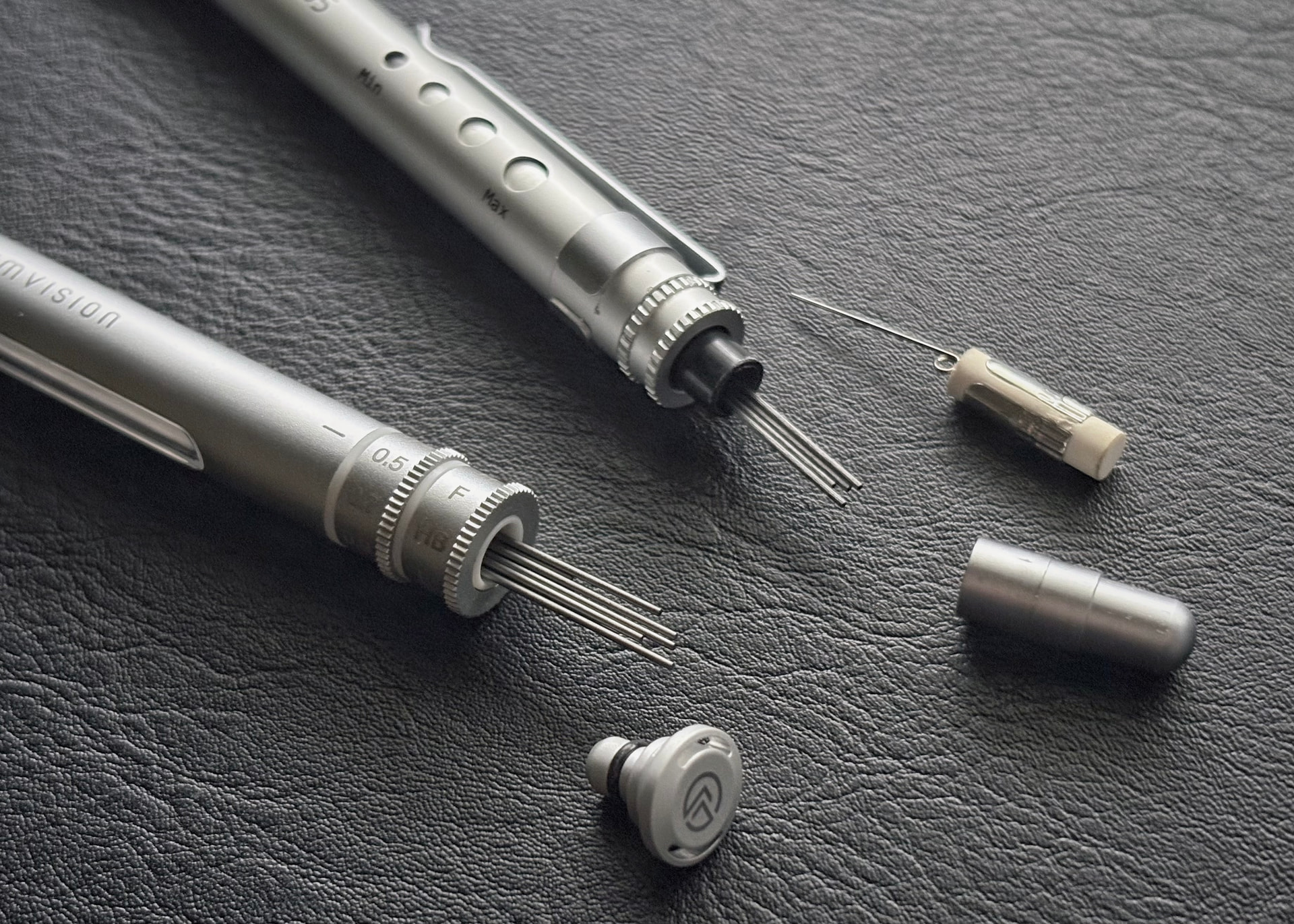
The case itself is very light; only 4.74 grams empty despite its aluminum shell. And the stopper style lid together with the rounded dome end of the case makes it look very ‘lab like’.
My two main criticisms:
Because the lid/stopper is so short, my fingers inadvertently grabbed onto the topmost dial whenever I tried to open the case. This would sometimes ‘click’ the dial askew.
The dials are not easy to read. Unlike the Aim Vision pencil, which has a natural ‘this side up’ orientation using the clip and text markings, the lead case forces you to look for the tiny and low contrast alignment ‘dash mark’ before you can pick out the correct lead size and hardness.
So, in the end this is more of a fun and indulgent fidget toy, and less purposeful than it appears to be.
I saw the Kayou+ lead cases as well but I ultimately decided against getting one because of its price. I can still appreciate the design that went into it. When I first saw the dials for lead size and hardness I thought to myself “That’s neat! Why has no one else done this before?”
Awesome photos by the way! The Conception pencil looks great too
So, in the end this is more of a fun fidget toy and indulgence, and less purposeful than it appears to be.
Ok, Yes, probably, but… Man that thing is beautiful! If all fidget toys were made like that, I would be fidgeting my life away by constantly tinkering with the dials.
Thank you for sharing, I did not know I needed something so deeply on a Wednesday morning…