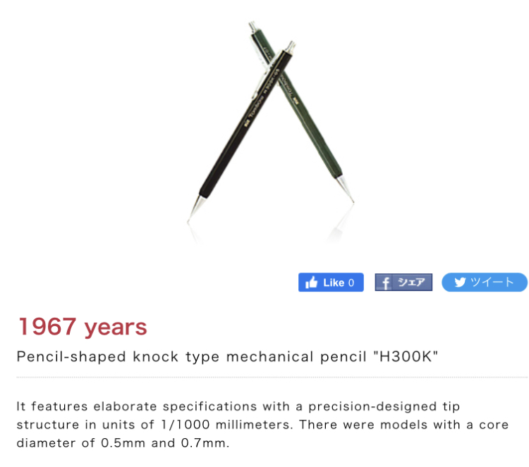
According the Tombow’s Flight to 100 microsite, their first knock type sharp was the H300K from 1967. It was a simple hexagonal design in either 0.5 or 0.7 and came in their signature green or black. Thinking about it, this would make it roughly 1-2 years after Pentel released its hi-polymer 0.5mm leads.
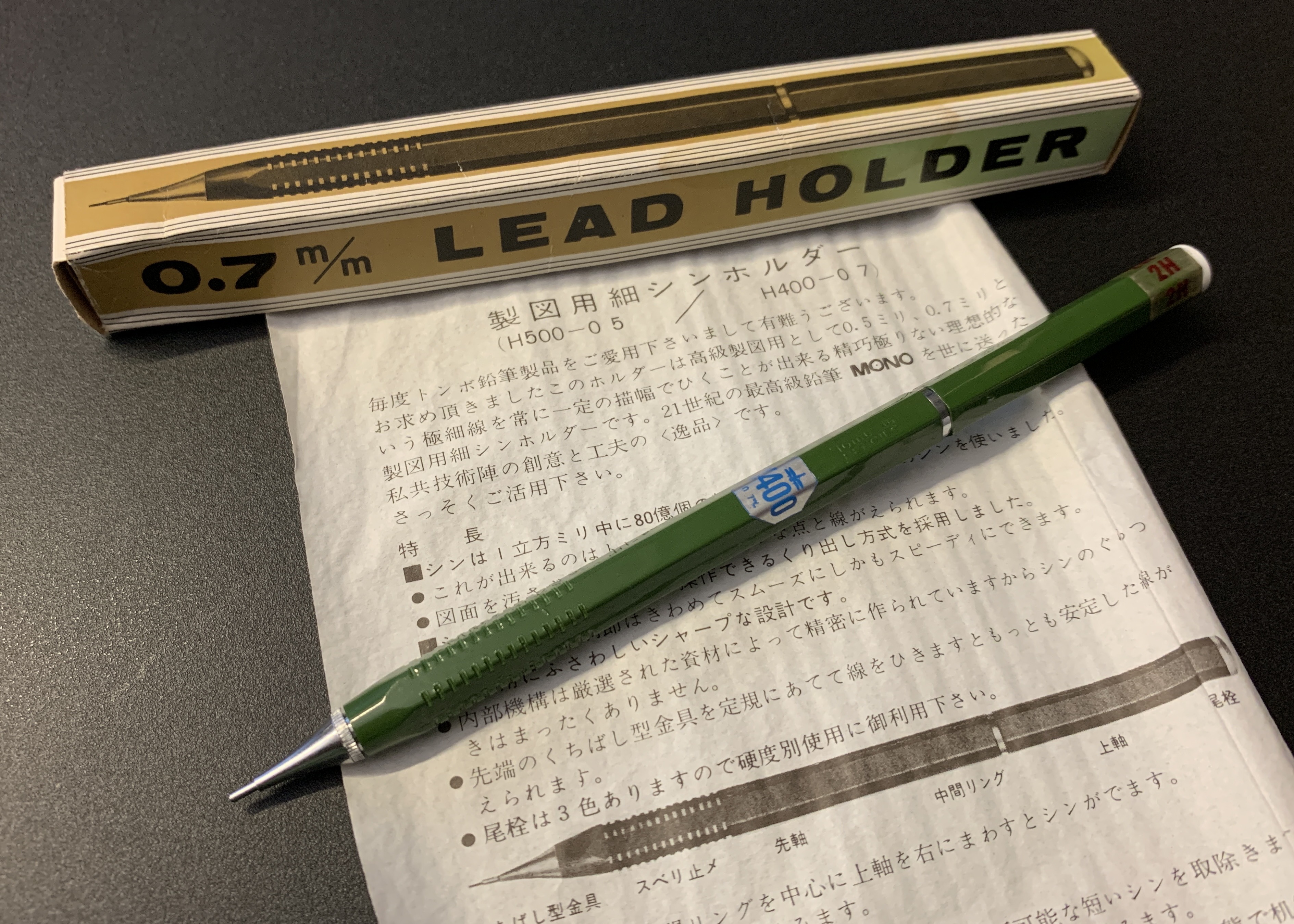
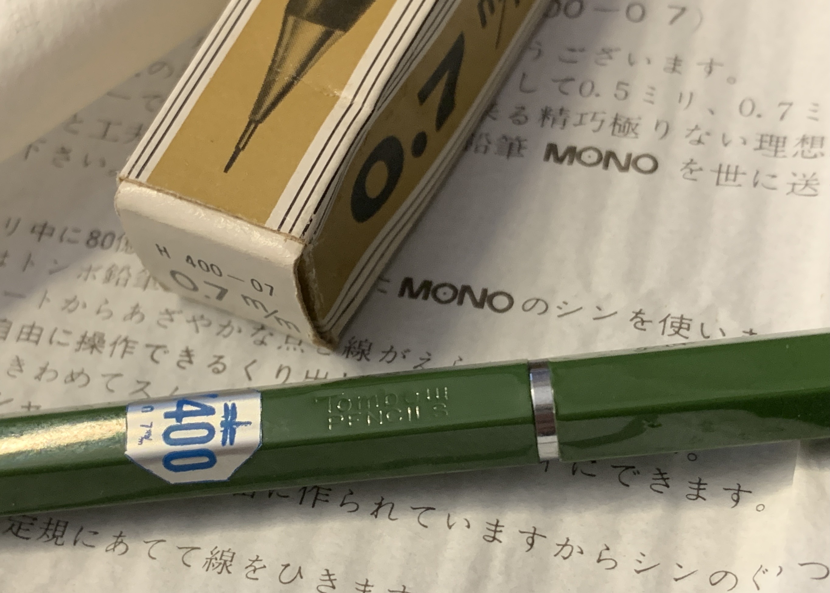
This specimen however is a twist propel design. The H400-0.7 also had a 0.5 counterpart, which cost 100 yen more, i.e. the H500-0.5. I haven’t taken mine apart yet but I believe Monogusa Museum has plenty of good photos.
What’s also interesting is that there was a preceding model that looks exactly the same but was sold in boxes labeled H350-0.7. I haven’t seen a H450-0.5 yet, so… here’s my guess at the timeline:
1965-66: H350-0.7
Tombow maybe did not have 0.5 leads yet.
1967-68: H400-0.7 and H500-0.5 concurrent with introduction of 0.5 leads but the extra fine machining for 0.5 twist mechanism pushed up the price. This must have been a transition period when Tombow had to monitor sales to see if knock type designs would grow in popularity.
Overall I’m really in love with the look and feel of the H400-0.7. I’m glad I got it in Tombow’s signature green. The notches on the grip seem like they were inspired by the classic Criterium. I still hope to obtain a H500-0.5 someday…
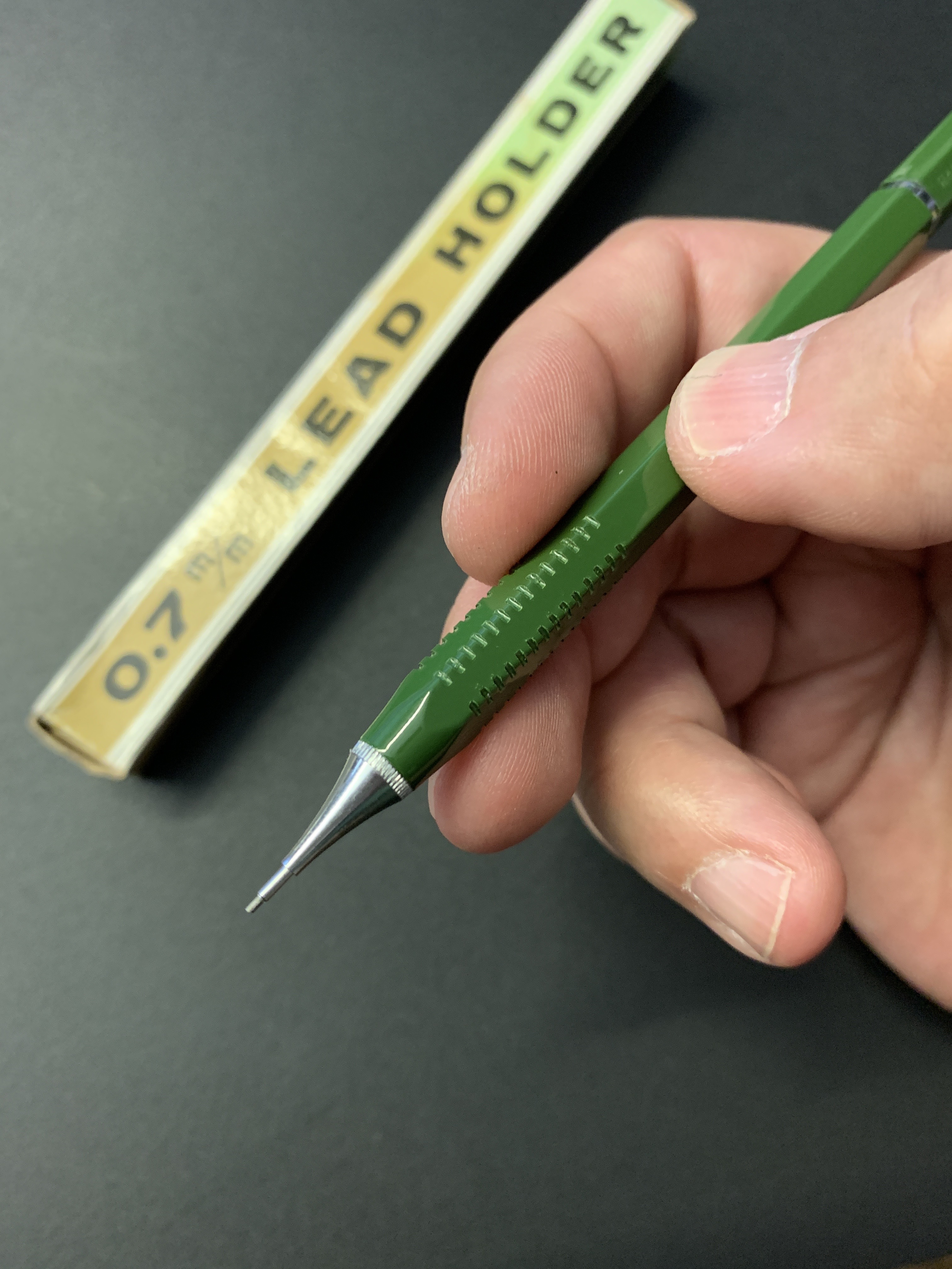
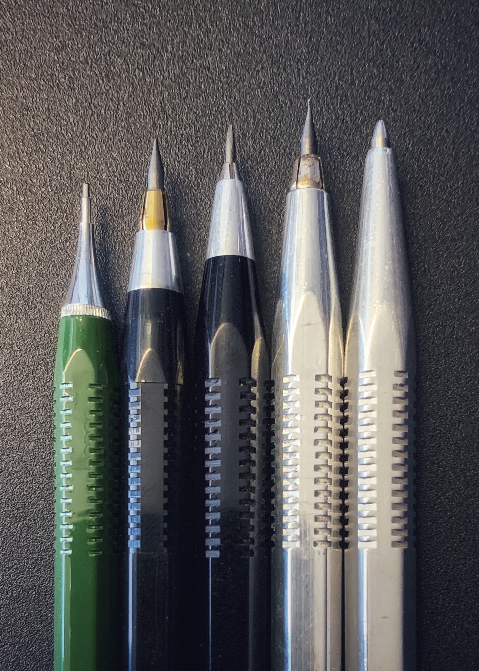
I was going to ask where you perform the twist to propel, and then I noticed the hash marks along the rear edge of the metal nose cone. The body design reminds me of Criterium, due to the perpendicular cuts to the body in the “grip zone.”
Hi Gary, the milled edges on the cone are to aid disassembly. You twist the back/top section where the chromed ring breaks the halves. Reloading is from the front, just like the Uchida twist models.
About those notches on the grip… now I really hope to get a Caran D’Ache Fixpencil Junior in green. The smaller notches seem like a better match.
The shape of that metal tip is something else: that level of commitment to both mechanical precision and aesthetic pleasantness is so Japanese, I can’t find other words to describe it.
Vaguely reminds me of other tips treated with equal care, e.g. the one of the first issue of the Pilot Sprinter model (metal tip with a double-radius curve), but this one is even better, looks like a hyperbolic geodesic on a tractoid surface.
The only way I could get something similar with another pencil, today, would be by taking a wooden pencil, and sharpen it with an old Faber Castell Janus handheld sharpener, or an El Casco double-burr sharpener.
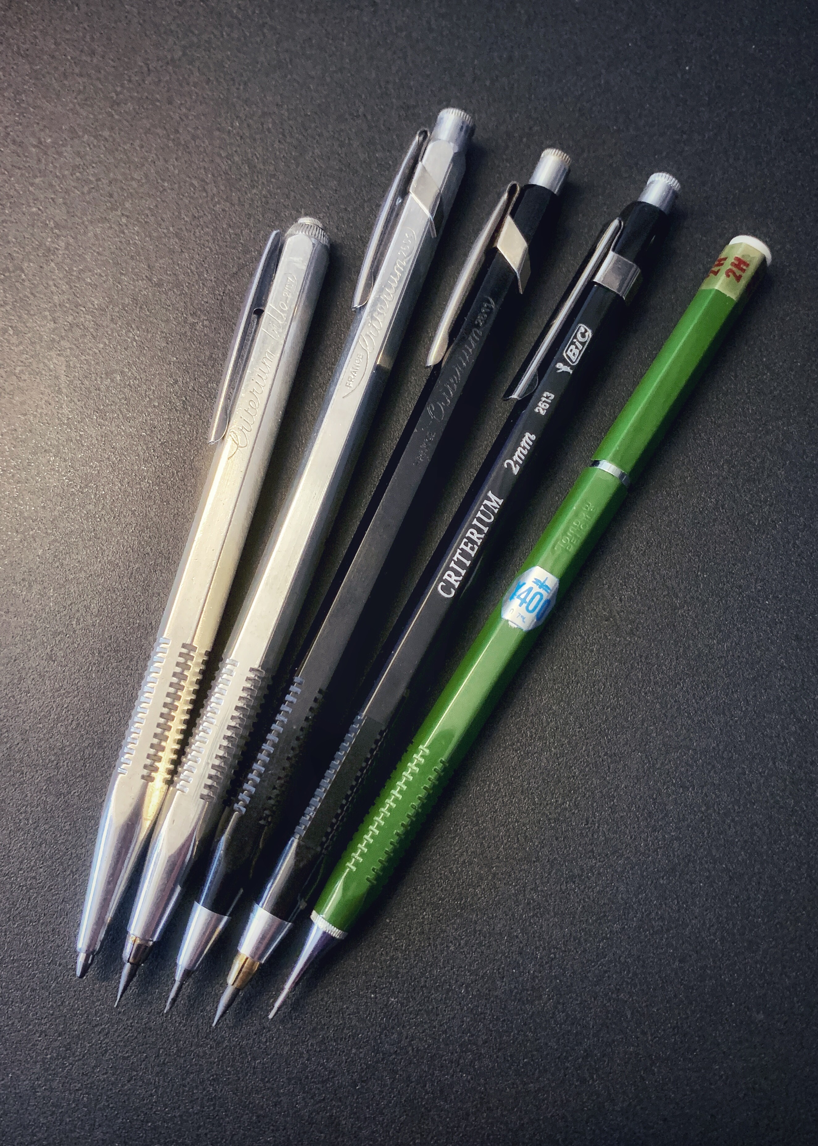
Quick comparison with what I believe is the inspiration for the Tombow H350/400/500: the classic French made Criterium leadholder.
The Tombow even has the same number of 14 notches on each side! Surprisingly, or perhaps not, it is the BIC version that cut corners by going with only 13 notches. Later, they eliminated this design signature to go with simpler square grooves instead. Stay cheap, BIC!
Especially where the grip is concerned. The notch spacing is almost the same. Same width but slightly narrow thickness.
@Leonov made a great point about that tip on the TOMBOW H400. It’s beautiful how the taper of the body flows right into the tip. Also the curvature is a bit concave, which lends to close tip gripping.