Here is my latest video. It was a collaboration with Dux at the rOtring Museum and Björn, a private collector and rOtring aficionado.
Anyway - it’s very long. damn long some would say, others may see it as 27 minutes of rOtring goodness.
Its in 3 parts.
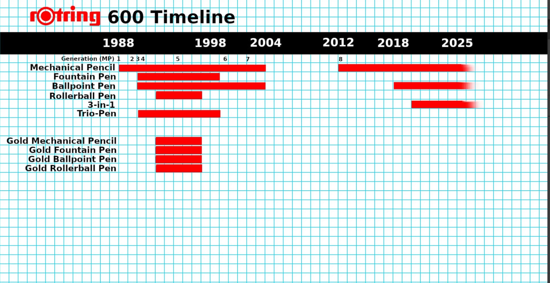
Part one I cover the entire rOtring 600 product line. Basically if it had a “600” on it (pencil, fountain pen, ballpoint, rollerball, etc.) I cover it. When they were sold, sizes and colors, etc.
Part two I cover the manufacturing changes made to the pencil as identified in the “Ultimate Collectors guide” on the rOtring Museum website : https://rotringmuseum.com/reviews.php
I demonstrate generation 1 to 8 (current). And then go over every available color and size option for generation 8.
Part 3 is short - but important. I address the quality issues rOtring has with the barrels cracking. I was able to identify possible source of the problem: the barrel gets lighter from generation 7 to 8, but the exterior dimensions remain constant. Add to this that older catalogs specifically say “brass” when discussing materials. Now they say “metallic” if they say anything at all about the barrel composition. My theory is that they are using a different material, or more likely same material but thinner walls.
Anyway - check it out when you have some time to kill.
I’m making it public tomorrow or Friday - I need to edit the captions in English and Japanese before I make it public. right now the captions are the youtube AI speech recognition so its probably a bunch of gibberish right now.
Loved the video. Thank you for taking the initiative to put it together. What a relief to finally have an exposé on this long overdue information that Dux, Bjorn, and others have uncovered and mapped out in the past few years. With the video, everything is so clear and accessible! Thank you!
Can you point me to the source of info regarding KIN 5640 release in 1985?
And once more I will hold a moment of silence for the unknown designer who gave KIN 5635 to the world.
Looks great, Patrick! Phenomenal work. What video editing tool do you use?
Btw, just one very minor point about the pronunciation of “hexagonal.” I noticed you are putting emphasis on the 3rd syllable. Hex-a-gon-al. Webster’s identifies emphasis on the 2nd syllable, hex-ag-on-al. (LINK). This is the standard pronunciation I’ve always heard as well. It’s not really worth bothering a re-recording, but just thought you should know for future reference. Thanks!
Thank you, Gary! I appreciate you allowing me to use your photo. You have a keen ear! I don’t think I’ve made a video yet without mispronouncing something or having a typo in the captions (like when I wrote “Lammy” in one).
@Dux just informed me about this interesting video by YouTube creator named Turtle Cub (かめのこわたし )
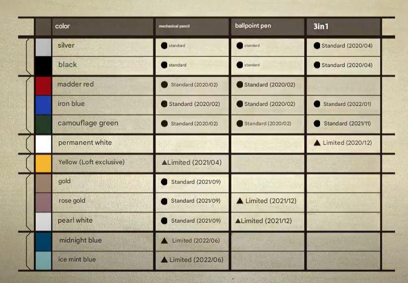
They have a video on the NONBLE 600 Ice Mint variants and has a timeline of the release dates for the various 600 colorways.
So… Midnight, Ice Mint, Yellow, and B&W Itoyas are the only limiteds. And Yellow is questionably limited. I wonder which of these has the least volume produced.
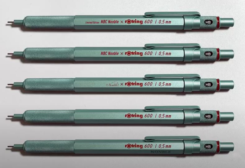
Very interesting. I’d no idea that there were so many variants of the NONBLE ice mint edition. Only versions I’d seen were the last one with “NONBLE” printed in a kind of white capitalized font. Those ones with the imprinting in red… must be pretty rare!
I’d also love to know if there’s any… “crack statistics” for these editions, or if it’s a problem plaguing the entire R600 line.
Interesting. Almost anything would have been better than the real version with ‘NONBLE’ printed on a different face than the Rotring label. Makes no sense.
Itoya’s logo next to Rotring’s looks normal. Supreme as well.
The Nonble pair were sold in Singapore’s branches of NBC Stationery. I looked at them every time I walked into the store. After about 3-4 months, I decided I couldn’t live with the crap logo placement.