PILOT QUATRO pen series
[NOTE: Sorry, my apologies for images only showing the QUATRO pencils. I’ve not yet been able to locate a catalog showing the ballpoints, rollerballs, or fountain pens]
The PILOT QUATRO pen & pencil series first appeared sometime in the mid to late 1980’s. The one key design cue separating it from so many other lines by PILOT is the 4-sides squared off body shape… hence “quatro” (a shortened version of “quattro”, the Italian word for 4).
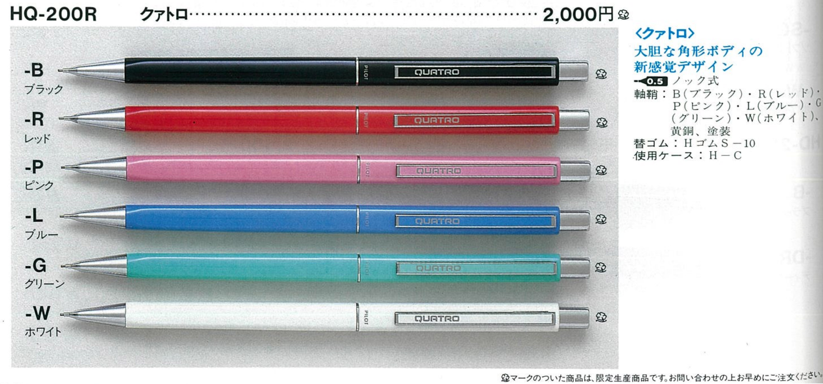
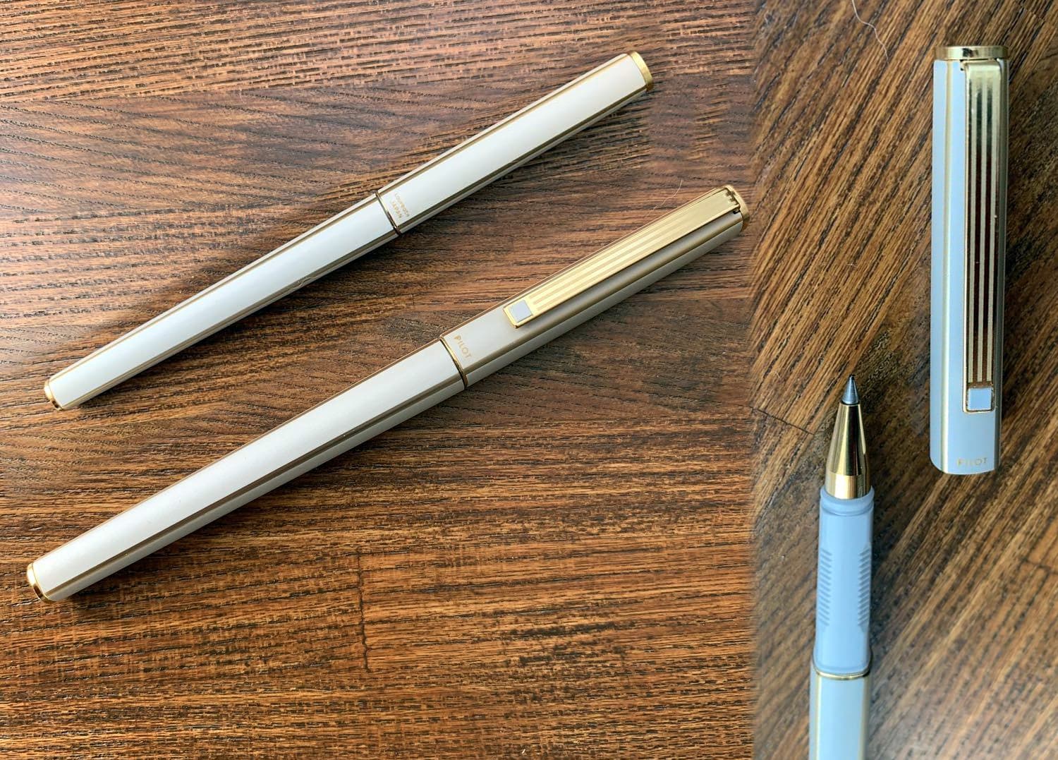
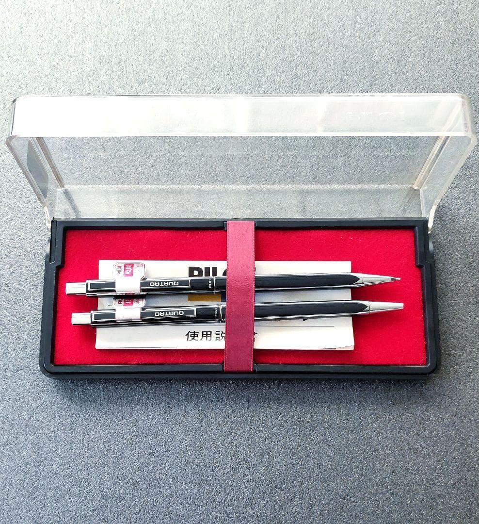
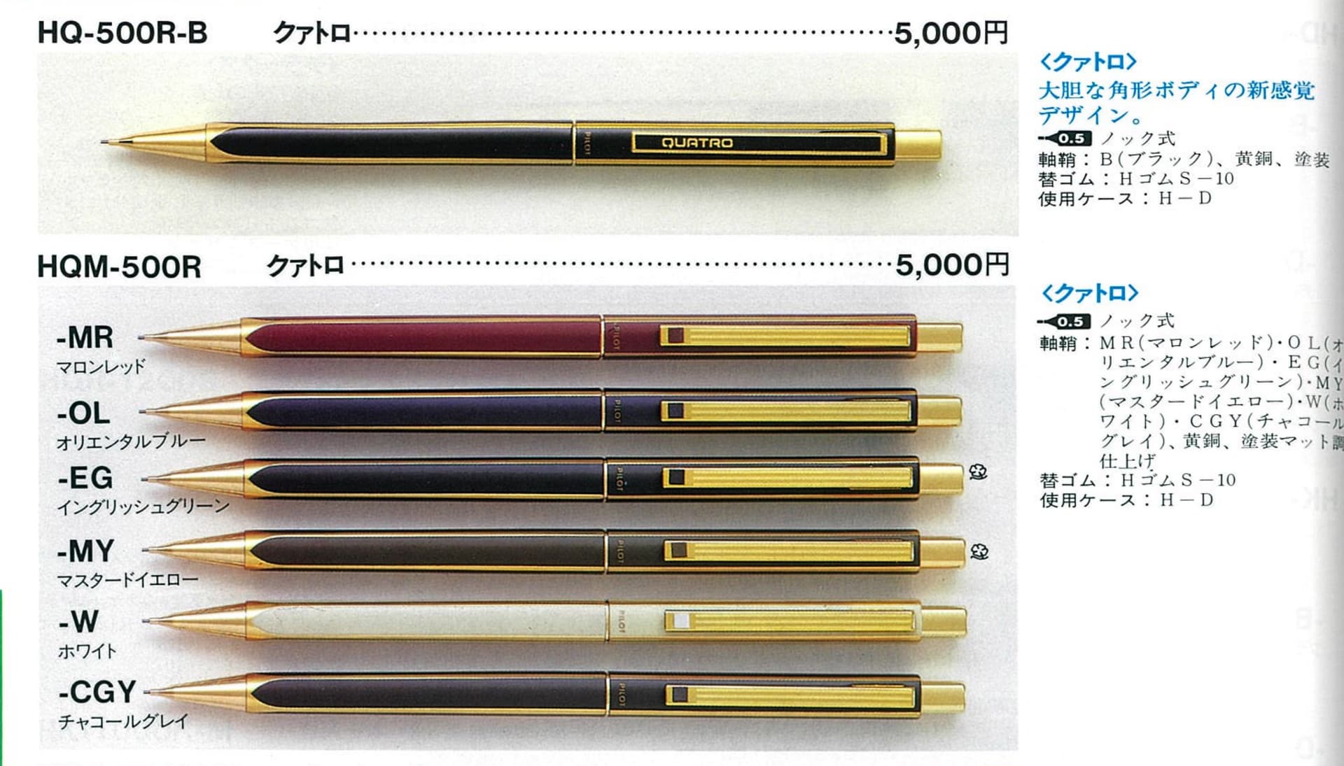
PILOT introduced this series with 4 different models: fountain pen, capped rollerball, ballpoint, and mechanical pencil. There are also 3 primary tiers - priced at ¥2000, ¥3000, and ¥5000. The main difference between the lowest and higher model lines is a slightly better build quality and a near seamless incorporation of the nose cone into the body (for ballpoint and mechanical pencil) with accompanying metallic accents making the lower tier look decidedly inferior. Why is there a ¥2000 jump from the middle to highest tier? It looks like gold plating instead of chrome, plus a changed clip that has a more minimalist, artful design shedding the bold “QUATRO” label. There was also one variant retaining the QUATRO label while still sporting gold plated accents. The catalog suggests only black, but some blended colors suggestive of tiger eye or tortoise shell were also made. There is another variant not yet mentioned, where “QUATRO” is written in a script style font and the entire writing instrument is mono-colored from nose cone to end cap. No accents. No chrome or gold.
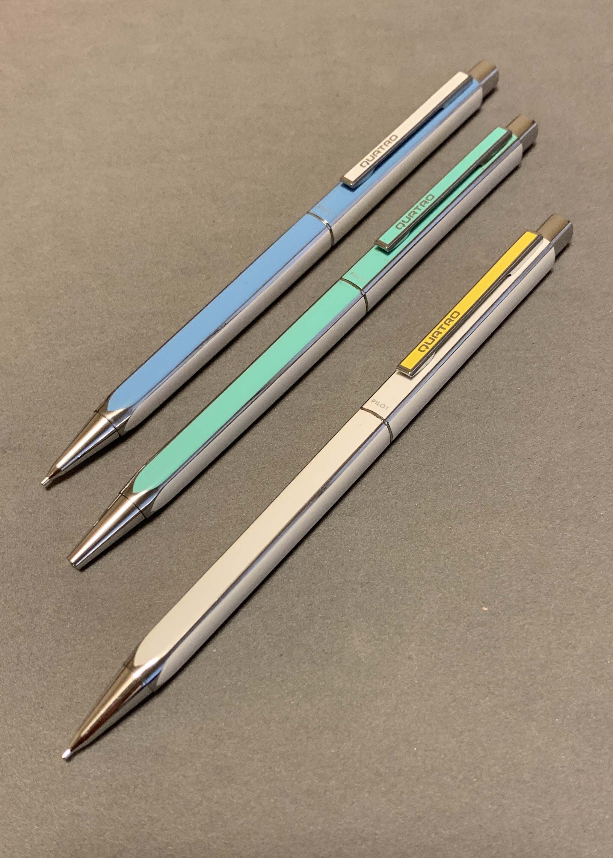
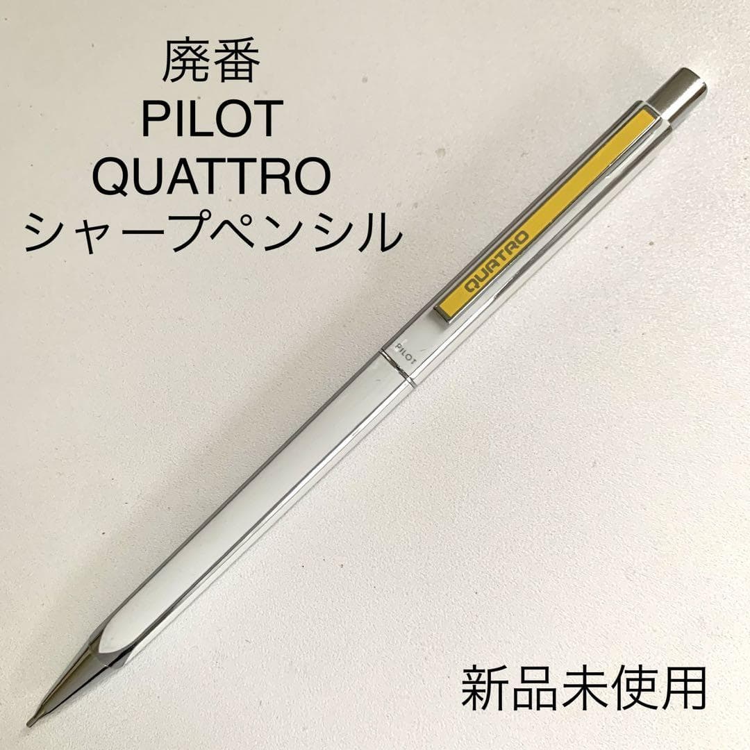
In my own exploration of vintage PILOT mechanical pencils, I’d become aware of the QUATRO line early on but didn’t take much notice. I had only seen the 1st tier. It was later on that I encountered the middle tier. And this is where things got interesting to me. The “4 sides” of the body is typically mono-color, with metallic accent lines at the edges. But PILOT went a bit liberal on the colorways, by introducing 2-tone models. This is where white and another color would alternate across the body facets. And on top of that, the clip color would be optional, to match the color, or instead remain white. My first sighting was green/white followed by blue/white, then finally pink/white. There are no other color combinations.
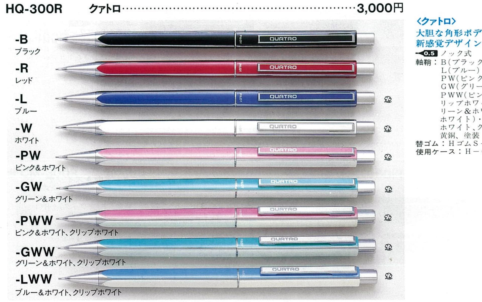
The late 1980’s into the 1990’s saw a shift in PILOT’s pricing. Some models they’d previously been making were decidedly underpriced. So markups were made accordingly, and that also caused a bump up in prices, in many cases as much as 50% and in others even higher. The exact release dates of the PILOT QUATRO are not known (as yet). It’s quite possible the first tier (¥2000) appeared in the early 1980’s and the more stylish mid tier (¥2000) came a couple years later, with the upper tier (¥5000) by 1988. I should state that it appears for the mid and top tiers, the composition is the same as they all have the same weight.
The fountain pen is reasonably nice for a lower mid tier pen. Where the quality lacks is in the grip section, which is very obviously plastic, and not a high grade composition. Still, it works reasonably well. The body will support cartridges and converters. The nib is a closed type (no breather hole up top) that looks similar to a rOtring 700. It can be a very smooth and moderately wet writer, depending upon tuning. Deceptively, you’d think the cap won’t post, but the body is tapered. There’s even a “notch” feature inside the cap, to friction fit nicely to the body without marring the surface.
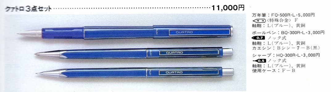
The rollerball is pretty much identical to the fountain pen, save for a nib-free grip section with a hole to accommodate a gel or ballpoint type refill. The cap can be posted, like the fountain pen.
The ballpoint diverges from the capped style, being an open clicky type. And despite a body with sufficient girth to accommodate a Parker G2 style refill, or PILOT G2 (or Laureate) refill, it can only take a D1. While less ink than half that of a G2, the bottom line advantage is supreme choice – so many brands offer D1 refill types. One thing to note – I’ve seen ballpoints for the 1st and middle tier QUATRO line, but none for the top tier (¥5000).
The mechanical pencil is probably where the QUATRO shines the most. It has a commonly shaped nose cone for PILOT, with the suggestion of a lead pipe for tip support. The mechanism is all metal, from brass chuck to steel cap. The body is also monocoque, despite that middle indentation suggestive of 2 parts. This makes for exceptional firmness and stability. A nice little touch is that the lead size is stamped on the back of the eraser cap. One key drawback? Only 0.5 mm was offered. But for an executive style pencil, this is by far the most common lead size. Size wise, the QUATRO pencil is actually a few millimeters longer than a PILOT MR pencil, and about as long as a crosshatch etched Elite pencil.
It sort of boggles my mind that the high end QUATRO was ¥5000, while the far superior functionality Protecs was just ¥3000, in addition to the PILOT Automatic and PILOT H-3005. I guess this is because a lot more time and effort went into the fabrication of the metal shell, anodizing, and plating… than to etched steel and automatic mechanism.
The QUATRO series pens and pencils are understated elegance. Truly timeless classics. I think every vintage mechanical pencil collection should feature at least one. I suggest either the mid or top tier. Both are great–it’s all up to your preference of “QUATRO” on the clip, or the gold lined understated design.