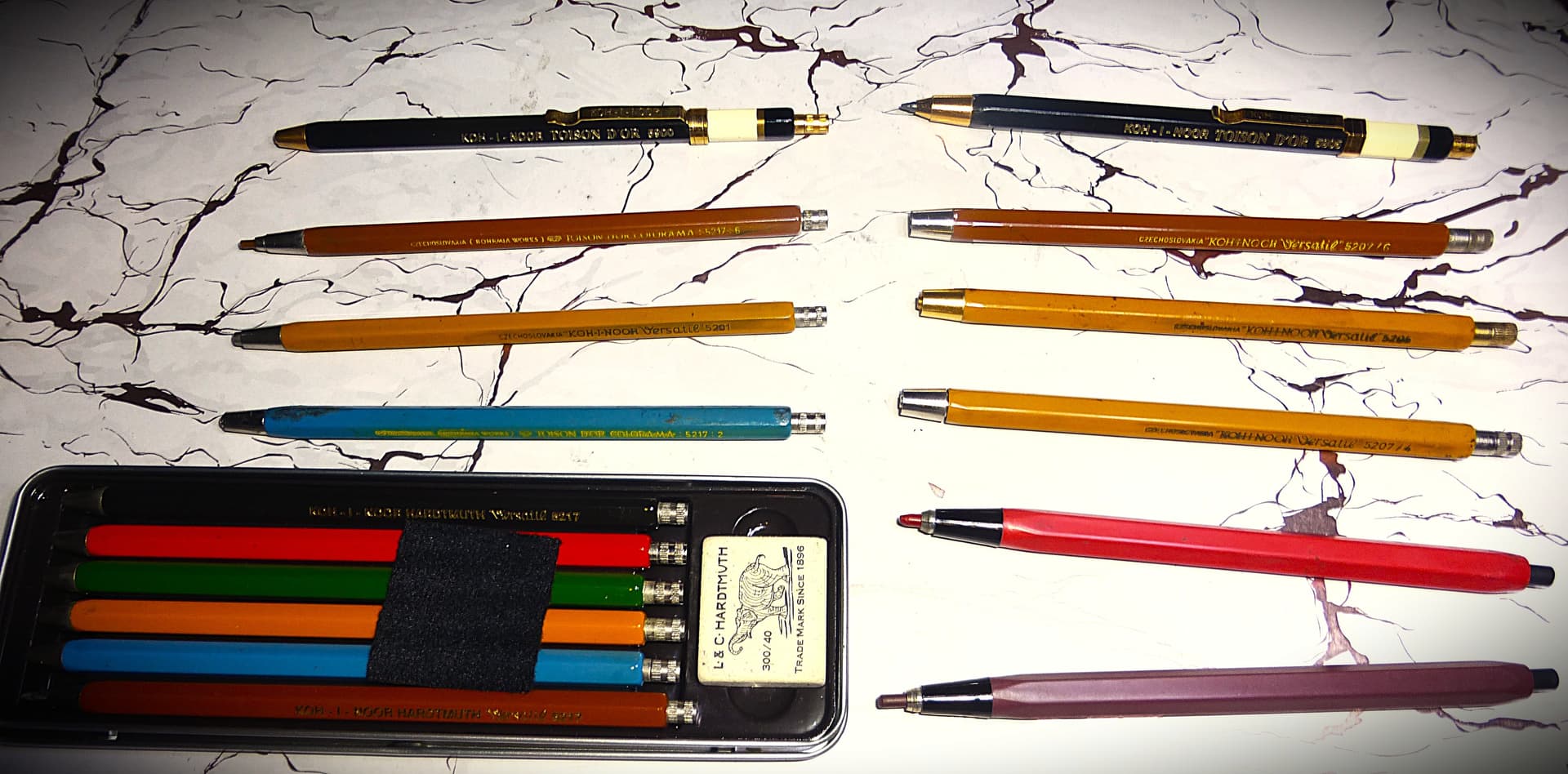
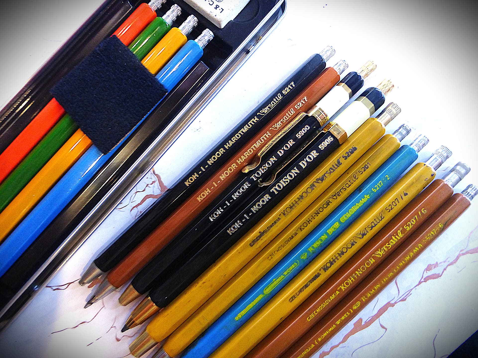
Yes, the inner mechanism is very similar to that of A. W. Faber-Castell leadholders. A nice feature of this pencil is that, although it can physically take 3.15mm leads, it can more easily alternate between 2.0mm and 2.5mm, the popular thicknesses at the time. Koh-I-Noor and some Russian leadholders were famous for supplying these 2.5mm leadholders.
Koh-I-Noor Company in particular (and with its “Bohemia Works” line) was famous for the coding for both 2.5mm and 2.0mm. For example, all 5207 leadholder pencils take 2.5mm leads while all 5217 leadholder pencils take leads with a thickness between 1.8mm and 2.00mm.
The 5207 and 5217 series were both produced in six different colors (this color coding system was abandoned later on but the model numbers remained the same):
Red (with color code “1”)
Blue (with color code “2”)
Green (with color code “3”)
Havana (with color code “4”)
Black (with color code “5”)
Brown (with color code “6”)
Other lines included the Versatil #5201 (2.0mm) and the Versatil #5205 (2.5mm), both available in the Havana color, with the possibility of a black color as well.
My favorite is the TOISON D’ OR black painted barrels with the golden top: #5205 for 2.5mm and #5200 for 2.0mm.
An interesting observation is that when Koh-i-Noor used the Versatil line, the number dedicated to the color coding was preceded by a slash (/), but when used the TOISON D’ OR COLORAMA line, these numbers were preceded by a colon (:).
I still regret selling some of these treasures long ago. Here are the WorthPoint links for those I sold
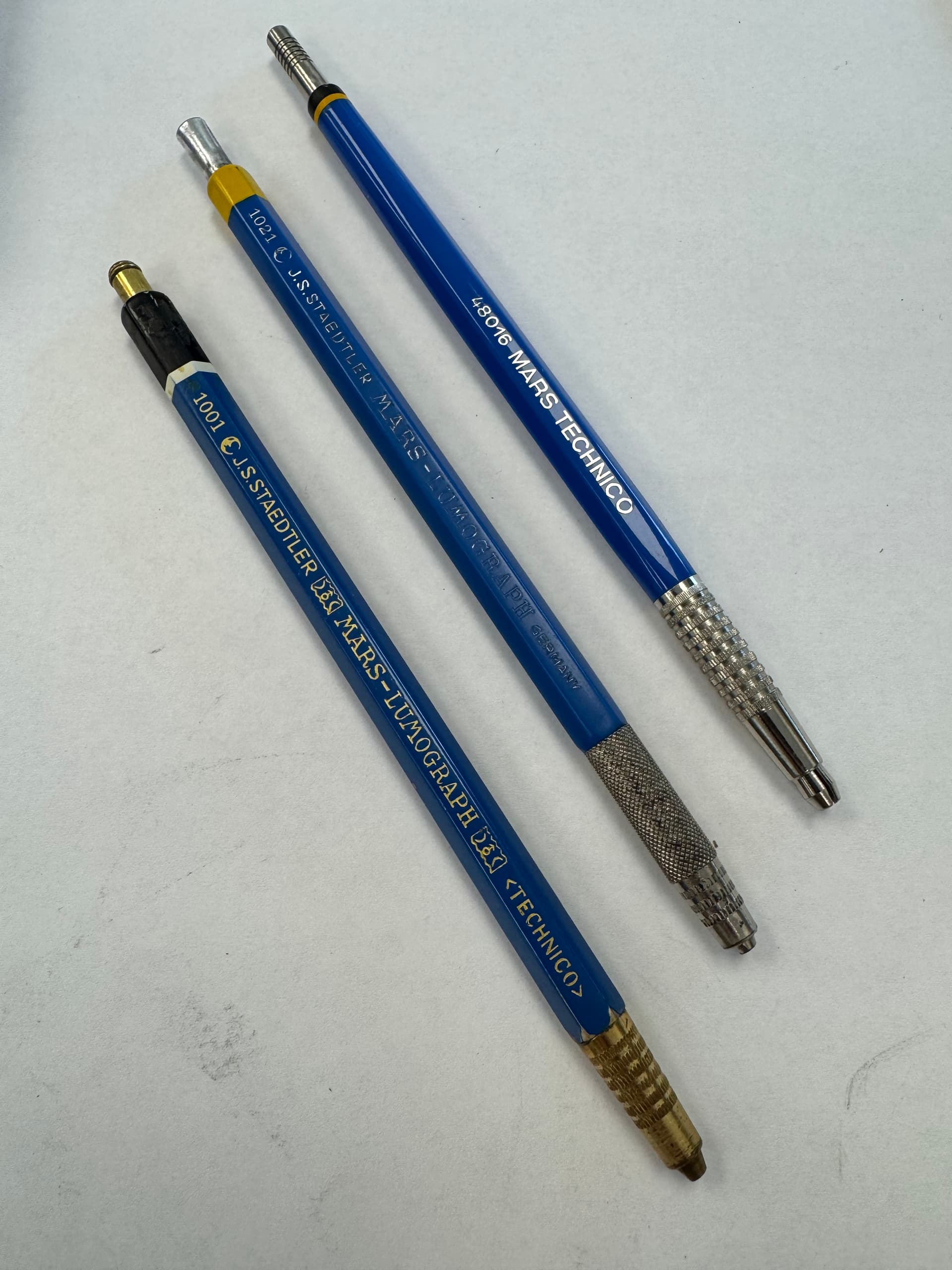
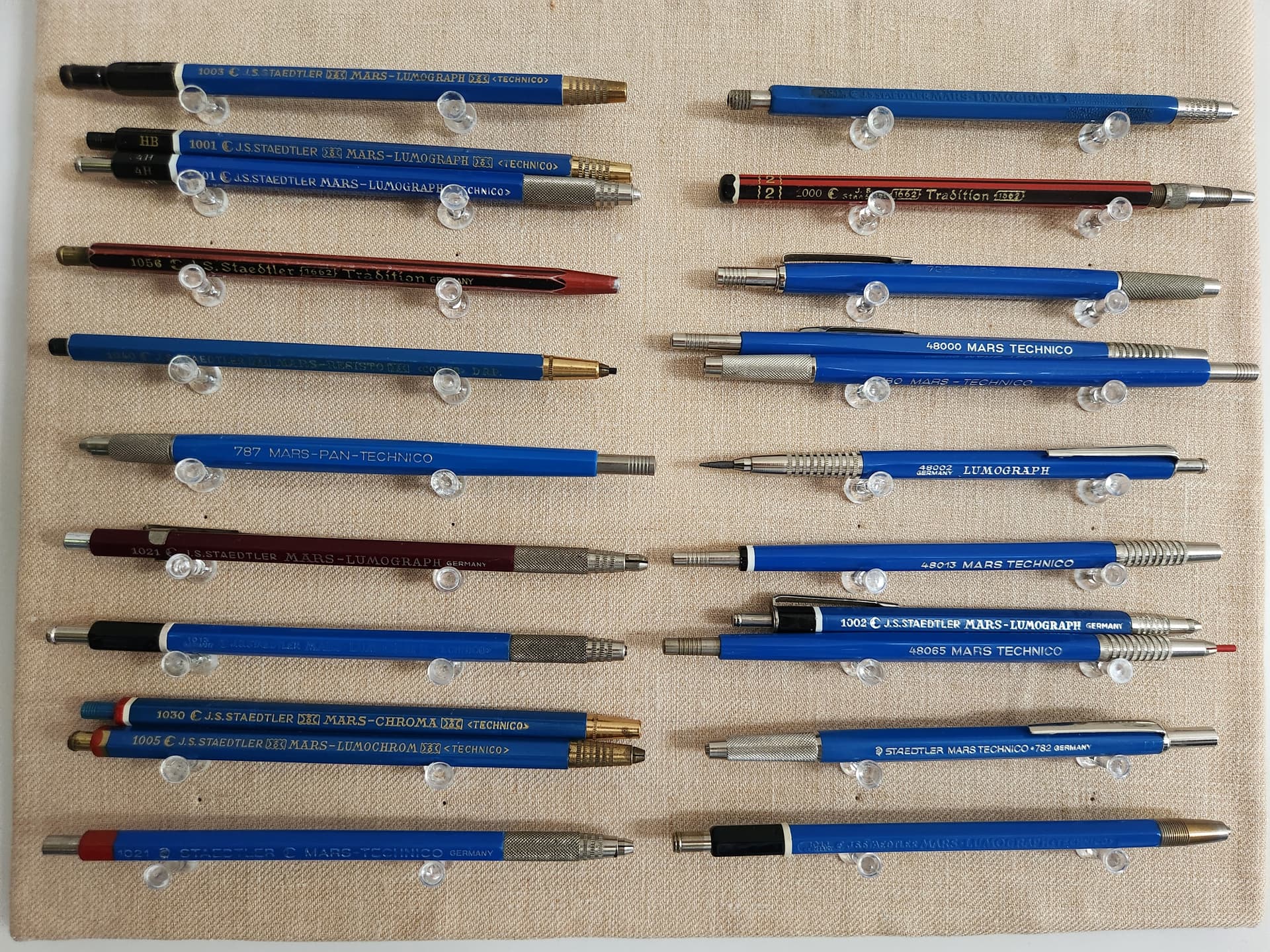
I think (but might be mistaken) that Staedtler in particular has messed up their coding system many times. So you can find two different leadholders with the same number (especially thier 700’s series such as “780”). The idea (probably) was not the number as much as the wording and coding that were attached to these numbers. Each word represented a particular production line with spesific attributes, that are not highly deffrentiable. I think these were all marketing techniques to advertise for “NEW” production lines with miminal enhancements, if any!
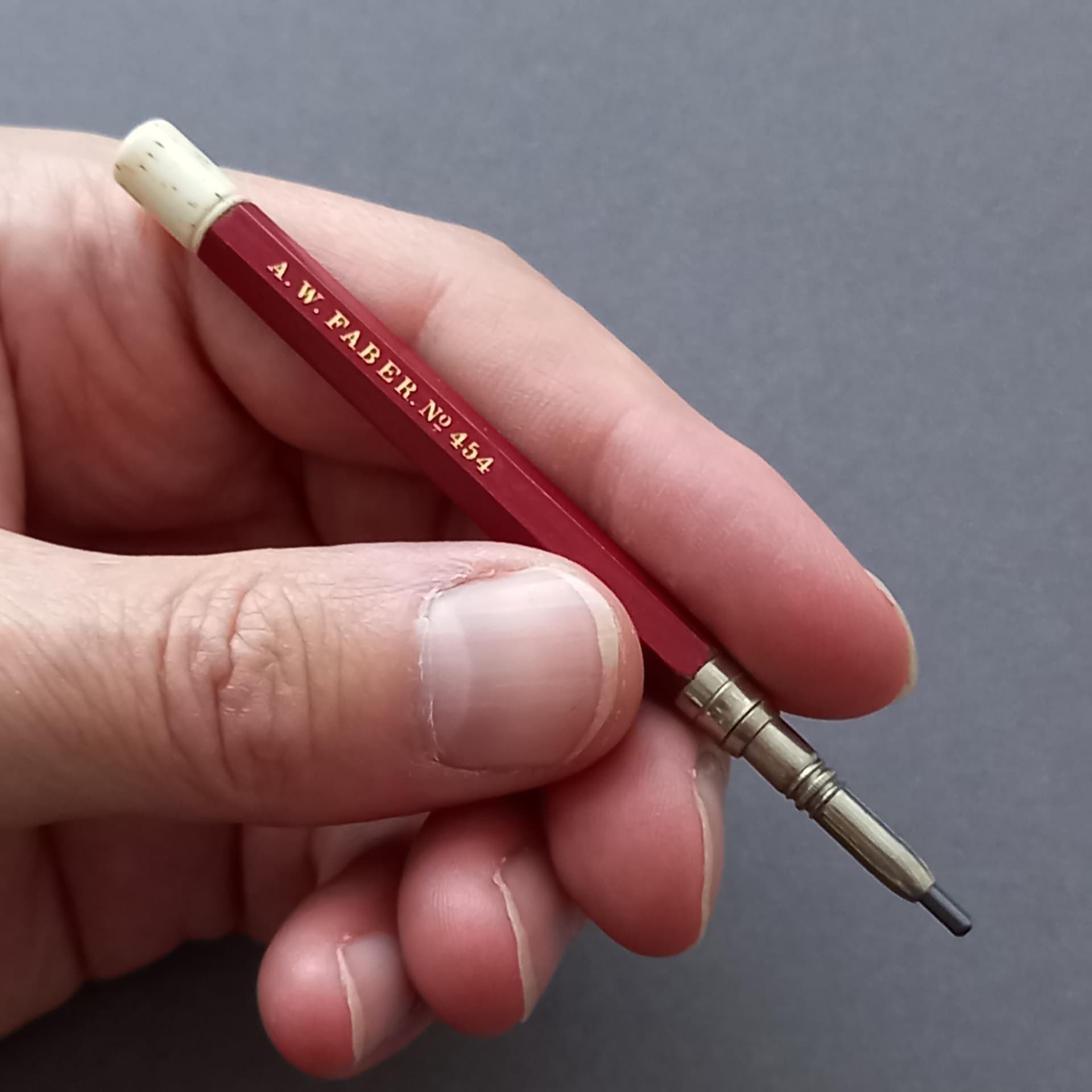
Sorry to tell you, but these yellow and black fonts are not the original colors. The original color of these was a “gold” imprint. I just filled in the fading imprint using grease markers to make it readable in the photograph.
JS, FC and to some extent KIN all went off the rails with names and numbers at some time(s). FC “Locktitte” had more iterations of buttons (metal, plastic, colored, all green, grooved, smooth, etc), nose detail, wording order, series (color, degree, you name it) than, as they used to say: “Carter had little liver pills” (look it up). Evidently took their sales directives from American auto makers…new models every year/month /week…In any case, a few of the JS world:
I like the read “Carter’s Little Liver Pills.” Thank you for the enlightenment.
Yes, all these dominant manufacturers seemed to adopt these silly marketing techniques. All big names in business started the right way, respecting their customers’ sense of logic, but they eventually became greedy and focused on mass selling over everything else. Even Amazon, which initially excelled in customer service, is now facing more troubles than ever with its overseas customer service units, which have no power to resolve a significant issue. I had to go to BBB when a seller on Amazon sold me a customized laptop with defective parts and voided warranty, but Amazon has its own BBB unit that sided with them!
Jon Veley wrote about this leadholder before. I think it was patented by Johann Lothar Faber in 1861. I think you also shared the same year patent info on reddit.