rOtring Core model line writeup

While I did write about the rOtring Core before, I thought it might be worth making a post here in the Pen Discussion subsection… since the Core line has a pen to pencil ratio of 4:1. So, here goes.


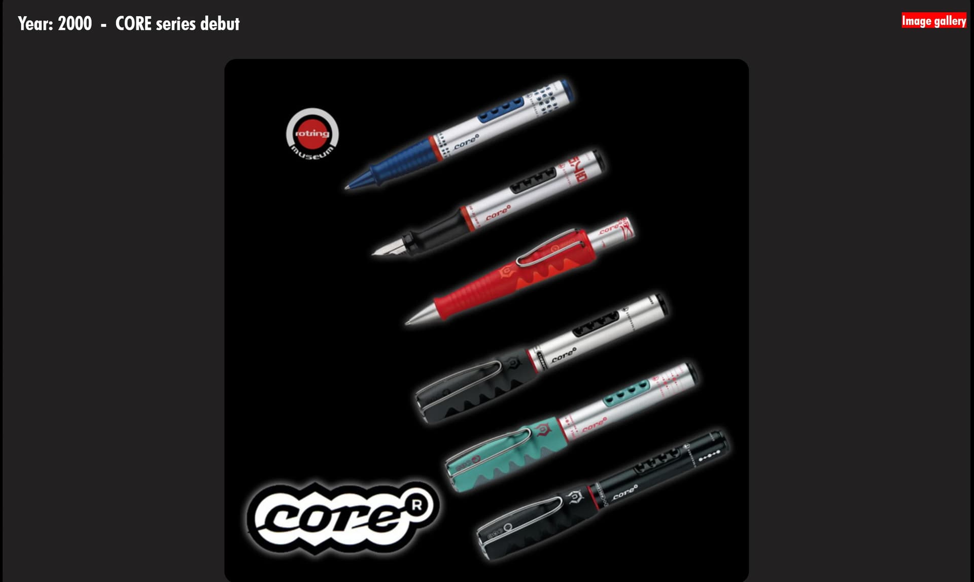
According to the rOtring museum subreddit expert, the core line by rOtring, Sanford patented core in 2000, with an application date of August 22nd 2000. The grant date was November 22nd 2000, then got a publication date at that time. Production was first facilitated in 2001.

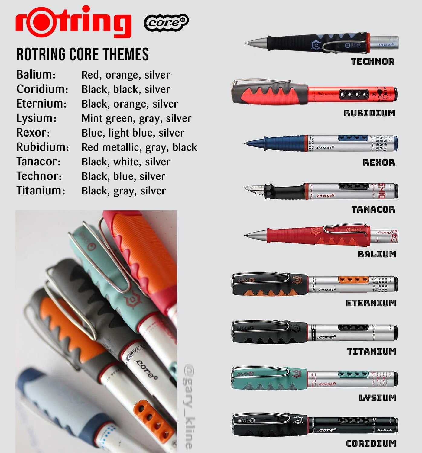
This was a little less than 2 years after the Sanford acquisition of rOtring. The core line had a total of 9 colorways produced. I do not know precisely when this line was discontinued, but it seems likely that 2007 was the last year of production. While electronic catalog copies available online don’t show core pens past 2005, the website had showed them to 2007.

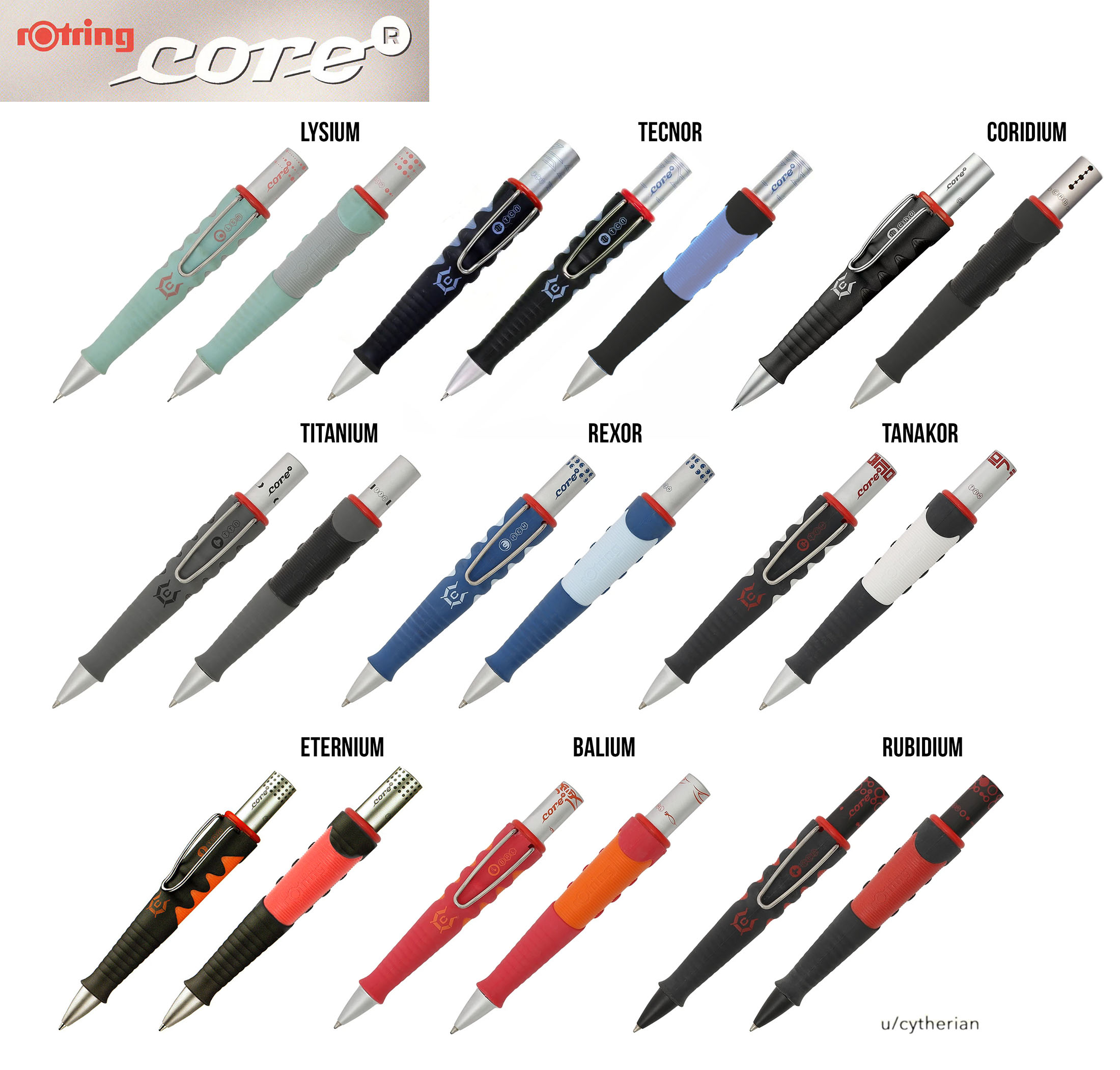
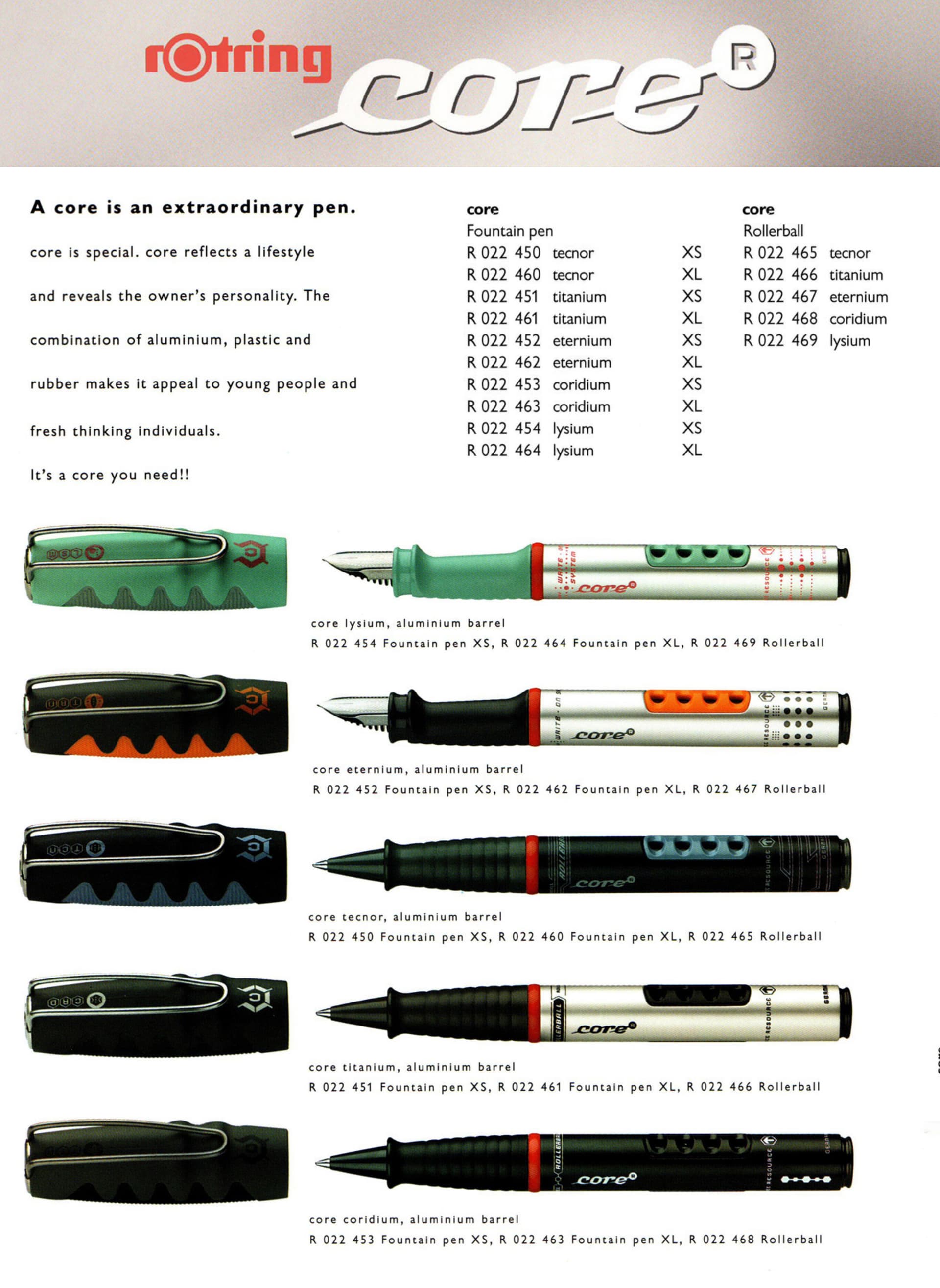
In 2000~2001, rOtring released these 5 core colorways:
Lysium, Eternium, Tecnor, Titanium, and Coridium in only fountain pens and rollerballs.

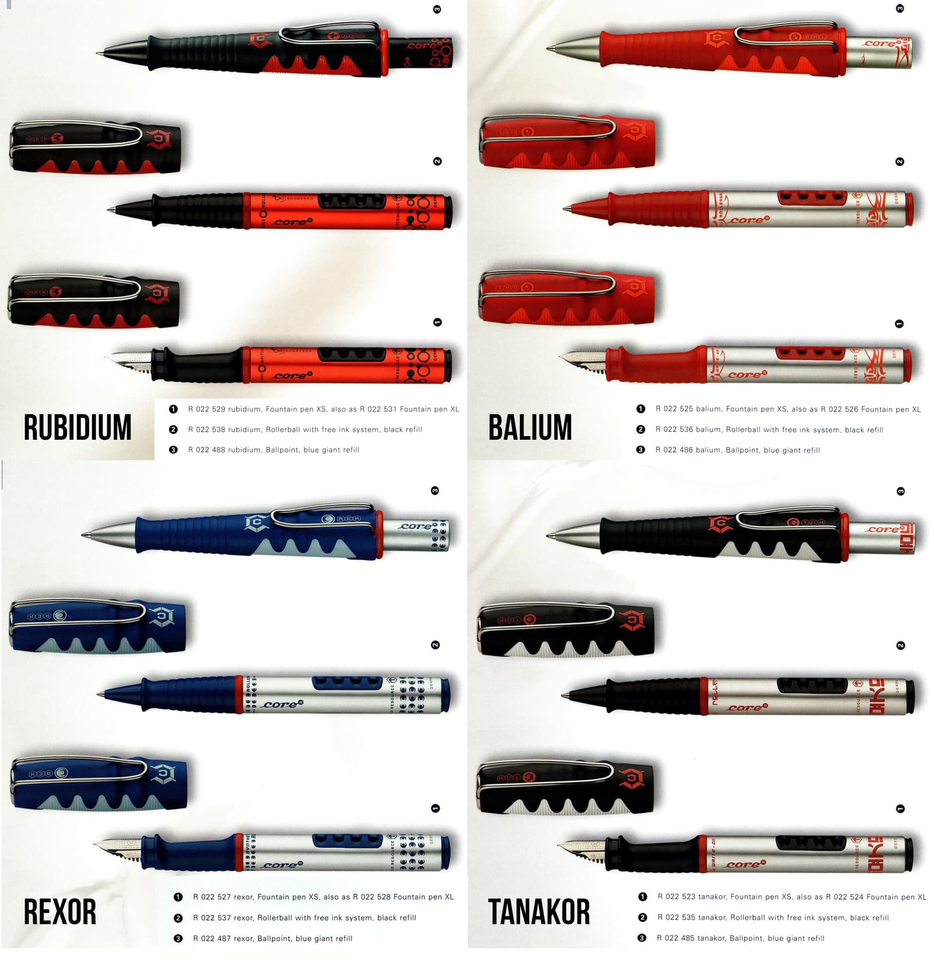
In 2002, rOtring added 3 more core colorways:
Balium, Tanakor, and Rexor. Plus, there were now click-style ballpoints and mechanical pencils available.

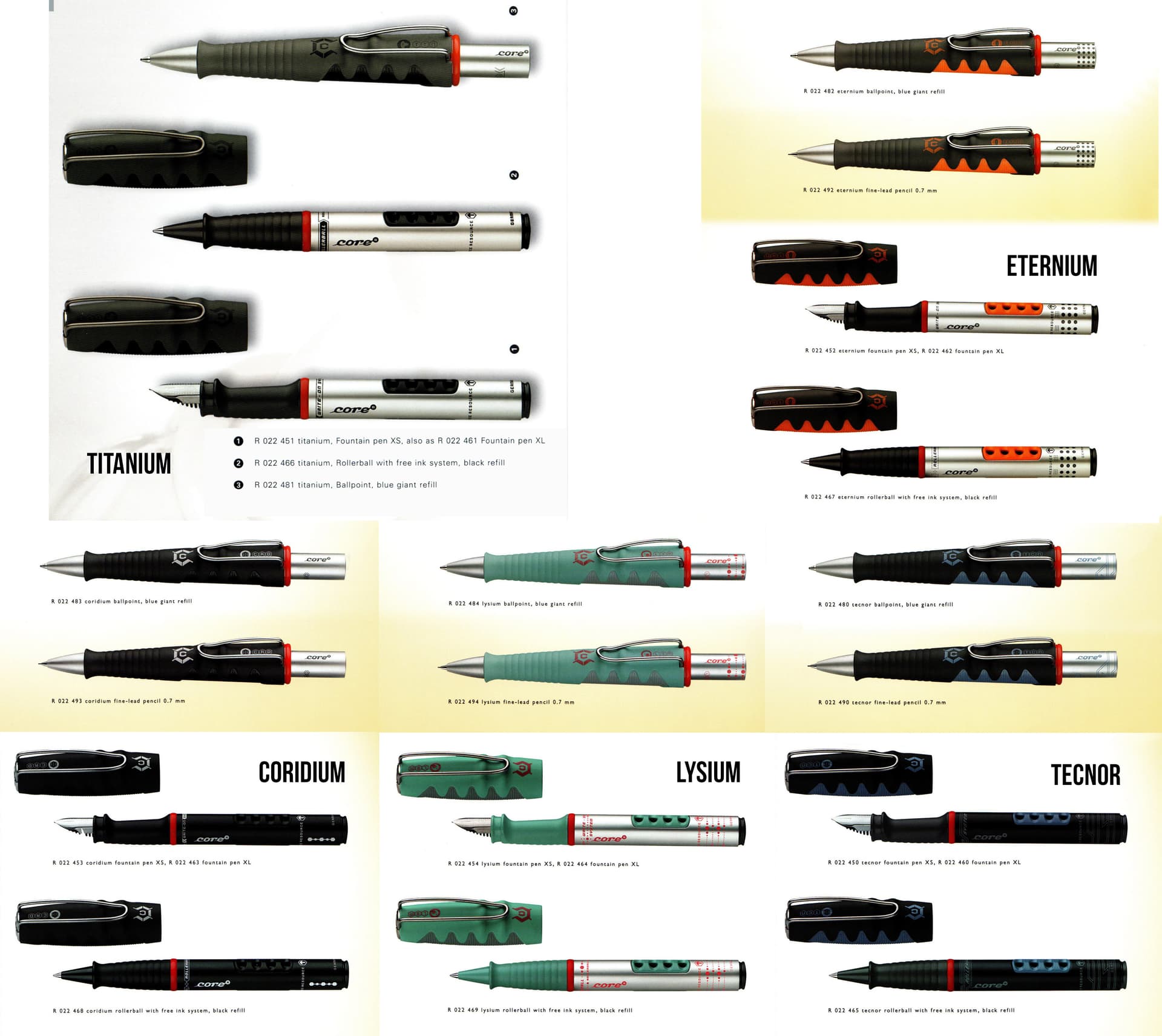
From the 2005 catalog:

Combined images from 2001 to 2005 catalogs:

In 2004, rOtring added 1 more core colorway, but dropped 4 others:
Rubidium added, but Coridum, Eternium, Tecnor, and Lysium dropped. Also, no mechanical pencils.


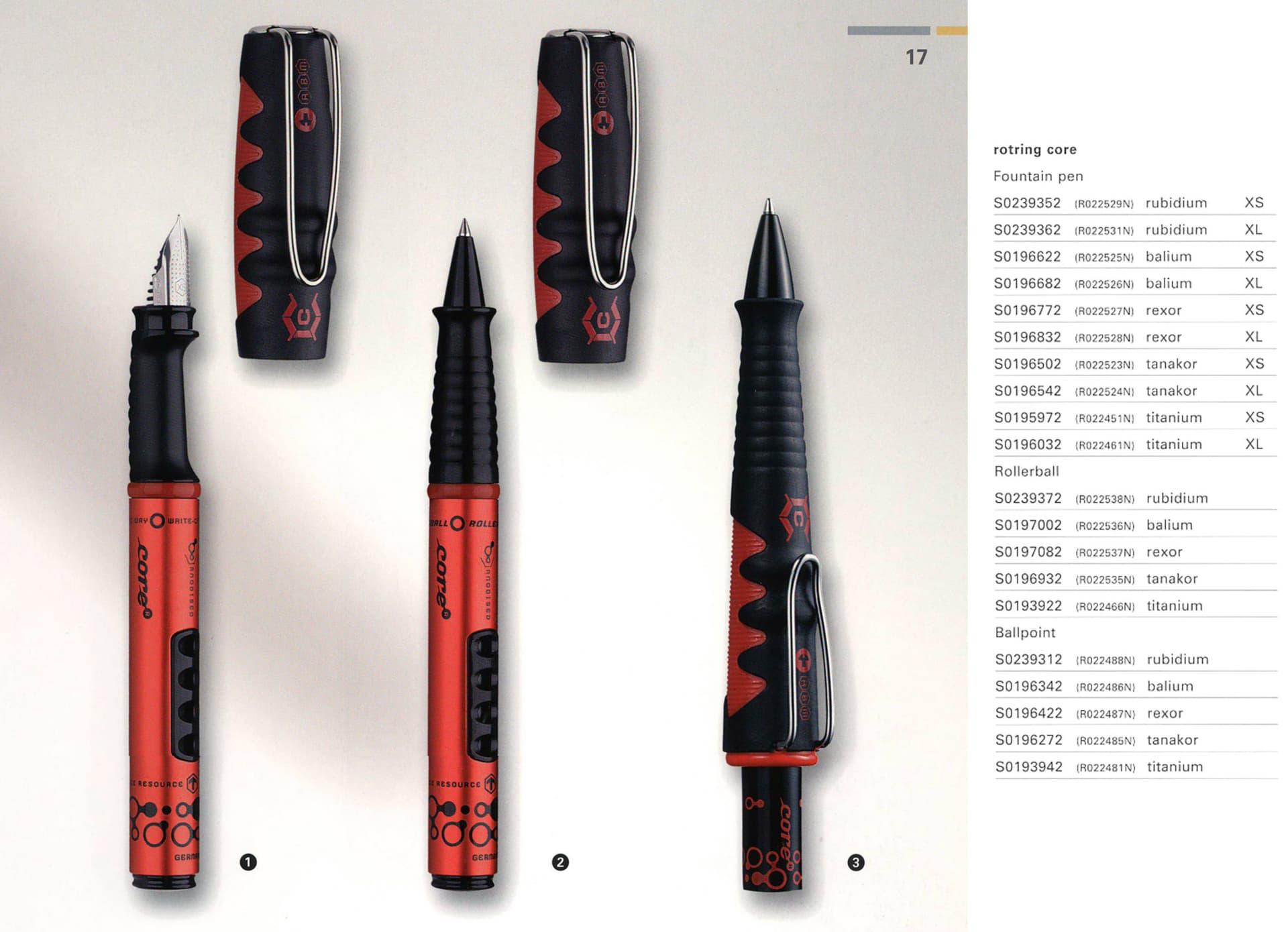
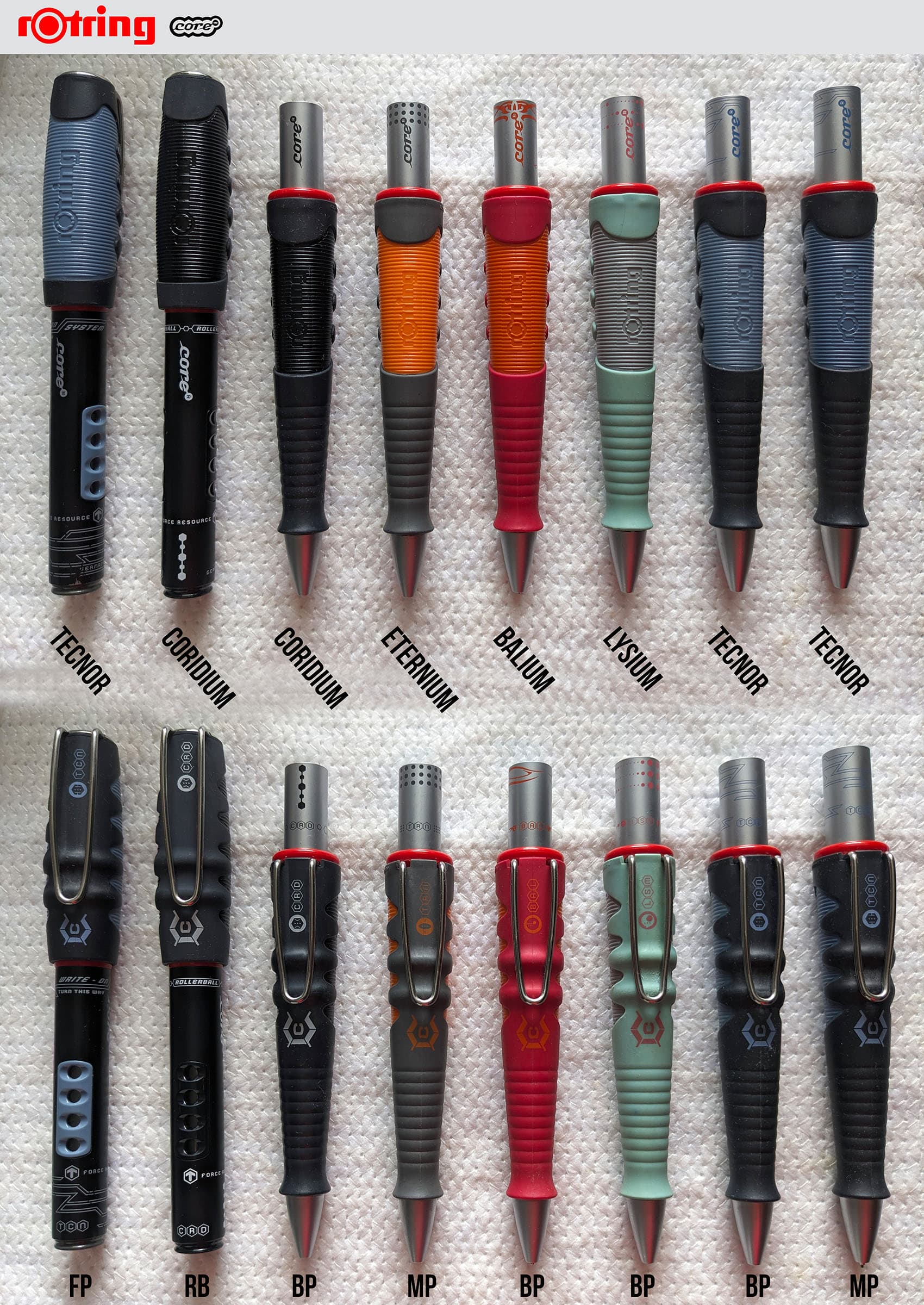
Here’s the full lineup of all the core models with a variety of writing instrument types:

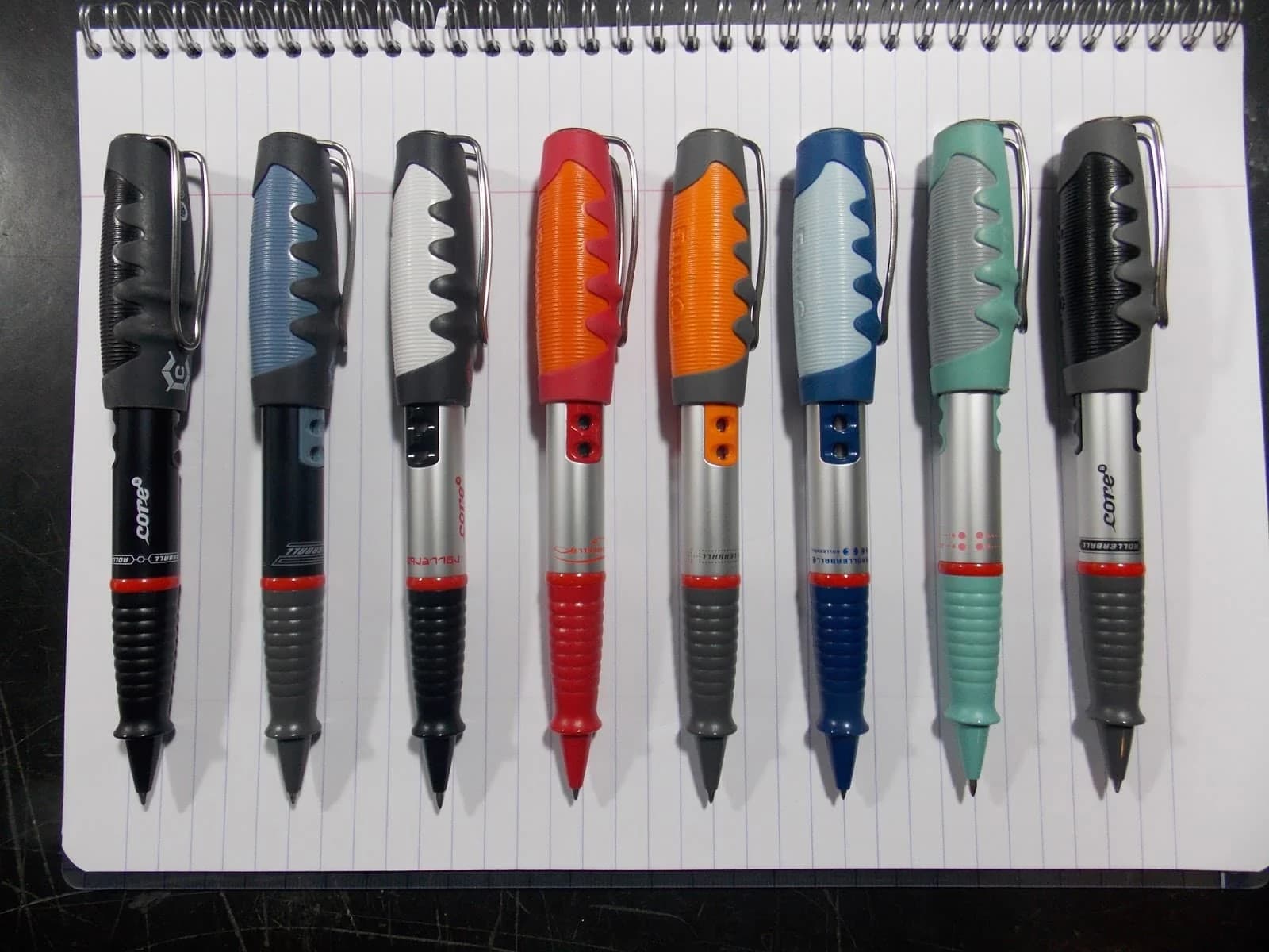
I did manage to grab a collector’s image that shows all of the rollerball colorways, except for Rubidium:

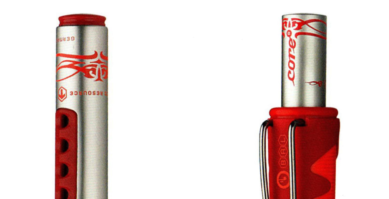
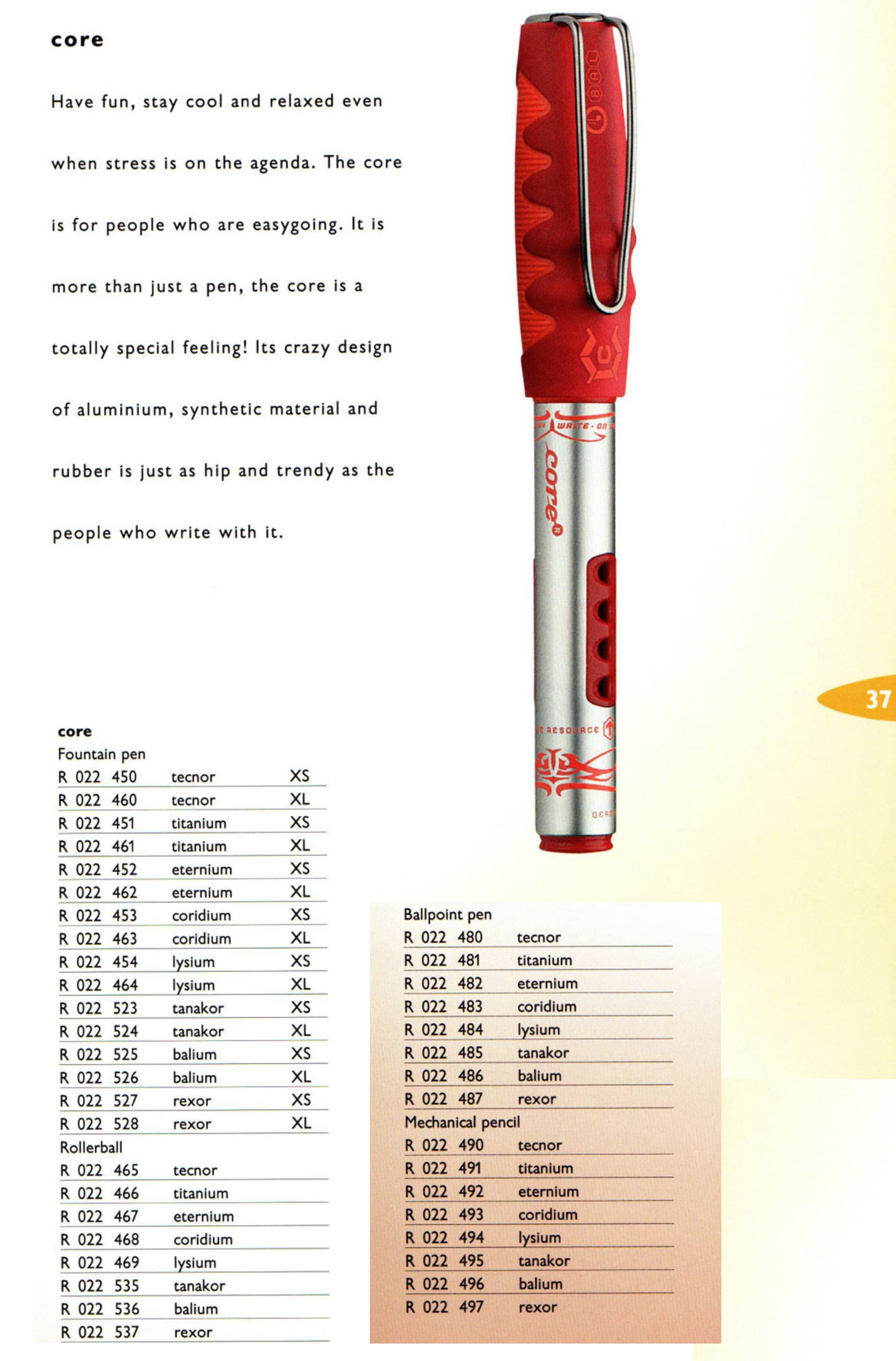
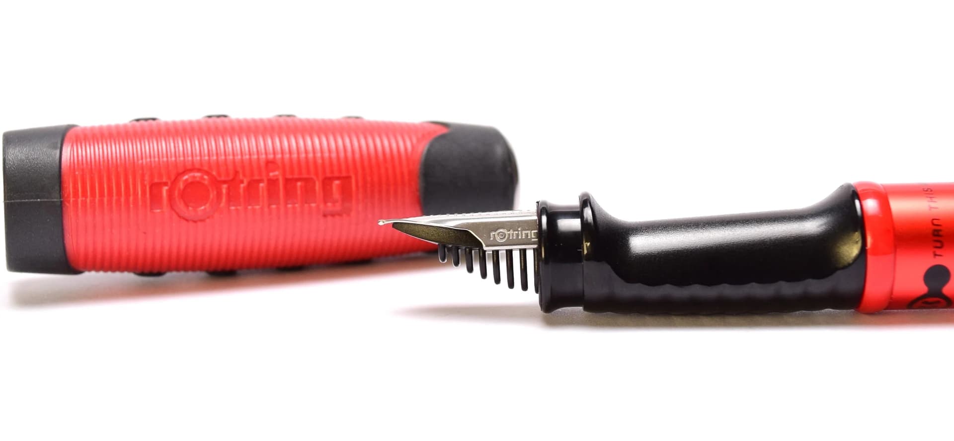
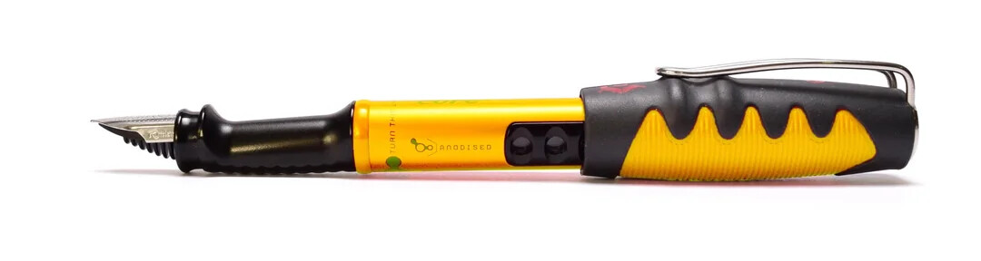
The core fountain pen is a rather unusual design, not just for the rather daring and bold body furniture. The grip is offset… lower into the body, such that your index finger rests closer in line with the tip of the nib. It’s actually a bit of an ingenious concept. It’s almost as if the nib is a direct extension of your finger tip.

Across the period of the core, rOtring had produced a prolific amount of inventory that didn’t sell as well as expected, so years later caches of them would get offloaded to various buyers who’d then in turn sell them at a nice discount online. I picked up the matching Tecnor ballpoint and mechanical pencil around that time (like $6~$9 a piece). I was aware of a few other colorways, but hadn’t really explored the Core line. Frankly, they’re not exceptional writing instruments–more of a curiosity for their “weird” or “unconventional” designs.

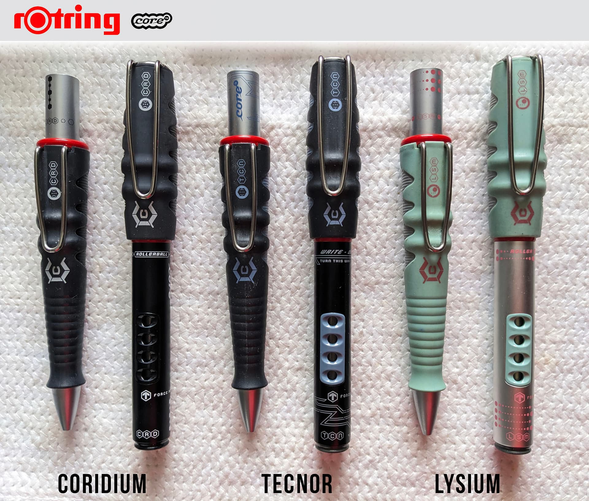
Here are a few from my personal collection:


Well, kind of bizarre to think that it has been a quarter of a century since the core came out! Time flies. So, that does make them a novelty collectible now. I hadn’t set out to collect this line… it just sort of happened by random chance. And I don’t have everything, clearly. I don’t know if I’ll ever end up getting every single colorway, as the “clutter effect” bothers me. I’m not enamored by all of the colorways anyway. Tanacor, Titanium and Rexor are kind of boring to me (very similar to each other), and Rubidium is a rather strange one–the only bright colored metallic body pen, but then the ballpoint doesn’t use that bright color for the body. It looks almost like they took the Eternium and then coated the rear plunger in black (instead of silver, which appears for all the rest).

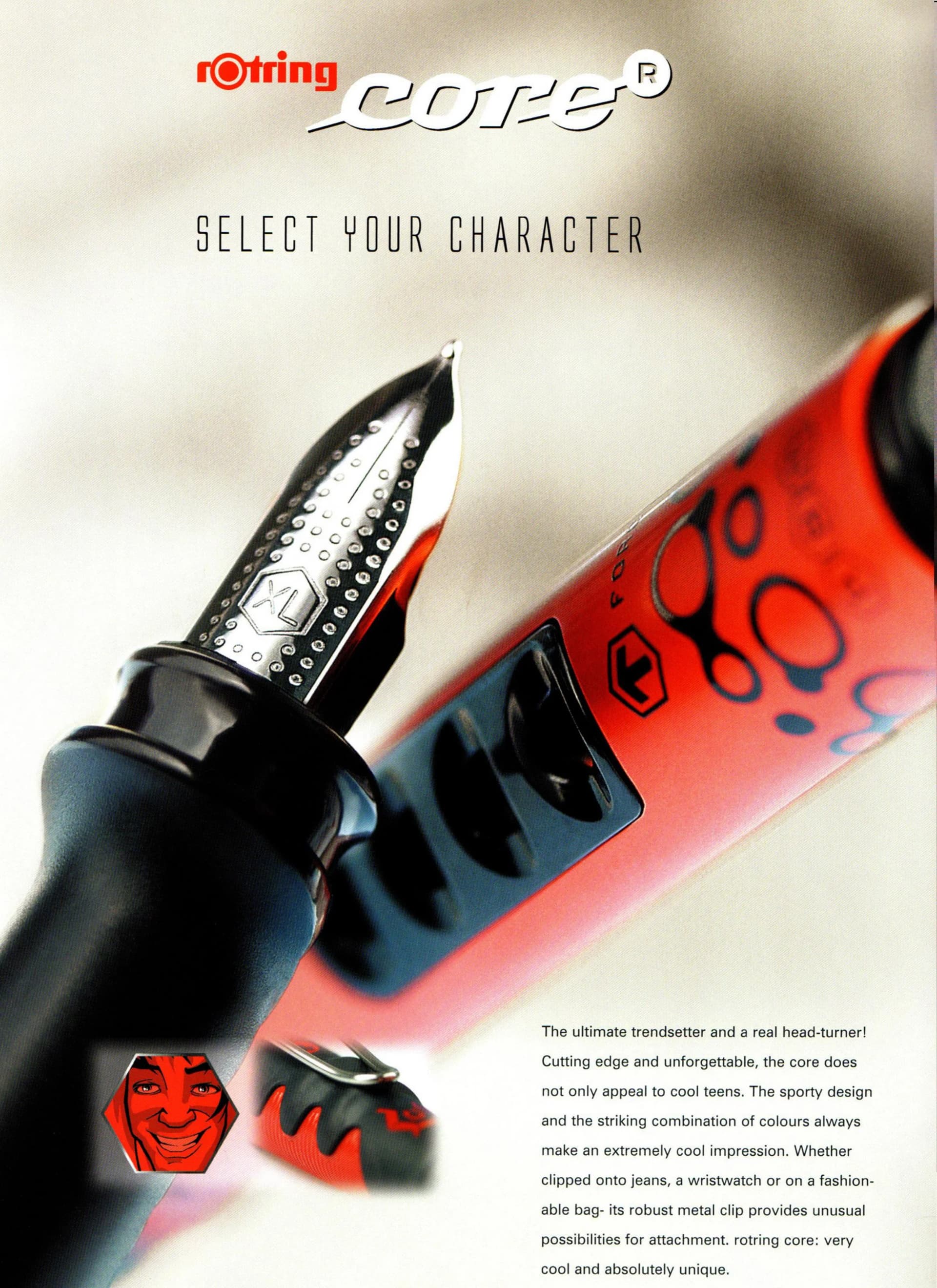
Anyway… onto the overall experience of this core series. I don’t think I’ve seen a more peculiar range of design decisions. Just look at that fountain pen with its offset grip. It actually is remarkably ergonomic as the nib tip ends up acting like a direct extension of your finger tip–as if you’re pointing with your finger the exact spot where the nib lays down the line. Sadly, the rest of the pen is almost comical, with it’s immensely oversized cap. rOtring designed it purposefully to be posted (there’s a detent)… but when you do that the pen is quite back-heavy. It does take some getting used to.

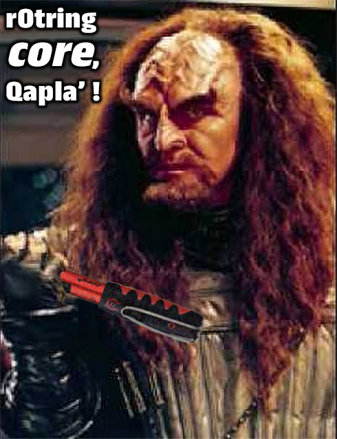
The pencil is a clutch forward design. No pipe. The mechanism works fine, though there is a bit of rattle, and lead advancement is very generous, having owned 2 examples to compare. The body shape is so steeply tapered, with a flared grip. It’s strange. But I must say, also fun. And then there’s that huge sturdy clip. The contour of the body is filled with ridges and bumps. It makes me think of something a Klingon would write with (“K’plah!”). And yes, I’d say that it’s not a long writing session pencil. The butt of the joke is the eraser. You have this ENORMOUS girth at the back of the pencil, and inside the shaft is actually a fairly modestly sized eraser. It’s workable except that the plastic frame is a design failure. There’s a set of plastic prongs that tighten around the eraser at the extension you want, but it just doesn’t hold. Maybe since the eraser ossified over time, it shrank? It almost looks like there could be a fastener ring for the holding prong.

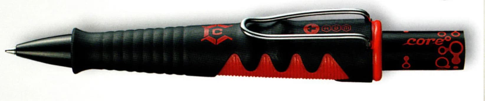
The ballpoint is OK. Probably the most usable of the bunch, all things considered. The rollerball is a bit oddly balanced with the cap posted… but you could use it without posting. And that really big cap doesn’t make it pocket friendly. Still, it’s a definite conversation piece. “My pen comes with ridges. Just like a Klingon!”

One last thing – the lead size isn’t noted anywhere on the body. They only came in 0.7 mm. And it was probably a cost saving measure, as the BP and MP use the exact same body, cap, and nose cone.

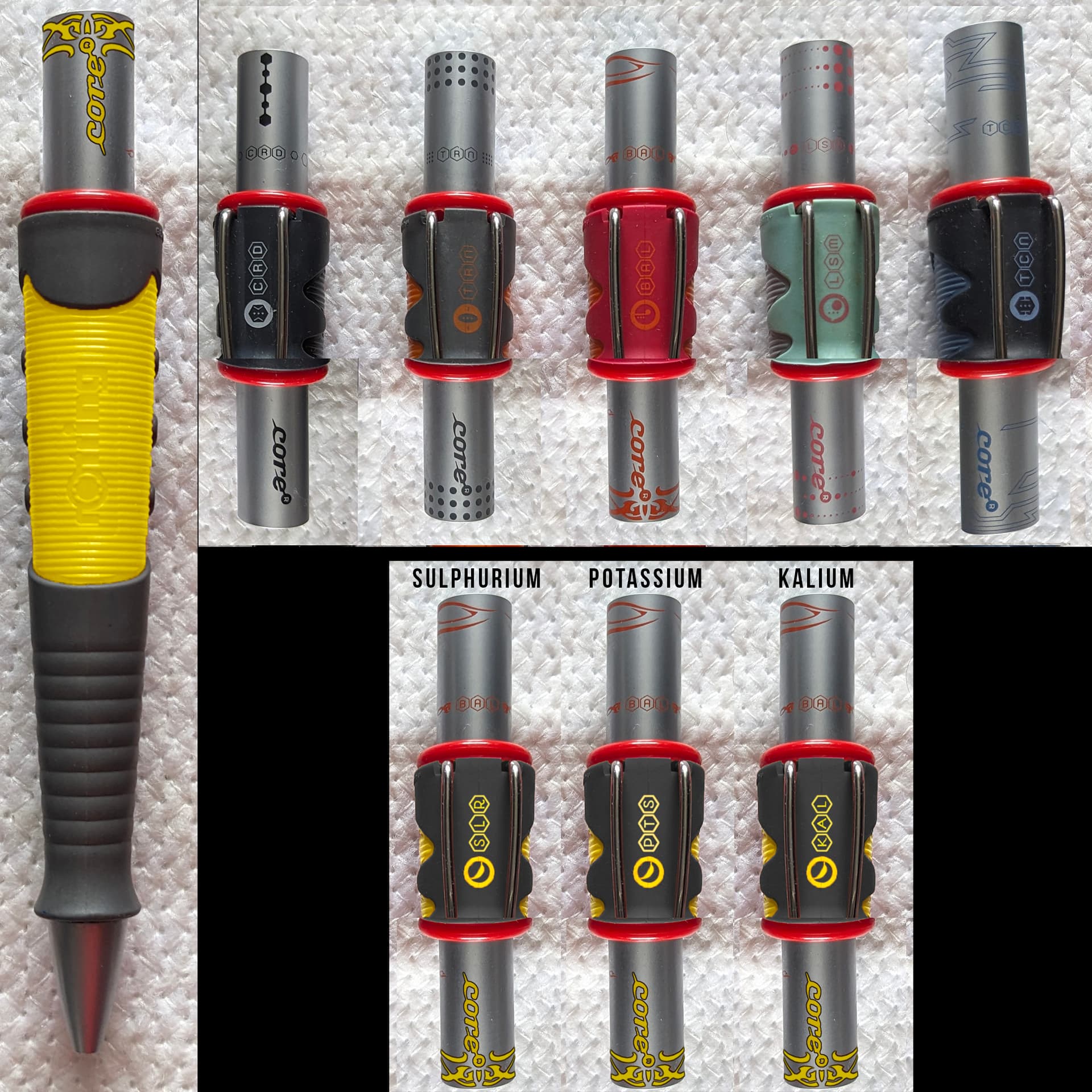
rOtring went to town on themes. I think there were 9 of them altogether. Most of the names were based on an “ism” suffix. Balium, Lysium, Coridium, Rubidium, Eternium, Titanium… then Tecnor, Tanakor… and Rexor. As part of the design theme, rOtring reduced those names to 3 letter codes that appear on the pen bodies. So Tecnor is TCN, Balium is BAL, Lysium is LSM, Coridium is CRD, Tanakor is TNK, Titanium is TTN, Rexor is REX, Rubidium is RBD, and oddly Eternium is TRN (I’d have thought ETN). Those initials appear on the cap and on the body, and on the plunger. Each model has it’s own unique symbol and line graphics as well.

You would think that this really wacky and quirky writing instrument line would have at least one or more devotees who collected the whole lot… but I’ve yet to stumble across a gallery showing off such a collection. I have to believe someone out there has all of them and may one day post about them online.

You know, seems they were totally neglectful of the color yellow. And I have just the name: Potassium! You know, because… bananas. :banana: But Sulphurium also works. Also, Kalium… the Indonesian word for Potassium. There’s also Κάλιο, in Greek.

Last but not least… the aspect of collectability. Well, prices are all over the place. Because of the age, there are sellers trying to command relatively high prices compared to how steeply discounted you can periodically find them. When a seller manages to acquire a huge batch of core writing instruments rather cheaply (I’d once gotten inside info from a seller, who’d bought a large box of them from a store closeout, amounting to about $1 per pen). The cheapest I’d ever gotten one was $6 USD. There are stretches when sites like eBay and Etsy have light inventory and sellers will try to get $20~$50, depending upon the colorway. Historically I’ve found that periodically sellers show up with large inventory and bring those prices down below $20, sometimes as low as $10 a piece if you buy several at once.

In closing, I would emphasize that the writing experience will be fine with some people, and off-putting for others. Today, the rOtring core is just a strange and amusing writing instrument line that’s fun to have at least one as a conversation piece. And if you enjoy the colorways, collect as many as you can!

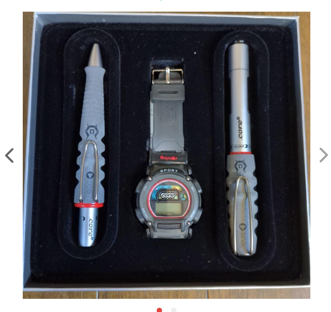
The core writing instruments are commonly sold in thin cardboard boxes with a hexagon grid design (white on gray). But occasionally you can find the more elaborate display packaging.


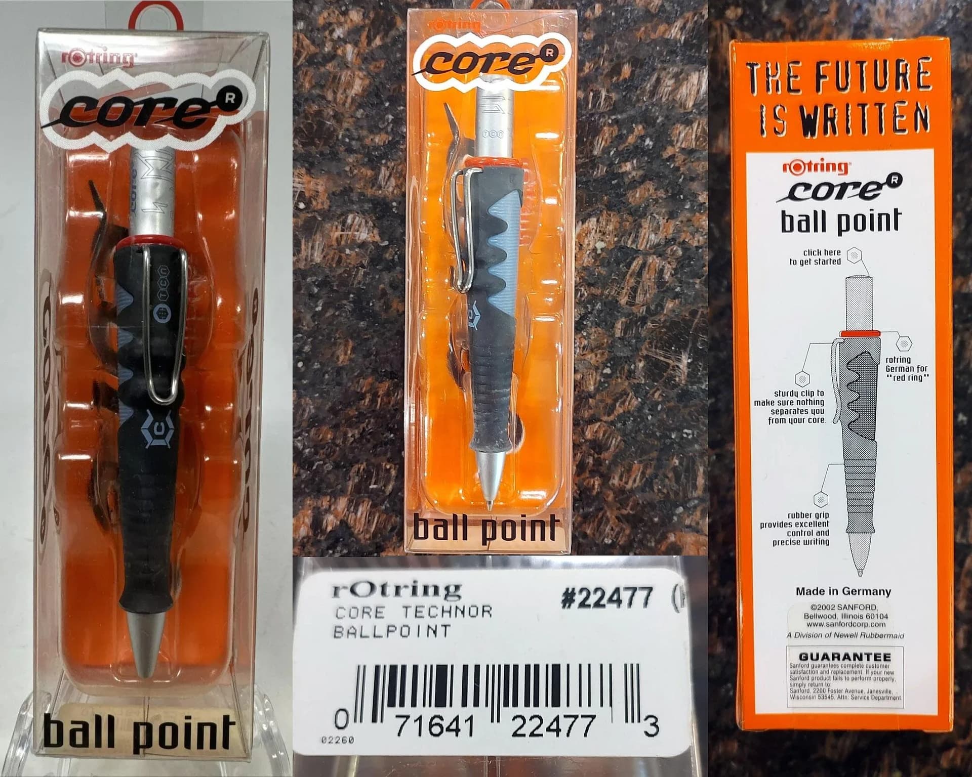
Btw, notice the label showing “Technor.” This was a typo that proliferated quite a bit, so occasionally you will see that colorway listed as “Technor” instead of “Tecnor.”

Also, here’s some rather amusing marketing text taken from the catalog pages:

2001:
A core is an extraordinary pen.
core is special. core reflects a lifestyle
and reveals the owner’s personality. The
combination of aluminum, plastic, and
rubber makes it appeal to young people and
fresh thinking individuals.
It’s a core you need!!

2002:
Have fun, stay cool and relaxed even
when stress is on the agenda. The core
is for people who are easygoing. It is
more than just a pen, the core is a
totally special feeling! Its crazy design
of aluminum, synthetic material and
rubber is just as hip and trendy as the
people who write with it.

2004:
The ultimate trendsetter and a real head-turner!
Cutting edge and unforgettable, the core does
not only appeal to cool teens. The sporty design
and the striking combination of colours always
make an extremely cool impression. Whether
clipped onto jeans, a wristwatch or on a fashion-
able bag- its robust metal clip provides unusual
possibilities for attachment. rotring core: very
cool and absolutely unique.

Member @Dux also sent me these one-liner bits on the names:

Eternium. Built for eternity; bright orange and grey illuminate the path for sporting freaks.
Tecnor. Ultra hard beats in blue and black thump you to an alternative universe.
Lysium. Hey girls, listen up! Turquoise and pink are the new colours of love.
Titanium. Metallic stars in grey and black show real strength.
Corridium. The ultimate in mega cool black – you have come to the point of no return.

I thought it might be interesting to get all of the colorways represented together, using the click-style ballpoint/mechanical pencil bodies.

14 Likes

Wow. What a great write up. Reading “a quarter of a century” kinda hit me like a brick for some reason.

I kinda want one now. In yellow.

2 Likes

Thanks! I’d been mulling a writeup like this for a while… but had other priorities. When a shipment arrived with a couple of Cores, I felt inspired.

Yeah, I don’t know what it is, but when I see early 2000’s dates, they don’t feel that old to me. And then, well, a quick moment of doing the math and then yah, it’s… a lot of time, relative to the average human lifespan. Would be nice if we could live to 200 as long as we take care of ourselves (no substance abuse, eating well, sleeping enough, manageable stress, etc.).

Then I think of the highly intelligent octopus and cuttlefish who don’t get to live for but a handful of years, if that (on one rare occasion, an octopus lived for nearly 8 years). The tough part is, having had adults tell us when we’re very young “make the most of your time, because it goes fast!” and yet it doesn’t hit home because time feels so endless in youth…

4 Likes

Yeah, isn’t that mockup kind of cool? Something about that shade of yellow next to dark gray. Looks so sharp. Some sports cars have been made with that motif.

2 Likes

A very cool post! I must confess I am a big fan of this series. As a matter of fact when I first started collecting mps as a kid, I remember saving up my pocket money to buy the blue and red versions which were available in one of the local stores. My experience with using these is quite positive, the weight balance was good for sketching and drawing. The grip was friendly too. I did not store them properly and they still held up fairly well. I am surprised that the second had price has remained relatively low compared to other Rotring models.

And an interesting analogy with the Klingons…just recently saw the movie ‘The undiscovered country’ and it is still fresh in my mind therefore easy to relate.

3 Likes

Yeah, I definitely think the Core was designed with youth culture in mind… but not exclusively. It does have some rather “technological” looking design aspects. The pencil only came in 0.7 mm, which I forgot to mention in the write-up. As a cost saving measure, they didn’t bother printing it on the body. I think the ballpoint and pencil use the exact same body. A pretty good lead size for this format… but it would’ve been nice if they’d made a 2mm lead holder too.

2 Likes

Great post! I bought one of the orange Eternium pencils when they were new - it got a lot of attention in the otherwise boring meetings I was in. I have to admire Rotring and Sanford for going all-in on this design approach. The Klingon analogy is spot on - it does seem like it’s from another planet.

2 Likes

Great post Gary! I’ve almost bought some a few times.
BTW saw this today. They made a watch for it.

メルカリ

7 Likes

Thanks, Patrick!

That watch looks remarkably like an old vintage Casio LCD watch. rOtring should’ve done a collaboration with them. They’ve done numerous collabs with many other companies, including clothing designers.

1 Like

I’m here to join in with the admiration of the yellow version and its banana-themed moniker. It did occur to me that the old Latin name for potassium - Kalium (hence the symbol K) - would also fit well with the Core nomenclature, except that they already had Balium and it all starts to sound a bit too much like the dwarves from the Hobbit.

Until now, nothing has come remotely close to persuading me that it might be a good idea to buy anything from the Core range, but having enjoyed this post I might just be tempted if one of the carroty orange pencils appeared at the right price.

Incidentally, I’m new here; hi!

7 Likes

Welcome Alan! We’ve been waiting for you. Kidding :slight_smile:

Super nice to have you here.

2 Likes

Welcome Alan! Nice to get your take on the Yellow Core name proposal. I like that–Kalium. Definitely agree, that it its in very well with the rOtring Core naming.

Temecula Pens on eBay has some very good prices going. Add a listing to your watch list and he usually drops a discount for you. He sends them in a small bubble-wrap mailer, which doesn’t provide much protection against the bending of the original box, but it’s a minor consideration since shipping is free. Back about 9 years ago, I was expecting that the Core line would become rare a few years down the line, but they’re still floating around on the marketplaces, pretty much non-stop. It’s just that when the number of sellers thins out, prices go up. And some of those perennial Core sellers have left their prices high. I don’t know if rOtring had sluggish sales on the Core, or if they simply just made too much inventory. I recently bought a 2-set for $23, which included spare refills, so probably worked out to $11 per pen. That’s pretty cheap considering how vintage these are plus the build quality is pretty strong (particularly body integrity and clip sturdiness).

The “carroty orange” one, which is orange/red, is called BALIUM but the name isn’t printed anywhere. Only the 3 letter identifier ([B] [A] [L]) in very tiny writing.

3 Likes

Thanks Thomas, glad to be here. I have lurked around for long enough to know that it’s a really nice place you’ve built!

You know you’re dealing with a friendly, open-minded community when it’s possible to post about the rotring Core without fear of ostracisation (kidding!)

Thanks also cytherian, I will check them out. Now that you mention the Balium being known by its 3-letter “BAL” code, I wonder if it was inspired by the Baltimore Orioles (also BAL) who coincidentally have the most orange uniform in baseball?

7 Likes

rOtring being a Germany company originally, and having much more of an international stance than USA centric, probably unlikely that the Orioles initials had influence. But it’s an interesting coincidence. :thinking:

Dabbled a little…

:smirk::smile:

3 Likes

I’ve added more details. I’ve not seen a year 2000 catalog, so I don’t know if the Core was included… but it was definitely in the 2001 catalog. There were only 5 colorways and only fountain pens and rollerballs. In 2002, three more colorways were added, plus ballpoints and mechanical pencils were included for 8 colorways. The available catalog for 2003 is sparse for some reason. But 2004 shows the Core line again. This time Rubidium is added, but 4 others are dropped, and all Core mechanical pencils are discontinued. The 2005 catalog has all the same info. The 2006 catalog is extremely limited and the Core series appears to be gone… but I’ve since learned that 2007 was the last production year. And 2000 was only when licensing and design took place–2001 was the first year of retail release.

Btw… I had mistakenly noted one colorway as “Technor” because a printed label on one package had that, but the catalog reads as “Tecnor.” I’ve updated the images above to reflect the name change, as well as any text references.

4 Likes

Hey Alan. Welcome.
Nice to see you are here. :hugs:

Thanks Dux, good to see you too - the more places to discuss Rotring, the better!

I love the yellow Core mockups. Given the variety of the Core’s range, and the number of closet Core fans out there, I’m surprised there hasn’t been more of a Core fan art movement.

Although my earlier reference to Balin from the Hobbit was essentially a joke (ditto the O’s), for some reason my mind wandered back to the dwarves and how Tolkien had colour coded them in the original book. Out of curiosity, I went to check what colour hood and cape Balin wore, and sure enough it was red (or scarlet in Tolkien’s early drafts).

This has been carried through to later adaptations, where Balin is often shown with a red hood and orangey-brown cloak, very much like the Balium Core!

(left, Balin from the 1989 graphic novel The Hobbit; right, from the 1977 TV movie)

Given that Rotring designed the core in 2000 and released it in 2001, coinciding with the production and release of Peter Jackson’s first Lord of the Rings movie (the first promotional trailer was made public in April 2000 with cinematic release in December 2001), I now genuinely wonder if the Balium colours were inspired by this resurgence of interest in Tolkien’s books at the time. Balin was one of the most important dwarf characters in the Hobbit and is referenced in The Fellowship of The Ring.

Could the Core design team have included Tolkien fans, or is there another more credible explanation for the Balium name and colour scheme? There is some suggestion that Balin’s name was a reference to the Old Norse word “bál” meaning fire (Tolkien was a professor of Anglo-Saxon and read Old Norse literature in the original, so he would have been well aware of the meaning).

5 Likes

Interesting theory. Would love it if that was so.
Who knows…maybe there was a fun of Tolkien in the ranks of rotring at that time and sliped this in.

2 Likes

It also just struck me that while most of the Core range has geometric or technological-looking graphics, the Balium has this very strange calligraphic design:

I can’t help but see similarities with the scripts used by Tolkien in his books, and his well-known monogram.

Maybe it really was a case of One Pen to Rule Them All!

4 Likes

Great points, Alan.

It would’ve been interesting if the orange part of the grip had been cast more like a beige, to reflect Balin’s skin tone. But since the orange was in use for a different colorway, it probably made sense to stay within a certain range.

Yeah, the core line was more of a kitschy, hipster young-crowd kind of initiative, while at the same time they tried to position it also for the “fresh young adult” crowd as well. One could say the Coridium and Titanium colorways were the most conservative of the line, and I could see pretty much any adult using them. Certain the ballpoint and rollerball being the most approachable.

1 Like