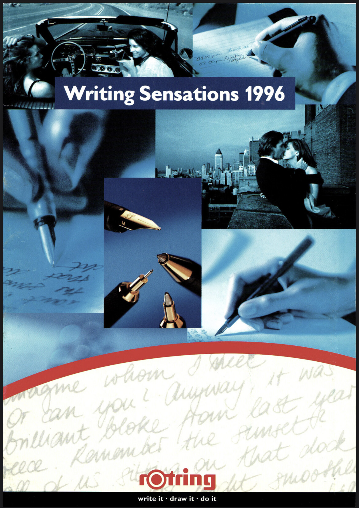
These were too large to upload but here are some links. I found these on the Romanian rOtring site (rotring.ro)
1996
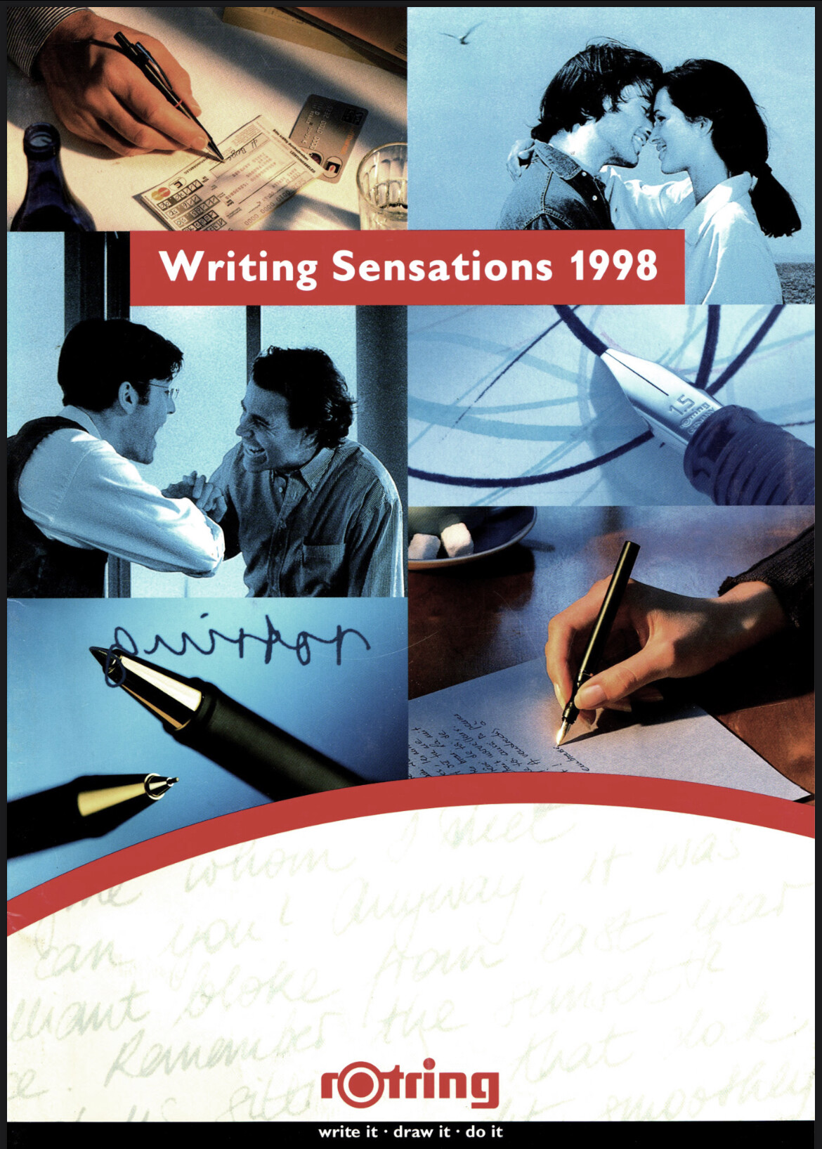
1998
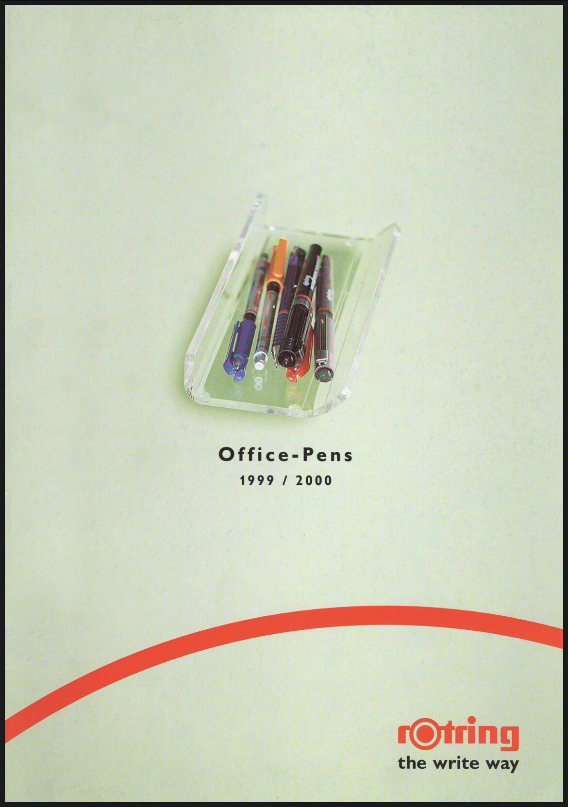
1999
(There may be more?)
These were too large to upload but here are some links. I found these on the Romanian rOtring site (rotring.ro)
1996
1998
1999
(There may be more?)
Rotring 700 in the 1996 Doc… ![]()
It’s interesting to see the rOtring 700 appear in the 1996 catalog, but is then absent in the 1998 catalog. USharpen did a nice video about this series that looks to have been released in the early 1990’s.

Thanks for the catalog links, Patrick!
The 1998 marketing photos in the catalog look peculiar, and not really what I’d expect for a pen company. Lots of… “romance” oriented shots. ![]()
![]()
rOtring lore has it that the 700 series was retooled from the Montblanc Slim Line from 1986, which was itself based on the groundbreaking Aurora Hastil.
The clip was design by architectural firm Kleffel-Köhnholdt-Gunderman in 1992. It was then launched in 1993 and OOP by 1998. Won a Design Plus award in 1993.
End of crib notes
Which cloud drive has higher permanent storage for free users? maybe MEGA?
I have some catalogs of Rotring(mainly from this website) and some fountain pen brands but the total file size is about 10G, I will upload them if there’s a feasible way.
btw, you can find some other brands at the bottom of this dealer’s website.
I think there’re several different forms of catalogs and this website has partial archive of them. e.g. catalogs of 1990 and b2b version of 2001~2004 looks much more fomal
MEGA is 20gb, there’s also Google Drive with 15gb.
Looking through these makes me feel sad about the current state of Rotring, reading up on the company’s history, significance, innovative designs and experimentation, seeing the beautiful pens they’ve made over the years.
It’s a shame to see what the modern “Rotring” is, lacking all of those aspects and basically remaking products of the past, arguably, with an inferior quality.
That lore is correct. I have a Montblanc Noblesse in gold and it’s the exact same proportions as the rOtring 700 fountain pen. The nib is identical as well, although 14kt instead of steel. And obviously the major departure is that clip. I didn’t know that rOtring had commissioned an architectural firm to make it.
rOtring has such a steep history and they were so well known for architectural writing tools. As the transition began from paper to computer, they didn’t retool themselves fast enough. And then they tried to be like TOMBOW at times, only a bit late, with some daring designs. They started with wild plastic color mixes for the Tikky II. Then came the weird squid-shaped Rive. But then… the Sanford acquisition happened, which was then swallowed up by the massive Newell Rubbermaid conglomerate. Someone thought rOtring should get funky and they issued the highly controversial Core writing instrument line. I don’t think it was a success for very long. Probably appealing more to kids, but the price was rather high for that demographic. The management just didn’t know where to take the brand. Thankfully the Japanese rescued the venerable rOtring brand and brought back the more principled and conservative designs, which brought us the 800 (albeit a reboot of the 600g).