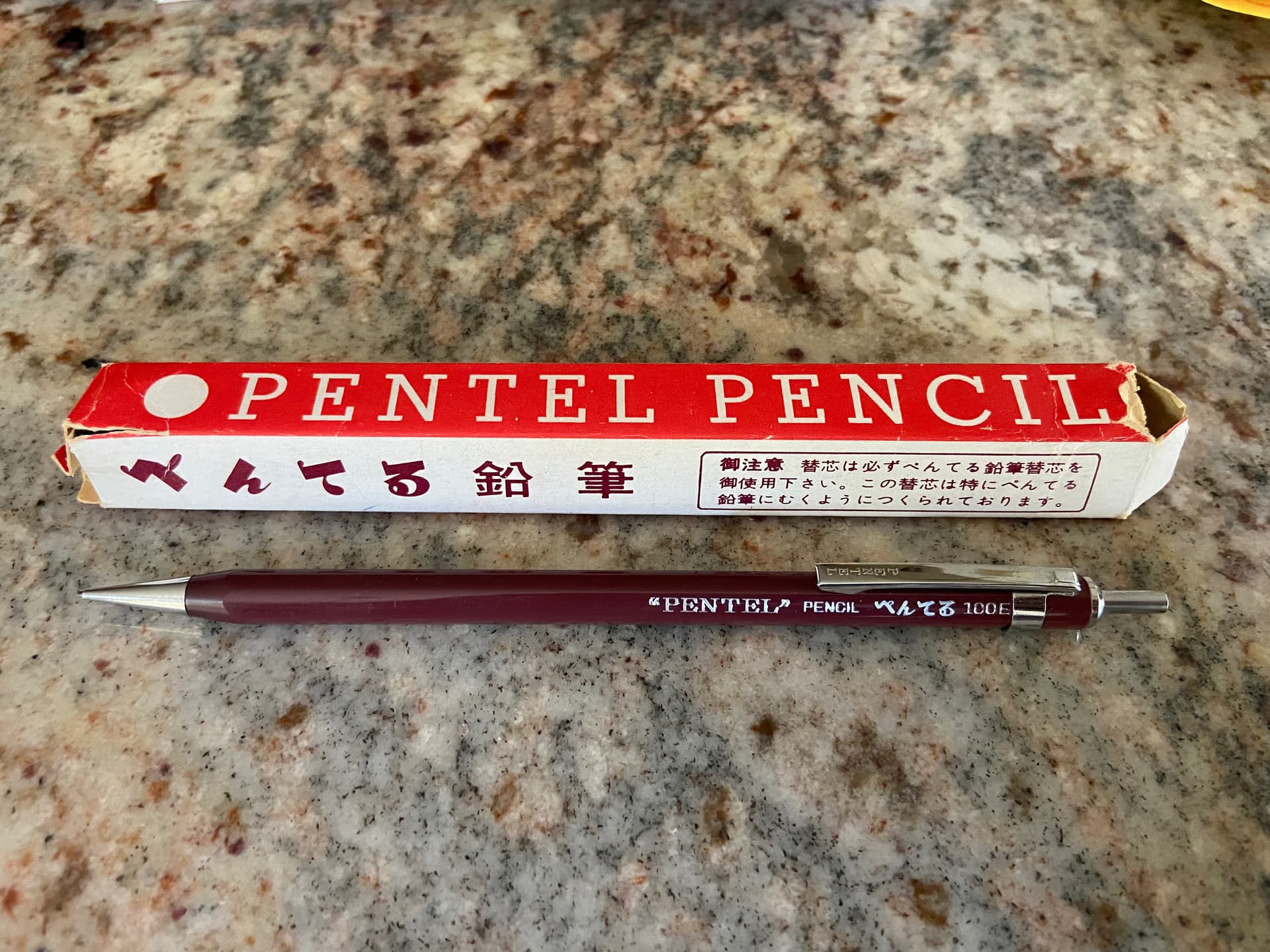
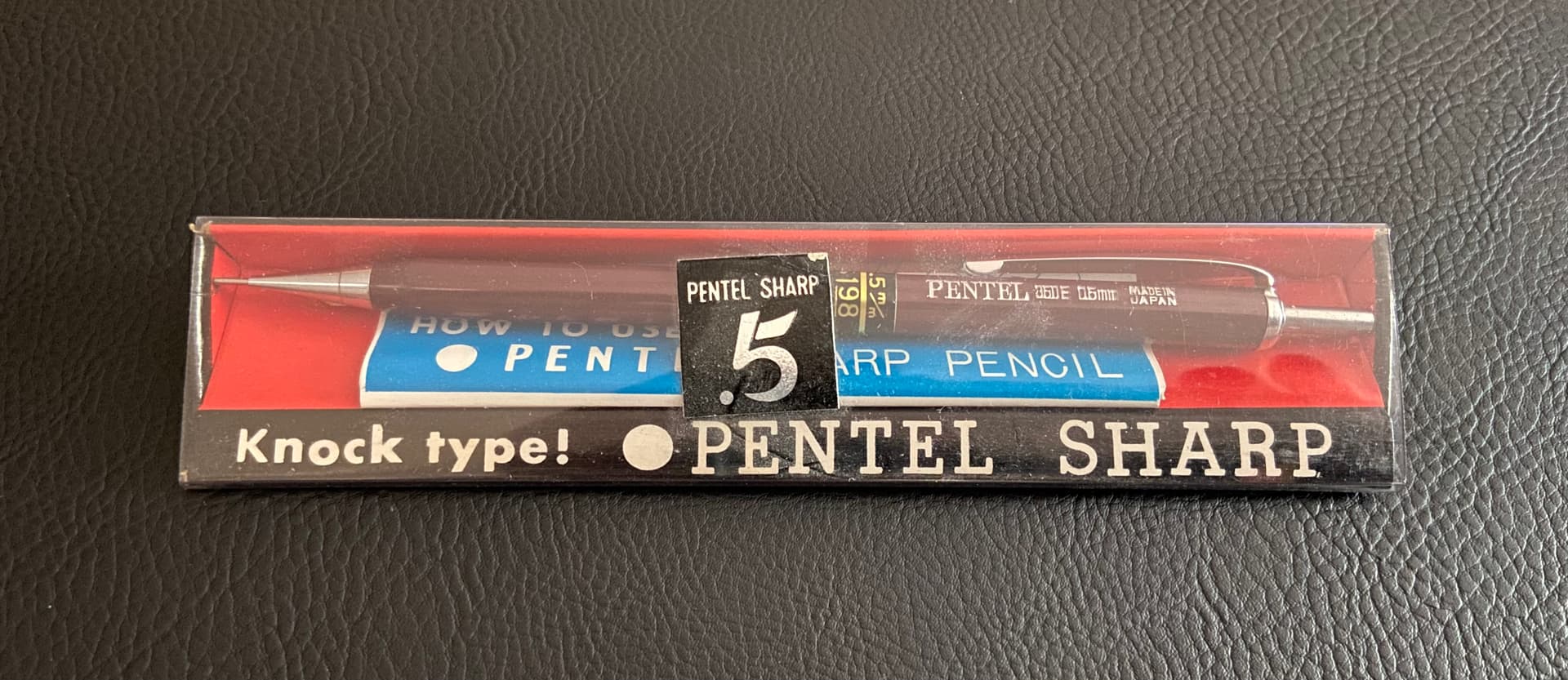
From what I can gather on here and Jimmy’s awesome Pentel Pencil Identification Book, this is the first mechanical pencil model manufactured by Pentel. I am guessing it is perhaps one of the first Pentel mechanical pencil models released in the United States by Pentel of America, Ltd., possibly alongside Pentel’s first PG model. The little sheet was rolled up inside the cardboard box. I never imagined coming across an item like this.
11 Likes
That’s awesome
Congrats, regardless of the provenance, it is a beautiful piece! Very nice
1 Like
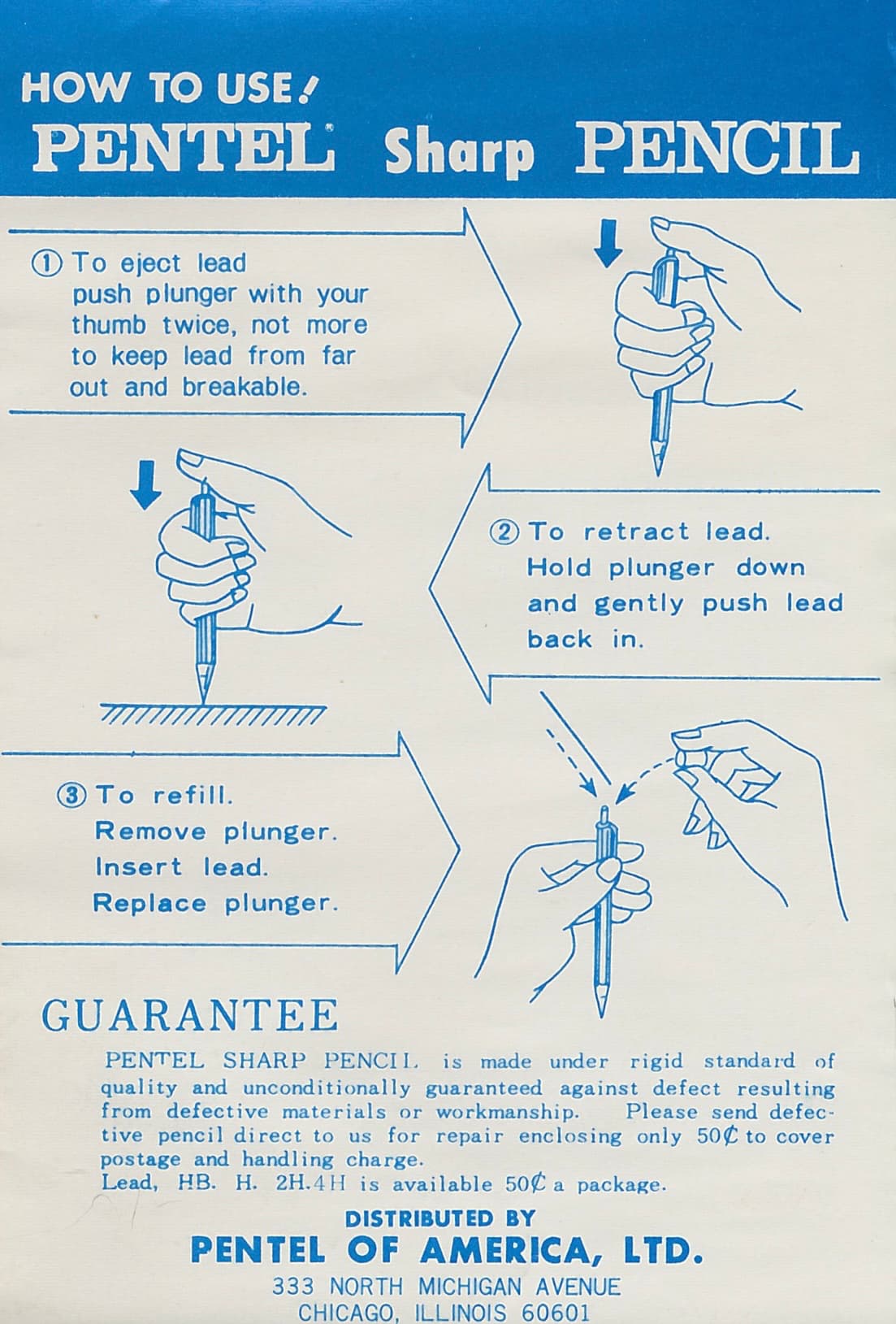
That little sheet that was rolled up looks perfect. ![]()
2 Likes
I had some help from Edgar Allan Poe when I put it on the scanner bed!
neat! Were you the one that grabbed the lot of 5 that popped up on eBay? I had it in my cart, and by time I hit checkout it was already sold ![]() I was bummed all night! If that was you, and you’d ever feel up to selling one, please let me know.
I was bummed all night! If that was you, and you’d ever feel up to selling one, please let me know.
3 Likes
Really nice piece! Congrats!
2 Likes
That is a really good one. Does the lead advance?
2 Likes
Yes, it works perfectly. Pretty amazing for something 60 years old. (I’m guessing you might have some 350 pencils that don’t function properly, yes? I have some of those that don’t work, including a new 0.5mm pencil.)
1 Like
Alot of the really early Pentels don’t advance the lead properly. My guess is that they predate Demming and so the quality is not what we came to expect is later models.
2 Likes
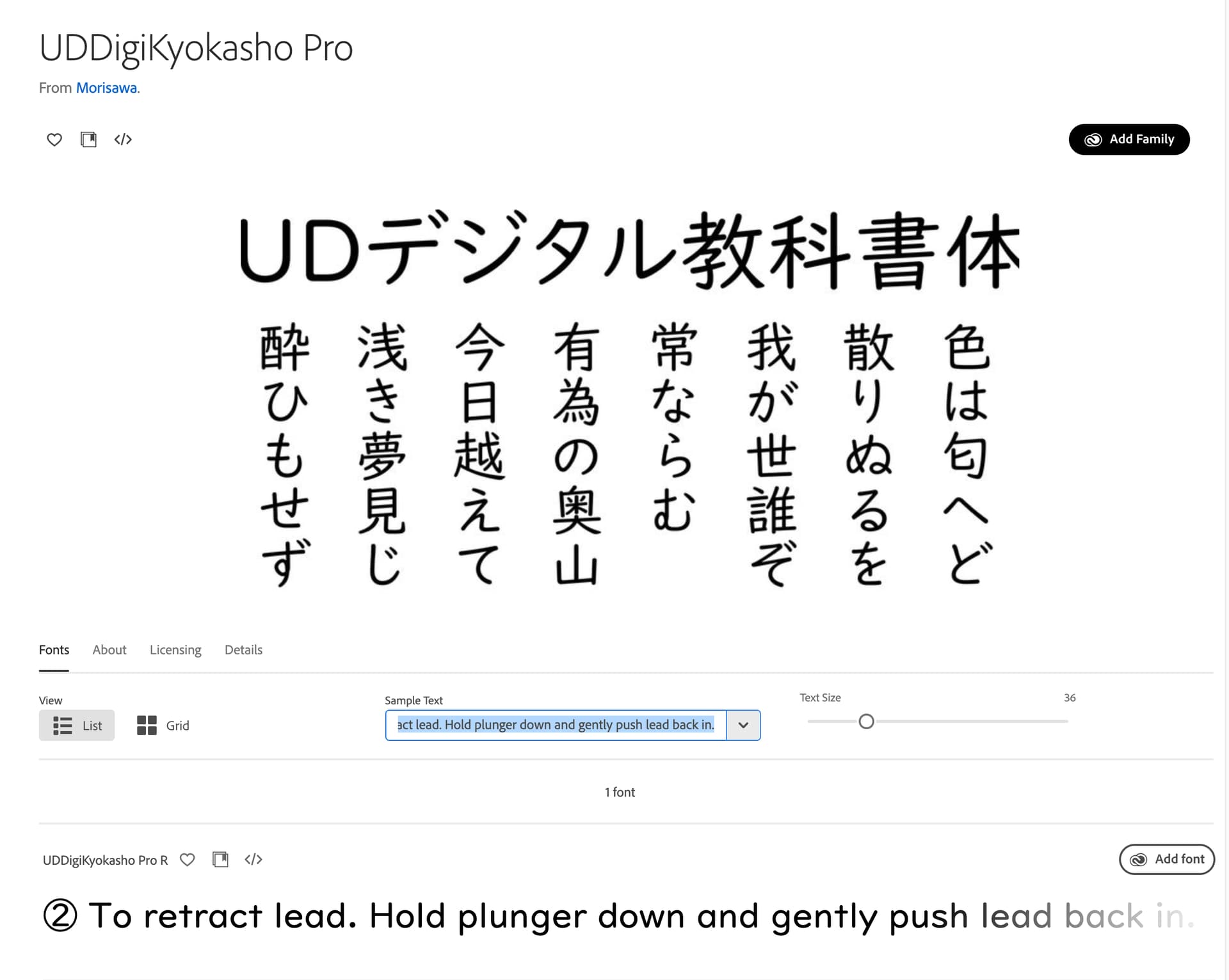
It’s tickling that the typeface used in the How To Use sheet is identifiably East Asian. For a product from the 60s!
2 Likes
Could you please elaborate? How do you spot East Asian typefaces?
1 Like
I am interested in the typographical aspects as well; all I can see right now is that the leaflet is filled with way too many typefaces, and I can see no less than two different sans-serif fonts in the numbered list alone (which I find admittedly weird).
Also, the serifed font seems, in a sense, a bit “old style”, and the glyph for the “cents” is one I find uncommon.
Still, an amazing paper document for a great mechanical pencil. Good job @SlideRules !
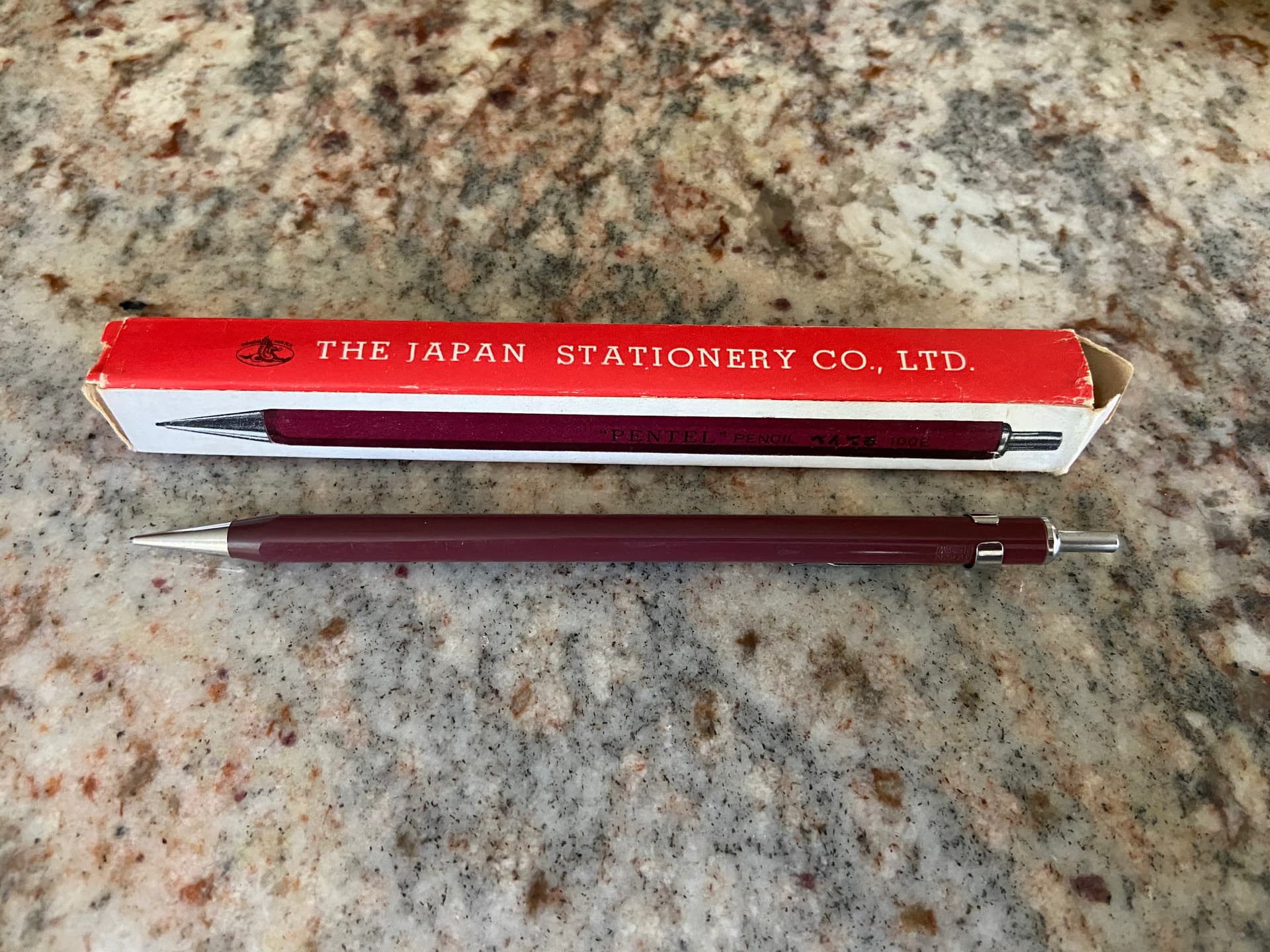
PS: the “fatty” writings on the cardboard box matching the colour scheme of the pencil itself? Chef’s kiss! ![]()
4 Likes
Not an expert in typography but like Leonov I also noticed that there are around 7 unique typefaces on the leaflet - crazy in its own right.
The awkward kerning and whitespace character length are the tells for me. This text in particular gives that feeling.

My understanding is that a lot of the weirdness around how Latin characters in CJK fonts look is due to technical limitations and various workarounds employed on early operating systems. The issue here is that this was from the 60s…
3 Likes
PS: I think I found a similar modernized type from Morisawa, a type foundry. Super cool history.
1 Like
Having lots of different typefaces is pretty normal for old signs, documents, etc.
Sometimes, there are more than 10 different typefaces in the title page of a book.
I have not found an answer as to why they did it so much. Theories involve aesthetical, practical or legal reasons.
3 Likes