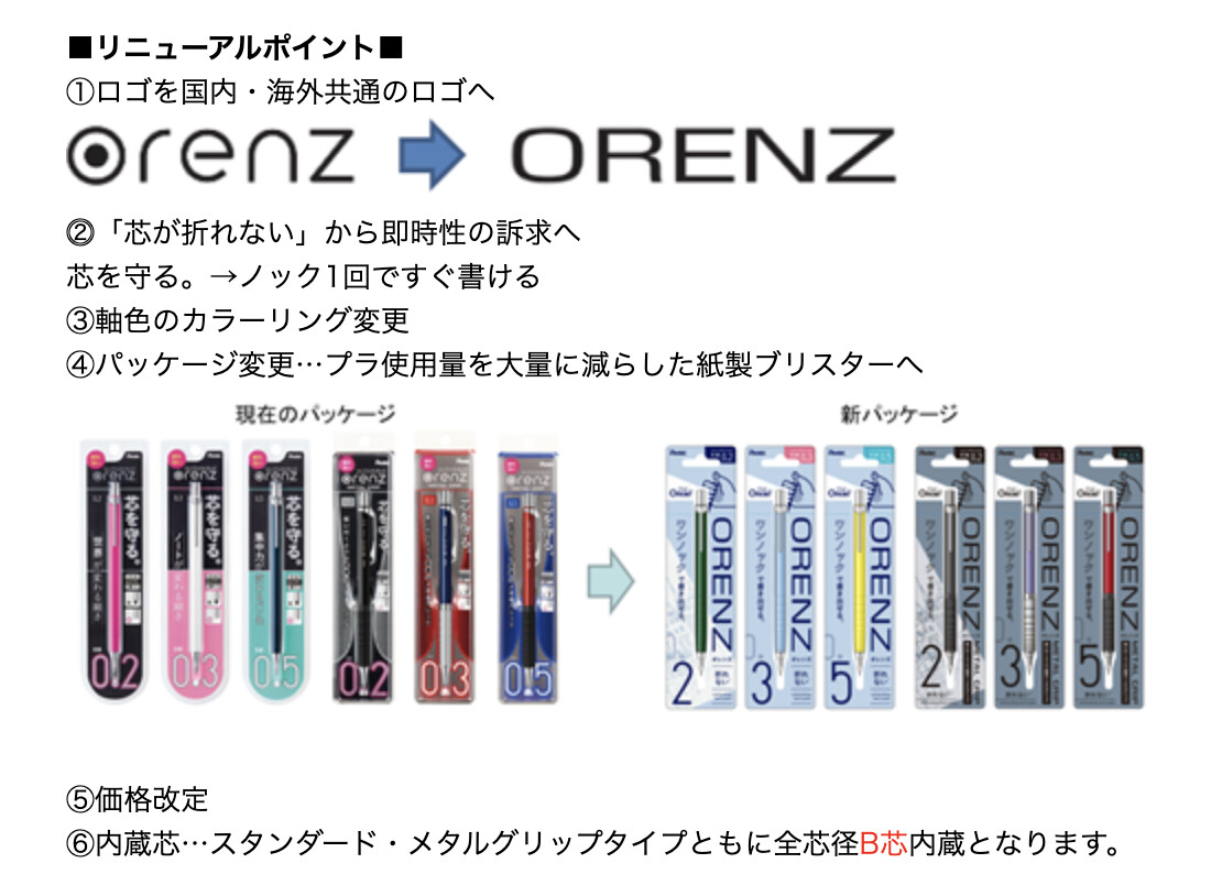
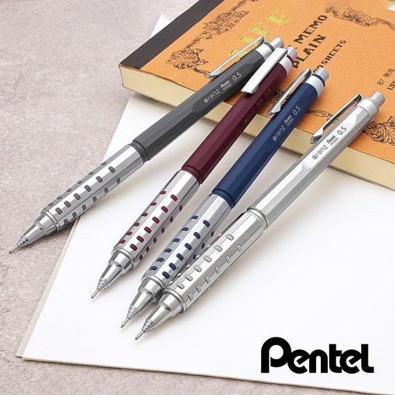
According to an announcement from the manufacturer, starting with products released on August 28, 2025, the Pentel Orenz will undergo several updates for both domestic markets:
The logo will be unified across Japan and overseas.
The current slogan “芯を守る。” (“Protects the lead”) will be replaced with “ノック1回ですぐ書ける” (“Once click"), shifting focus toward immediacy and ease of use.
Barrel colors will be updated.
Packaging will switch to paper-based blister packs, significantly reducing plastic usage.
Pricing will change.
The included leads will all be changed to hardness B by default.
The new design of the name reminds me of the neologism “blanding” which consists of “bland” and “branding”. Why do so many companies switch to boring lettering?
I’ve just recently bought an orenz and it was kind of awesome to be honest. I’ve bought the 0.2 and 0.5 and I couldn’t believe I was able to easily write with 0.2. The technology coming around is unreal. I believe I saw one listing reference the “one click” but it didn’t stick out to me because I wasn’t on board the orenz train previously.
I will say that I think I was surprised because “one click” didn’t tell me what the pencil was capable of and though “protects the lead” is more cumbersome, it is to me a better description of the pencil.
Personally i HATE the new lettering, and love the old one. But including softer lead is not only beneficial to the initial writer expirience but also logical due to the lessened need of lead strength thanks to the Orenz sleeve!
The new logo is kinda boring. I liked the dot inside the o. Indeed blanding. Cool for the move to cardboard though.
I wonder if they did this rebranding because the orenz line was selling very well and wanted to differentiate it more from pentel core (same as the recent change with zoom) or because the opposite. Personally I’ve seen the limited colour orenz at stay at the shelves for months so I think that after the Nero hype the orenz line is struggling
Totally hear everyone on the emotional attachment to the old logo. I liked the little dot in the “o” too. It had a certain charm. But I think this change goes way beyond just font preference. If I step back and look at it from a product, branding, and global business strategy standpoint, here’s what I see:
For years, Pentel ran two identities for the line… the stylized lowercase “orenz” for Japan and the all-uppercase “ORENZ” internationally. That kind of split worked when most customers were regionally siloed. But that’s not how the world works now. With cross-border e-commerce, social media, and global fandoms, brand fragmentation weakens recognition and erodes trust.
By unifying under one bold, uppercase mark, Pentel is tightening its global presence and not just visually, but strategically. This isn’t just about “how the logo looks.” At the executive level, branding is optics, positioning, and long-term leverage. It’s about sending one strong, consistent signal to the world: this is a flagship product with staying power.
And the tagline change from “protects the lead” to “one click” isn’t a step back, it’s a pivot in value prop. Pentel is reframing the pitch: from a clever mechanism to an effortless user experience. From “it won’t break” to “just write.” That’s a much stronger narrative if you’re expanding into broader markets.
Bottom line: clean doesn’t mean soulless. And global brand strategy isn’t about nostalgia but about positioning, clarity, and coherence at scale. The new logo reflects where Orenz is headed, not where it started.
These arguments sound very reasonable, and I think it’s very likely that Pentel was thinking along the same lines. Nevertheless, I think it’s a shame that part of the (national) brand identity is lost and there is a risk that everything will look the same everywhere. But I admit that I may sound a bit old-fashioned and romanticised here
I’m (sadly) exposed on a daily basis to these kind of corporate arguments and I’m aware. Blanding works, that’s why all brands are doing it. I think that, as enthusiasts, we can do better analysis than this and would encourage everyone to think twice about why these rebrandings are done and what impact they have.
I’ll reiterate my previous message with more examples.
One of the most controversial rebrands of the past year, Jaguar Land Rover changed their iconic logo to a bland new image that says absolutely nothing. The promotional video was very controversial as well, with no cars in it at all.
Sue Benson, founder and CEO of The Behaviours Agency, lists some of the reasons she feels the new approach failed. “Heuristics like the leaping cat logo have been discarded, weakening mental shortcuts consumers rely on. Emotion has suffered, too; rather than stirring pride or aspiration, the new identity feels cold and aloof. And in terms of consistency, the shift has been jarring, with little cohesion between legacy and future.”
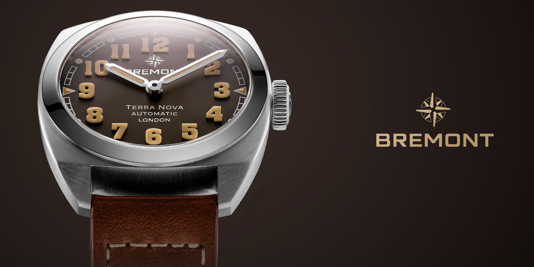
Another 2024 controversial rebranding. Bremont, a watch brand that couldn’t get to the quarterly profits that their shareholders expected, introduces a new CEO, new brand logo and a completely new lineup of products.
Just one reddit comment about the new image, since there’s no official statements here
I understand the brand was underperforming and the rebrand is them trying to appeal to the U.S. market but they are unrecognisable.
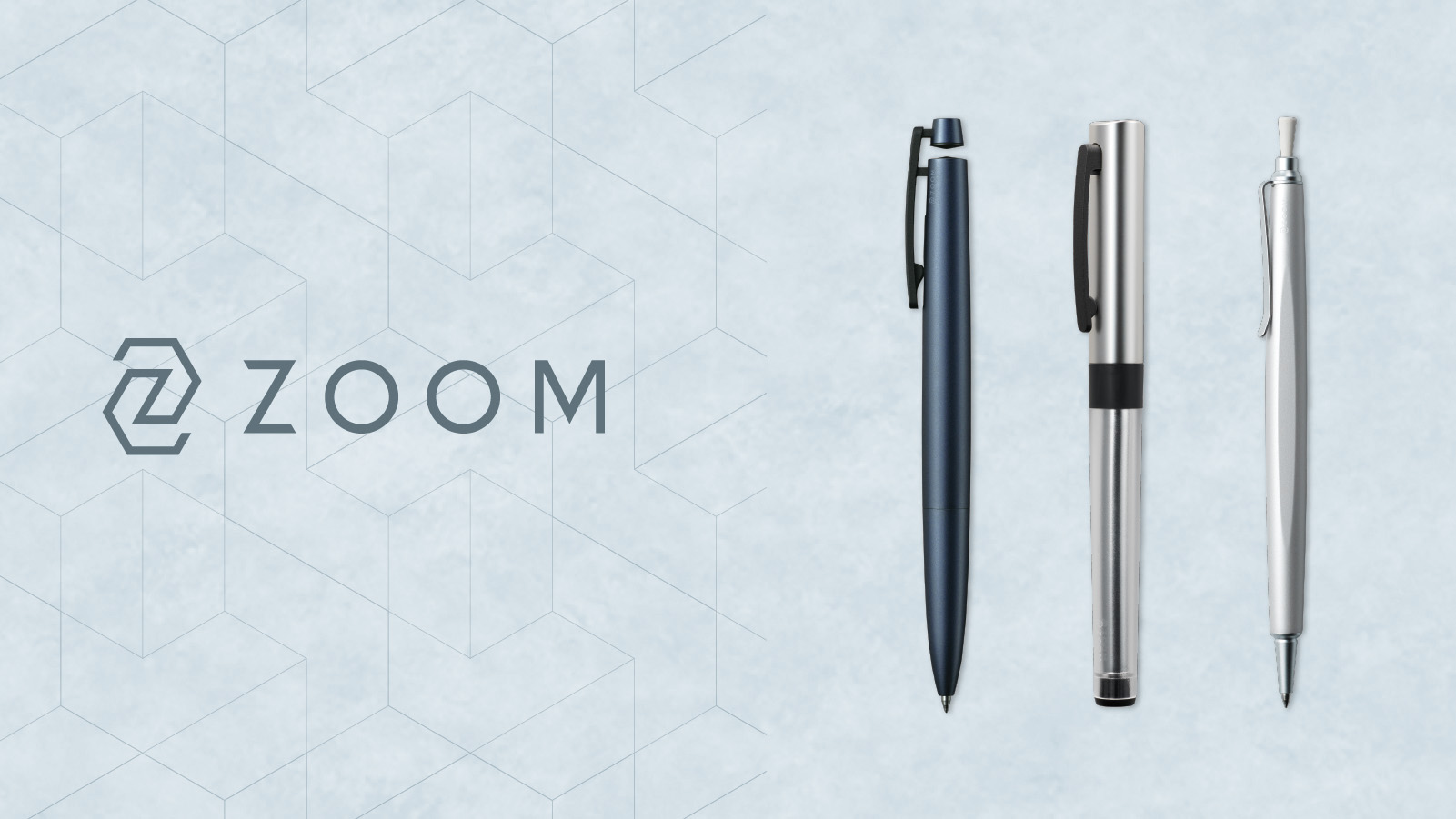
Tombow wanted to keep distance between their core line and the Zoom line, as well as not associate a brand that should be more related to design and innovation with somewhat bland models like the zoom L102 or 105
What’s the difference with the zoom rebranding? It came with a new lineup of pens that evoked loved old designs. The L1 has many cues which remind of the old España, while the floating clip of the C2 enchanted many people. It was a good product lineup first, and then the rebranding came second.
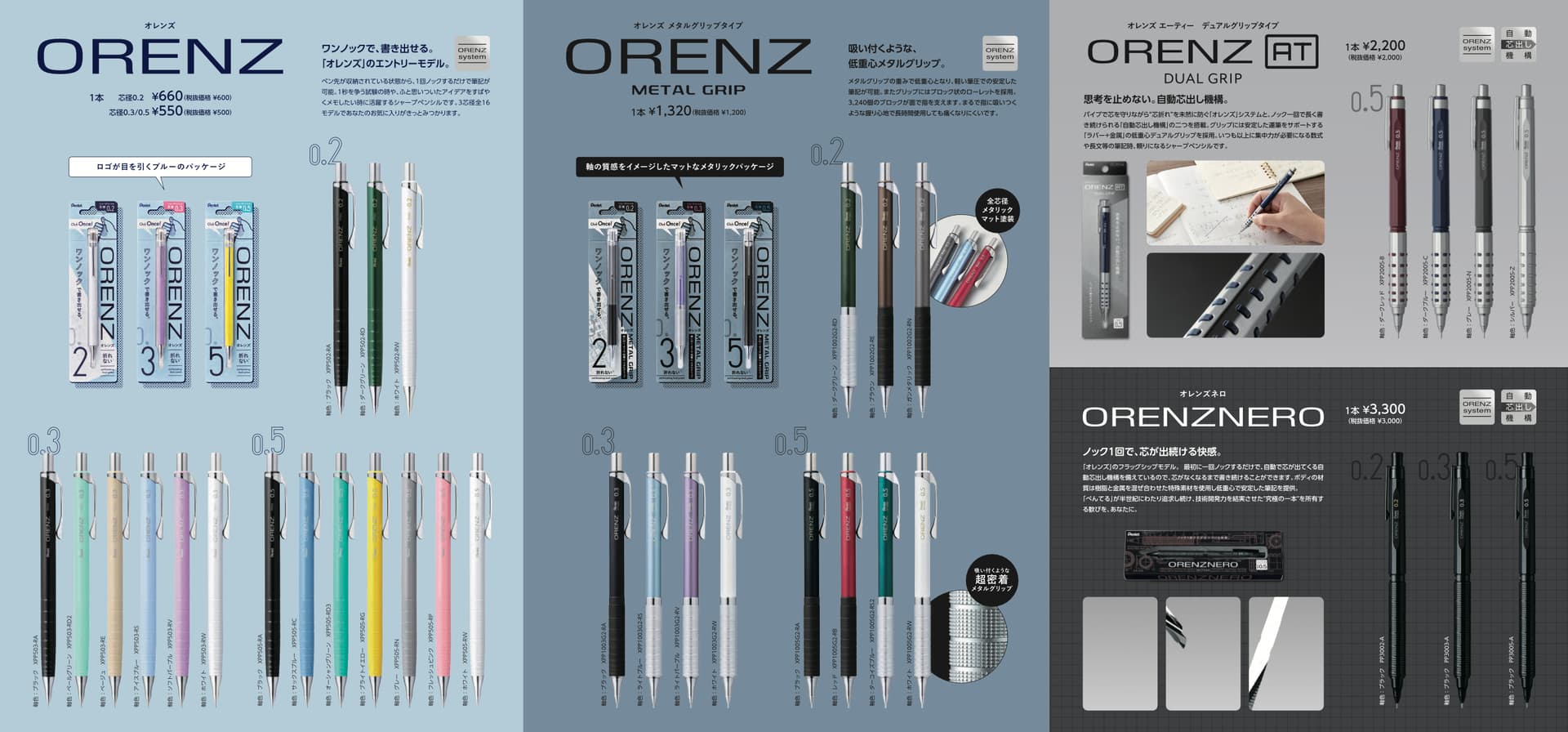
Orenz had a big hit with the Nero. New materials, affordable automatic technology, cool design. The basic model was sold out for months after release, and the limited edition colors are desirable even today. But what afterwards?
In my opinion, nothing. Orenz can’t move upmarket anymore with new products, only raising prices, since there’s nothing more they can do to reasonably charge more than the nero. They tried to do something similar with the AT, but this was a rather unexciting release. As I mentioned before, the limited edition colors of the AT can still be found in stores.
Pentel is feeling the pressure from Uni. The Dive has been the heaviest hitting pen of the last few years, and all subsequent releases (new better kurutoga motor, metal model, wood model) have all been big hits. Kurutoga now has a lineup from 300 yen to 5000, with all price tiers covered (1000 with advance and roulette, 2000 with metal, 3000 with wood, 5000 with dive) while Orenz is capped at 3000 and has a big gap between their popular cheap models and the nero. That’s the true driver of this rebranding, in my opinion.
Nero seems to be limited by its material process. The metal resin body doesn’t lend itself to cool colors. All of the ‘limited colors’ are too subtle to tell apart at a glance. And perhaps 0.2 has been a double edged sword… leads that are still too expensive and finicky for the auto mechanism.
A rebrand needs a compelling product to drive the story to be successful.
Ideally, they should have (re)launched the branding with a new halo product. Q: What comes after Nero? A: Orenz Shirow / 白 (White)… ceramic body and clutch!