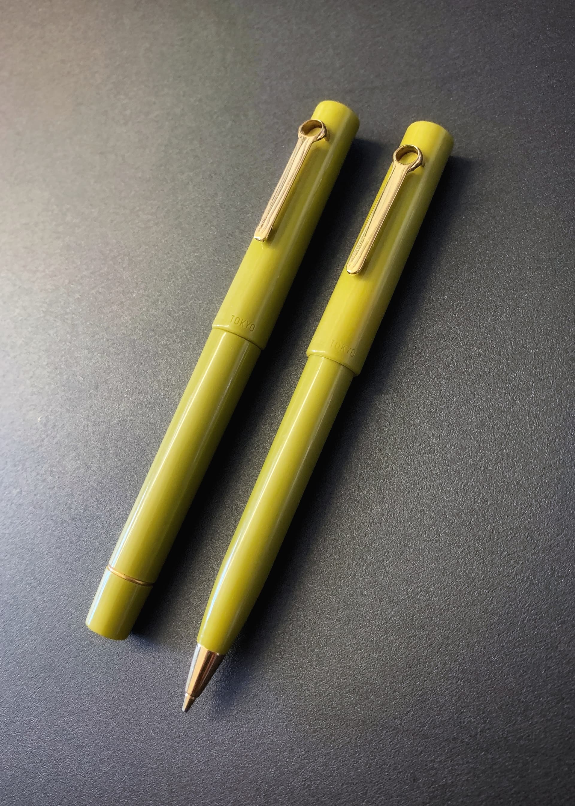
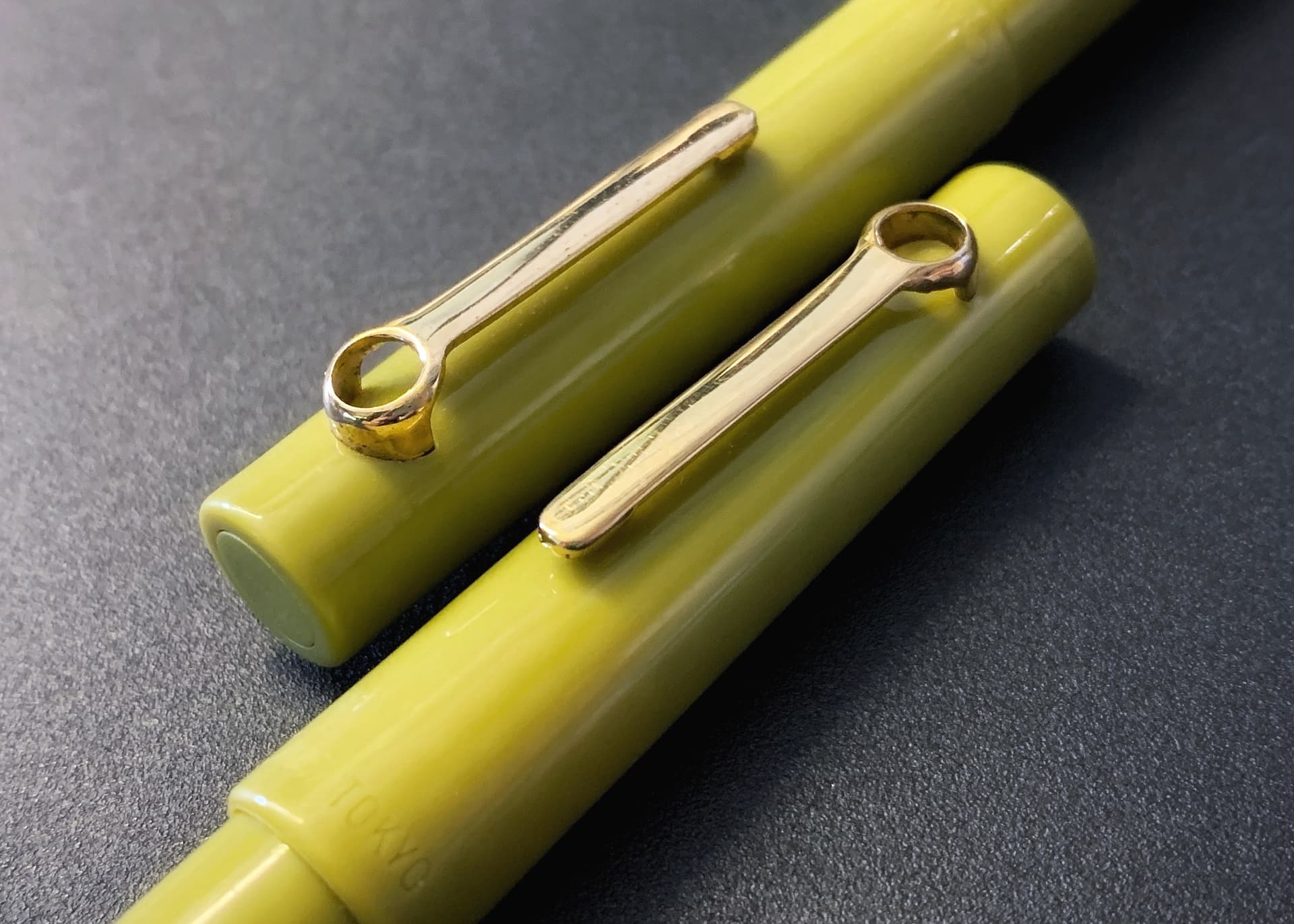
I think in many categories of consumer goods, there comes a time when technical innovation seemingly plateaus and all that is left is style. In the case of the Omas TOKYO series from 1991, I was drawn to it because of the elegant and mildly orientalist form of the golden clips, which I came across while researching the works of Ettore Sottsass, the designer behind the zany ‘Memphis’ graphic movement in the 1980s.
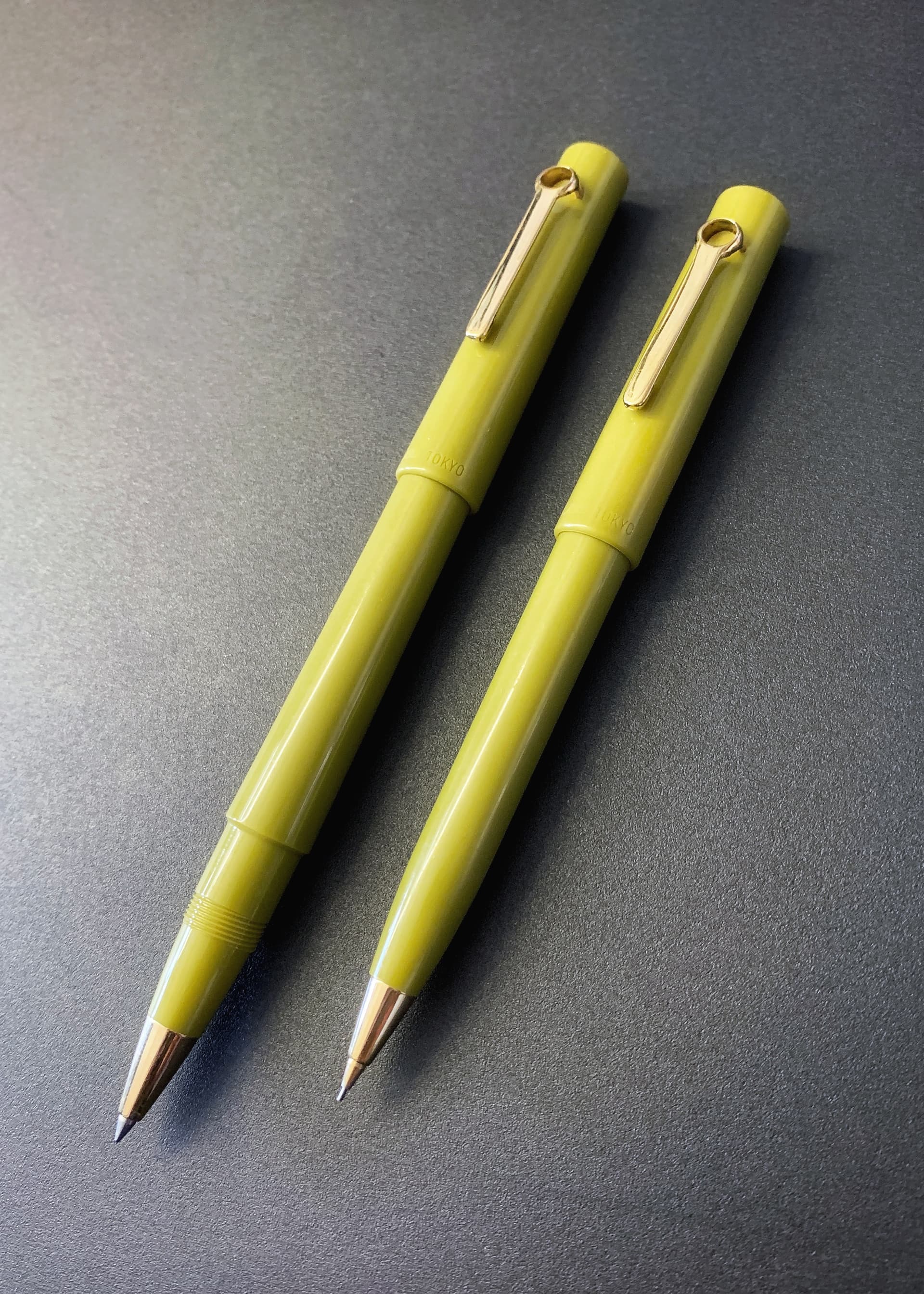
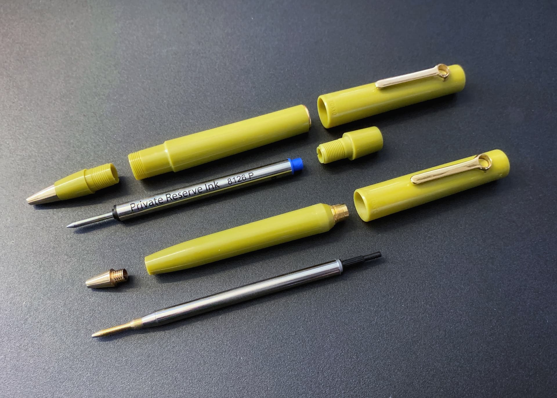
There are of course fountain pen models but they hold no interest for me, and so I only focus on the capped rollerball, cap knock ballpoint and mechanical pencil models. The MP in particular uses an all-metal 0.7mm Schmidt unit, so this trend of using Schmidt as the ‘universal guts’ for any pen design based around a Parker-type refill has been going on for a long, long time!
I can’t think of much else to add except that the color variants are quite muted and mature. Seen here is the ‘Lychee Nut Green’ according to the included booklet. The series was also produced in ‘Navy Blue’, ‘Classic Black’, ‘Persimmon Orange’ and ’Viridian Green’—a total of 5 colors, one for each letter in ‘TOKYO’. I hope someday to collect (at least) one of each color! ![]()