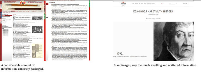
Maybe you know another example (please tell about it), but the worst “modernization” of a pencil manufacturer’s/brand’s website’s history page that I know of has been Koh-I-Noor.
I’ve put the old website (left) next to the newer website (right).
It’s really sad. They added a couple additional points, at least, but cut most others. It’s now more about milestones and achievements, further detailed information undesired. A website not for stationery enthusiasts. Previously, they had a whole additional page “Interesting facts about Koh-I-Noor”!
Any other pages that got this downgrade? Lesson here: Make sure to always check on the internet archive…
4 Likes
I’ve noticed this time and again as websites start to be optimised for smartphones.
It all boils down to two factors:
- screen size: due to the inherent smaller size of screens and vertical orientation there is only so much info it can display.
- short attention spans: Younger people do not want to read and be informed in depth, they view everything as quick entertainment, so all info needs to be compressed and dumbed down.
Also due to smartphones, most people now read and post on the move, not in front of the desktop in the evening with plenty of time. We are always connected, spend more time online but an invreasingly smaller percentage of that time is consumed in a useful manner. An ever shrinking vicious circle.
For me peak internet was between 2005-2015, with blogs, forums and youtube. Now most people migrate to short word count apps and short videos. Facebook, Twitter, tiktok.
4 Likes
