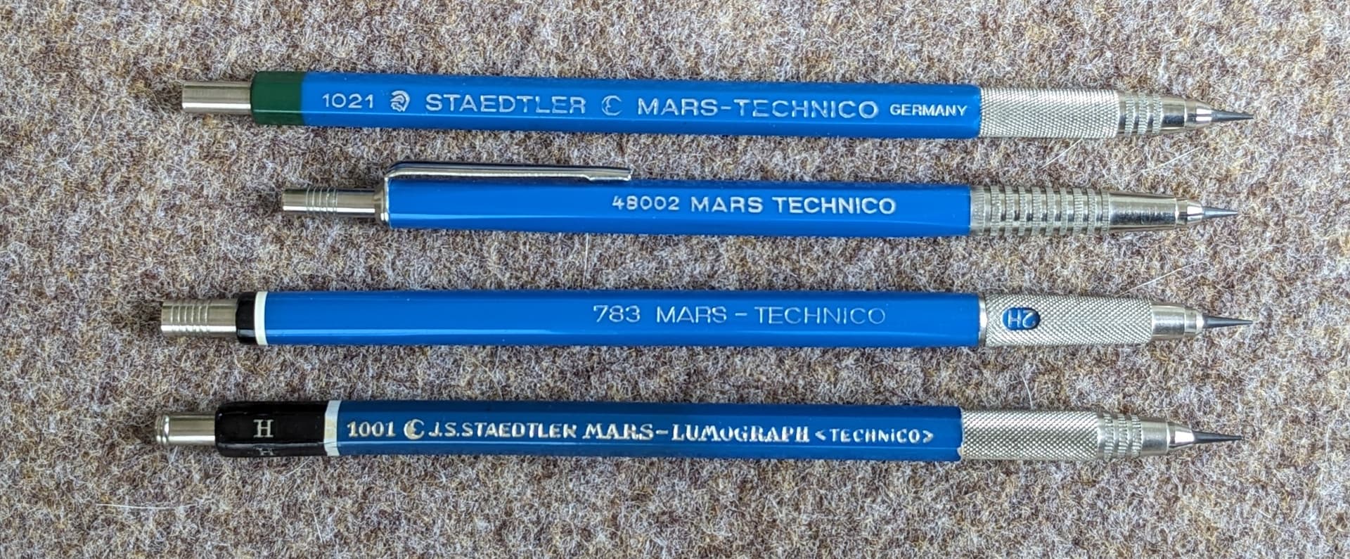
I have always been curious why early Staedtler leadholders have left-handed markings. They seem to have changed to the more conventional right-handed markings at some point - not sure exactly when that happened.
All the other pencils and leadholders in my collection have right-handed markings. Are there other brands that went against convention?
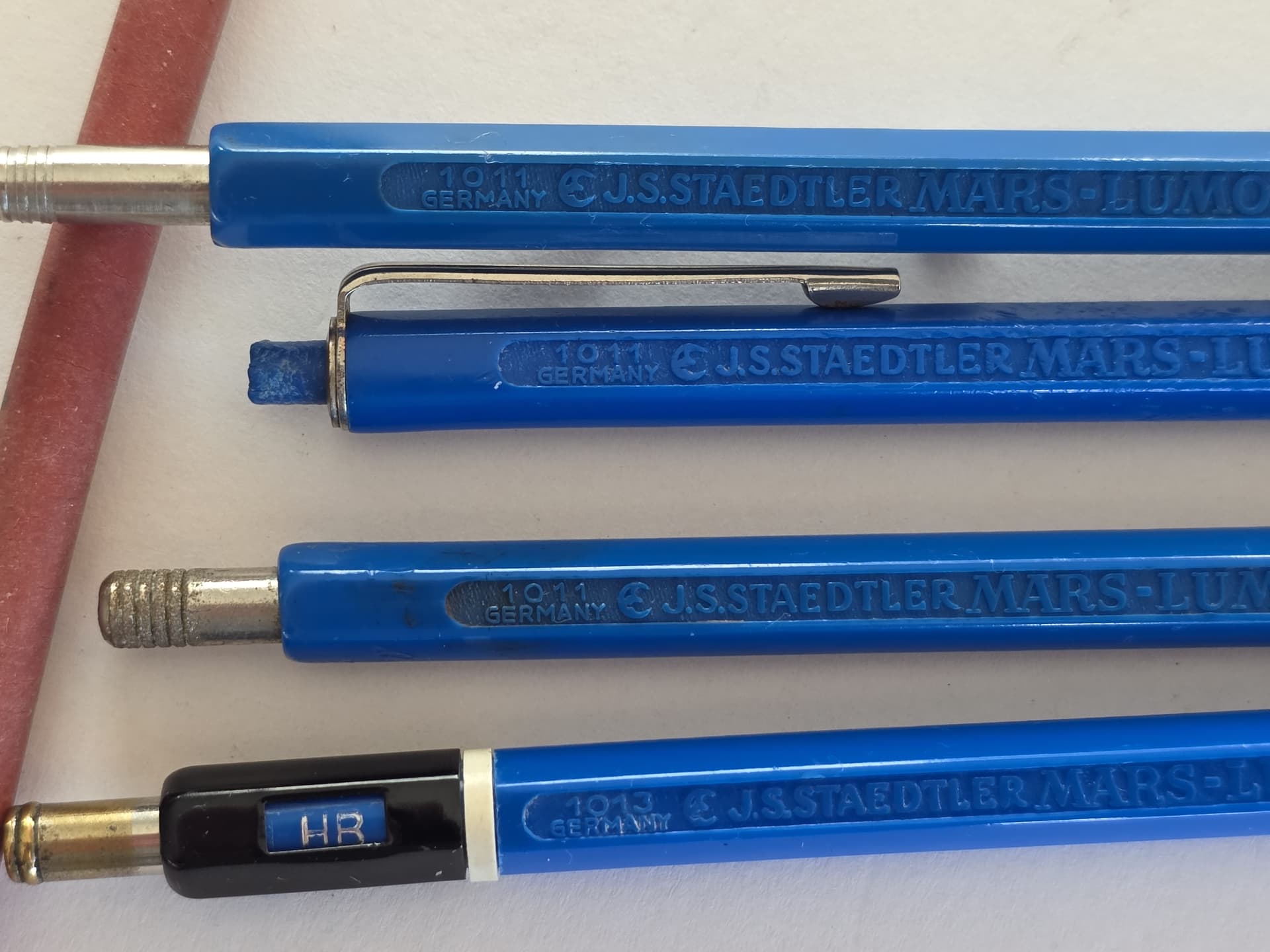
I once learnt from Staedtler that the direction of the lettering was reversed in 1963. However, the changeover from four-digit to three-digit article numbers took place in 1969, so that there should actually be no pencil with the so-called left-handed labelling and a three-digit article number (like the third one).
I have still not been able to solve this puzzle, nor do I know why the company opted for this unusual type of labelling at the time. Did they want someone else to be able to read the labelling when a right-handed person used the pencil?
By the way, the shape of the Mars head on the first leadholder was used von 1963 to 1967. The quarter moon which can be seen on the last leadholder was registered as a trademark in 1887. It’s one of the oldest trademarks in the pencil world and was used until the early 1960s.
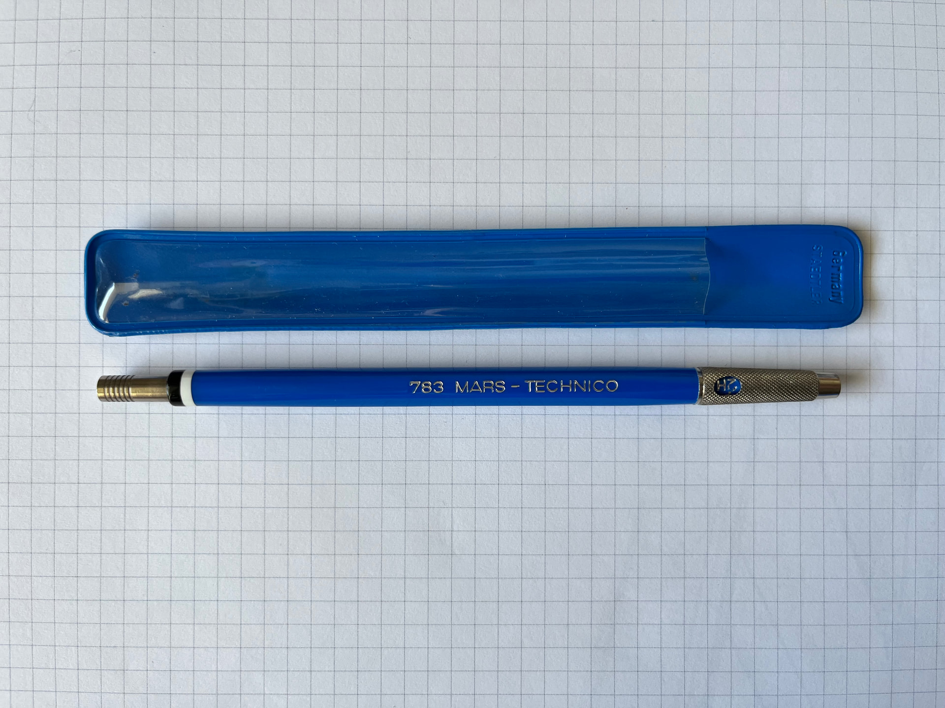
Thank you Gunther for your detailed reply! The information about which logo was used when was very interesting. I notice that they shortened the name from “J. S. Staedtler Mars Lumograph Technico” as the years went on - hard to fit all that on the shorter leadholders.
I had never considered that the labeling was oriented for someone other than the user - kind of like the orientation of logos on the laptop computers. But who knows what the real reason is - maybe there was a left-handed person in charge at Staedtler.
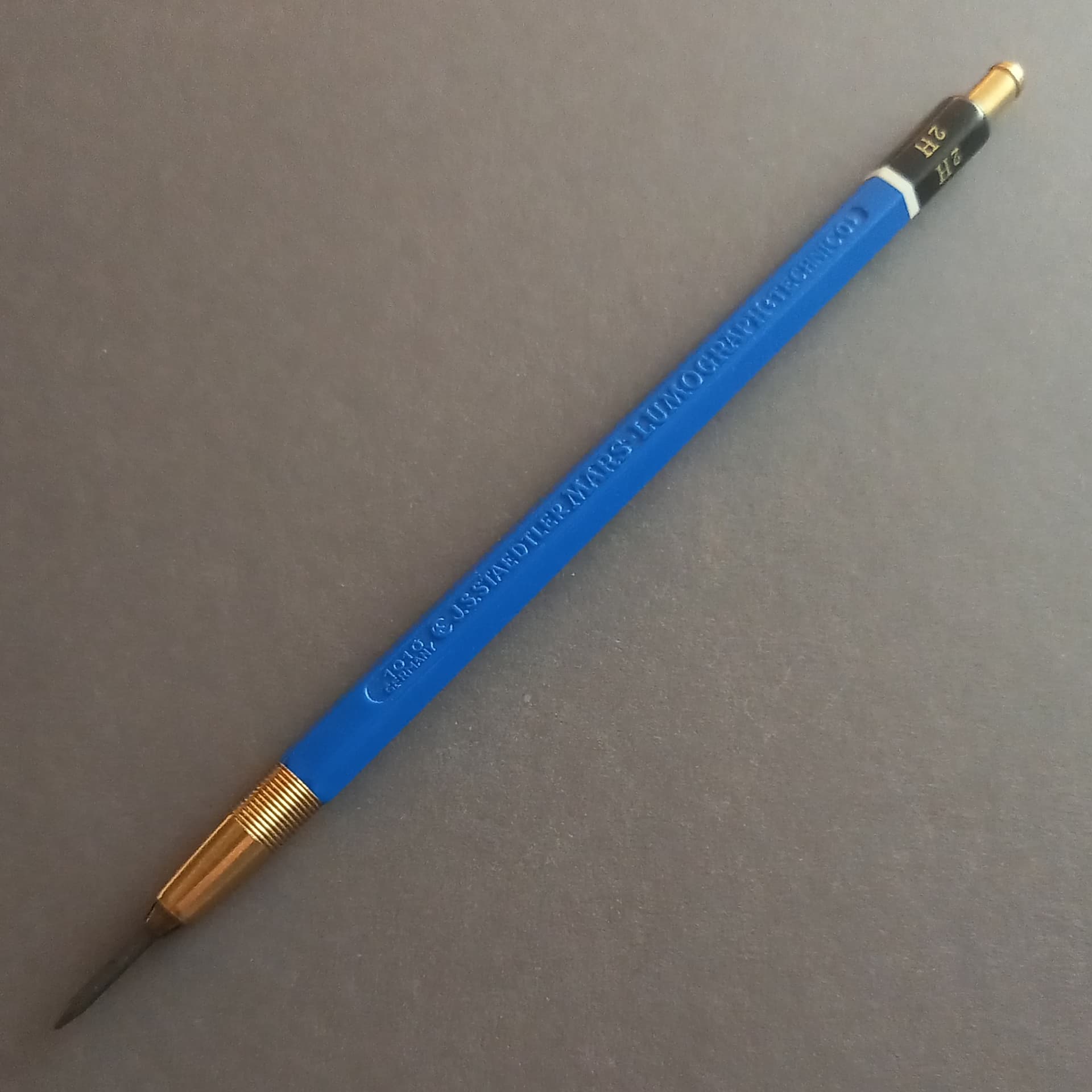
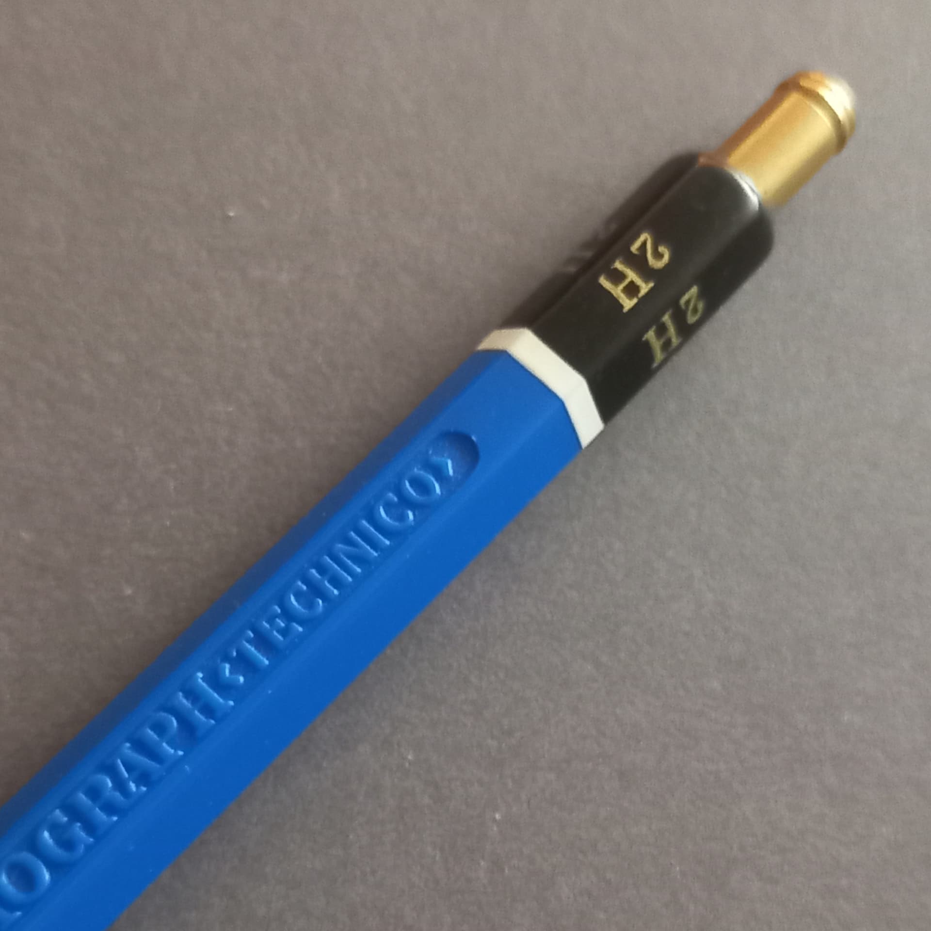
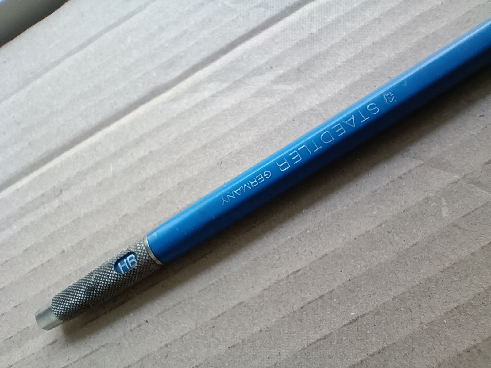
Ulfesharpe - I agree that it is curious that the lead hardness indicator doesn’t match the other labeling. I double checked to see if that was a separate part that could be reoriented by the user, but it did not look like it came apart easily.
What a lovely group of pencils! There are a lot of earlier wood clinched pencils that were ‘lefty’ too. I always just assumed it was consistency with the ‘direction’ of the point of a pencil as it was naturally presented for sale in print… generally aligned with the direction if the text being read, from left to right, for visual fluidity, then some bright spark realised that, when in the hand, where it really counts, it was pointing the wrong way, and, as with the hardness indicator in your 3rd example, it should be readable, so they all followed suit and reversed it? I know… ‘mere surmise, sir!’
It reminds me of a lecture I attended when studying design, in which we were told that though it was less useable, often buttons and features on electronic goods were always placed on one surface in order to be easily shown as features in catalogue photos to sell those features to consumers…
But then, when I found this plastic 1010, all my theories went out the window… ‘right handed’ embossed branding and lefty printed hardness grade. So what the hell is that about!?
How about trying to make any possible customer happy — well, sort of?
Right-handed user? Legible model number, flipped lead hardness imprint.
Left-handed user? Legible hardness grade, flipped model number engraving.
Everyone can be as happy as 50% here. I would call this “German fairness”: no one can really complain, as this bi-directional barrel is 100% direction-compliant in each one of its significant halves as per the communication of the pencil nature and intended usage.
I really love these quirky anomalies in a seemingly flawless history: they make our collection “alive” in a way which is impossible to achieve by simply varying materials, lead diameters, or hardness grades.
I would not be surprised if this was a transitional piece, produced on a mixture of old and new production lines. In other words, the lead hardness was still applied to the hexagonal end using the old pencil equipment, suited to left-handed layout, while the moulded body had been designed to the new right-handed standard.
It would surprise me if this plastic hybrid had been manufactured for much longer than a year or so, which might explain why I have never seen one before. There is something very Faber-Castell-like about the embossed “cartouche” layout and gold trim; maybe Staedtler was in the process of changing supplier, resulting in some crossed wires design-wise.
I like the embossing too, but a few of the earlier examples I have were made of plastics that were too soft and the compression of the spring, combined with pressures of use has meant that they bow toward the weaker barrel wall, (the embossed one with less material) so I’m always slightly wary of buying them…
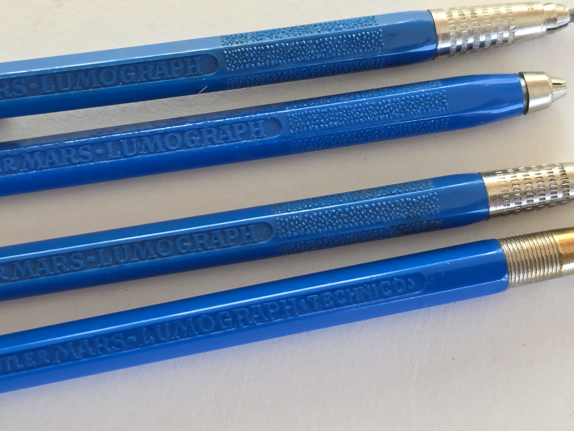
The 1013 and versions of the 1011: no clip, clip at button, clip on barrel ( always a loser to warpng…see AWF 9441..) Following AWF, I suspect…(the late) Dennis Smith of Leadholder.com fame thought the deep embossing was a good place to trap dirt, bacteria., etc…?
That 1011 in the middle (third from the top) seems super-interesting: extra cool combination of surface finishes in the grip area; I wonder how comfortable to use it is, with that short smooth band between the textured plastic and the rigged metal band…