French Collections

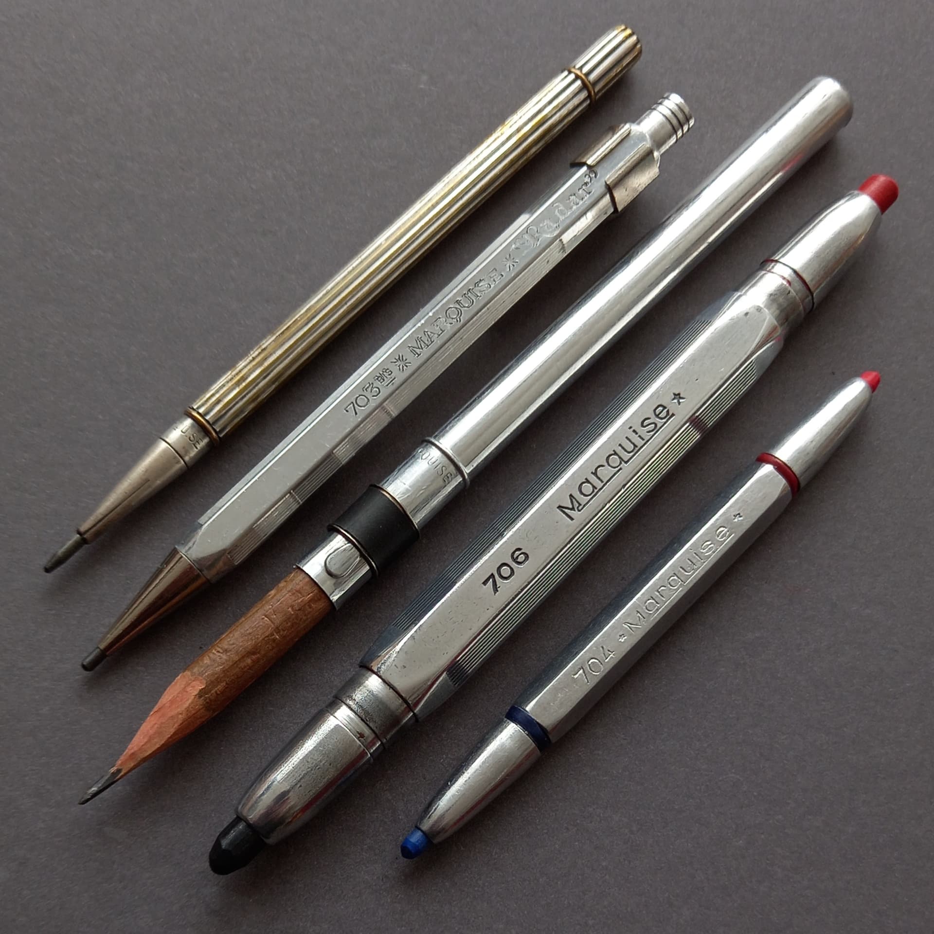
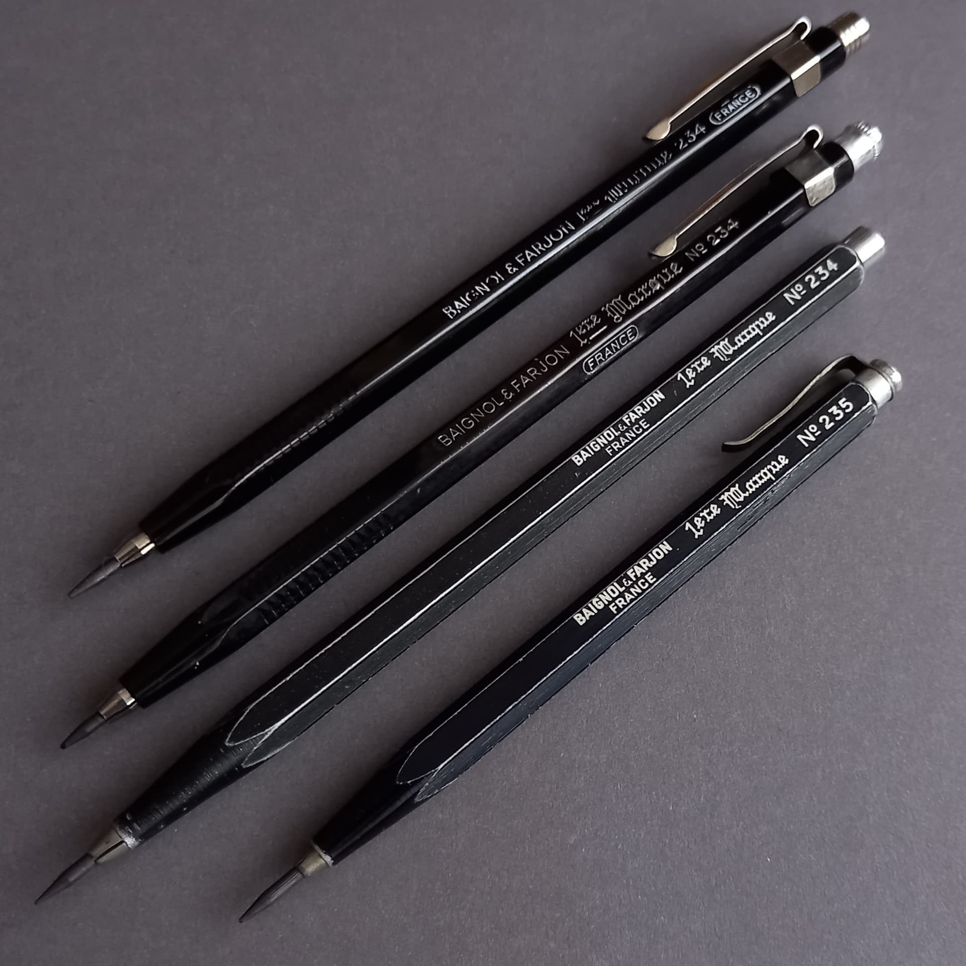
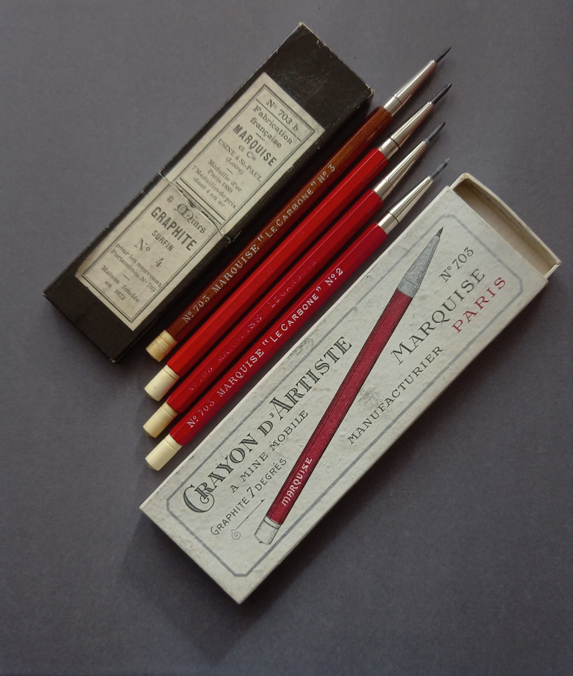
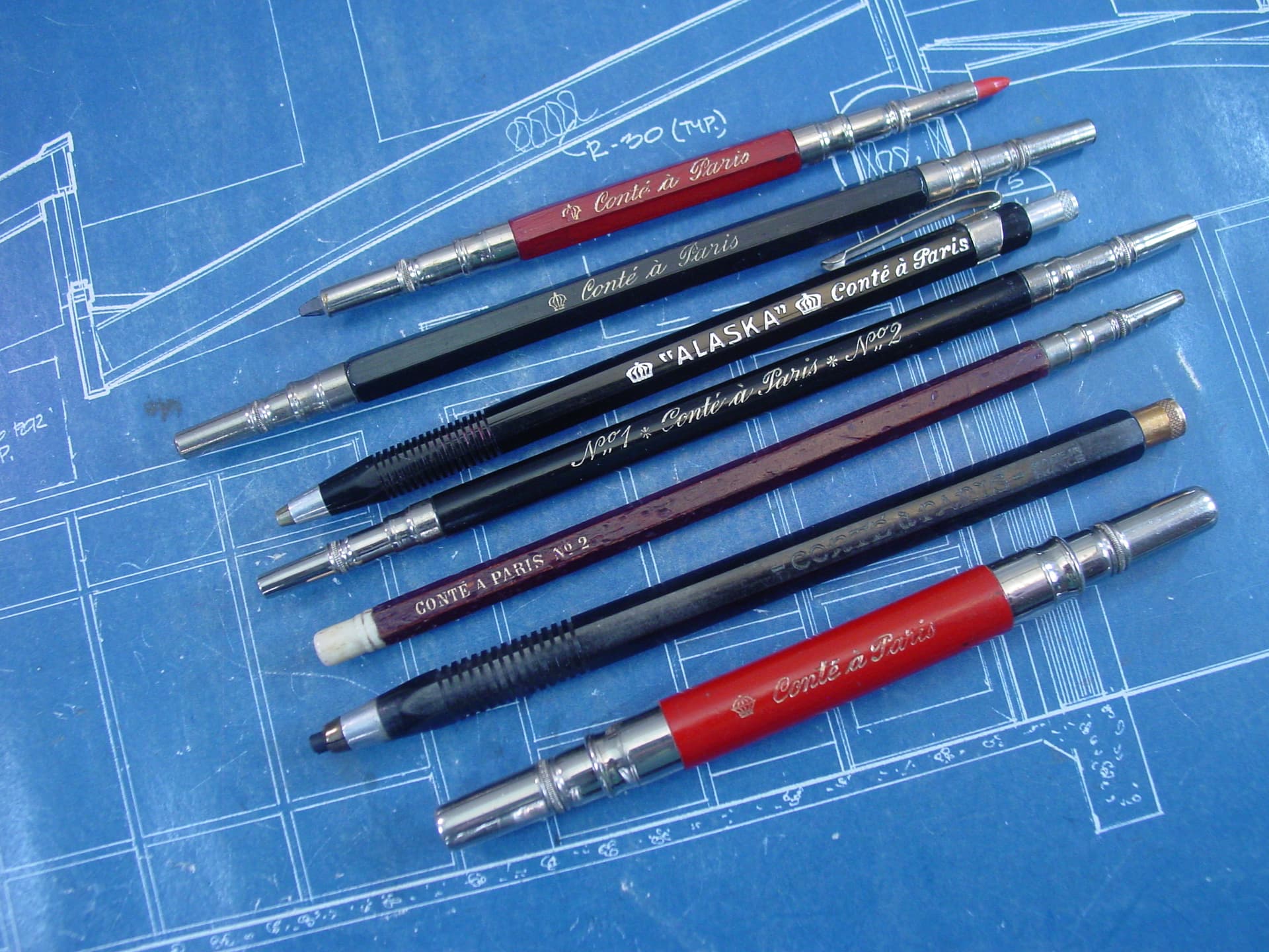
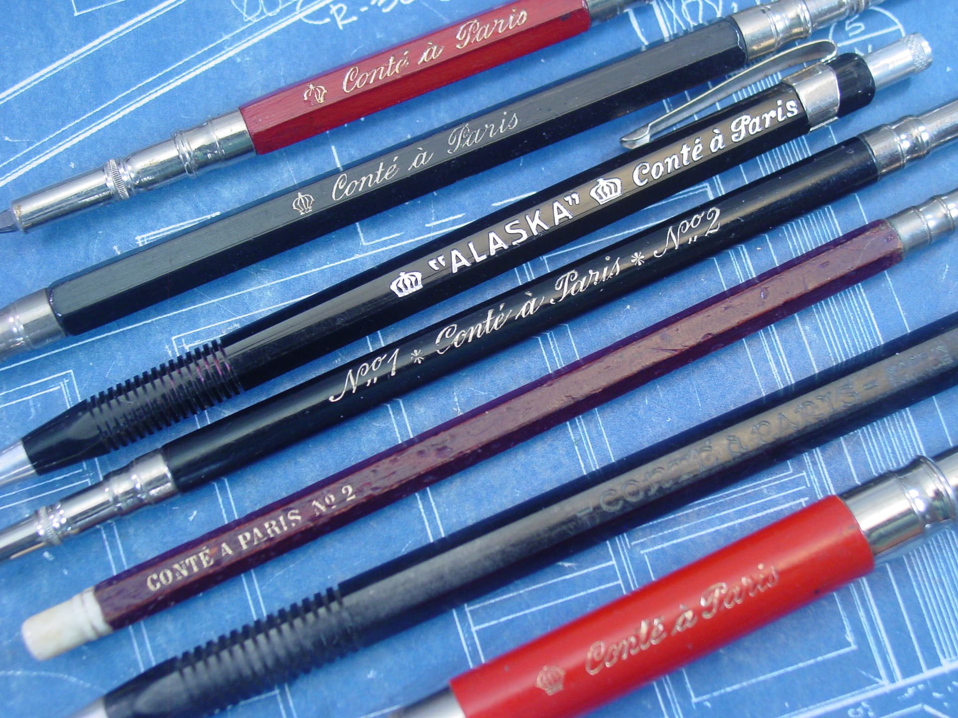
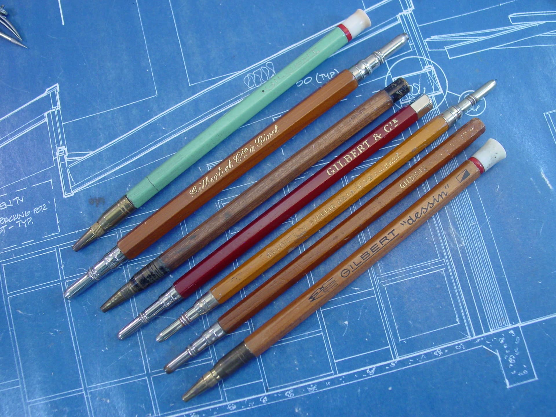
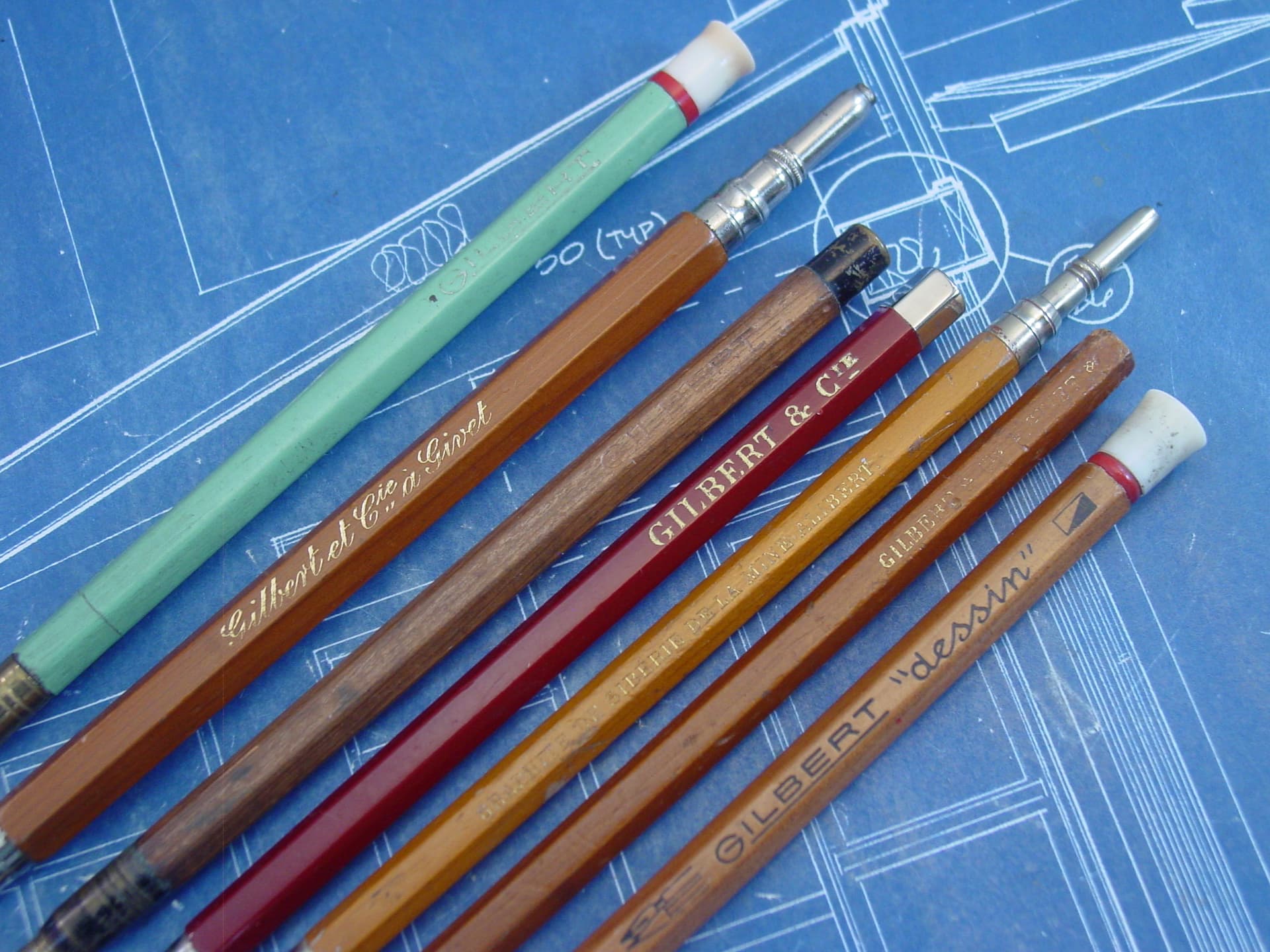
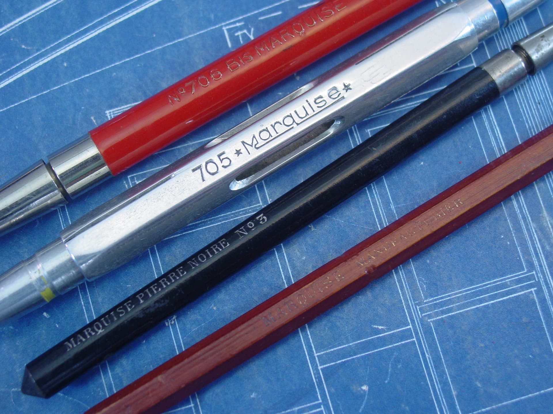
I feel like the French pencil houses deserve some love, so thought it might be nice to collect some examples together.
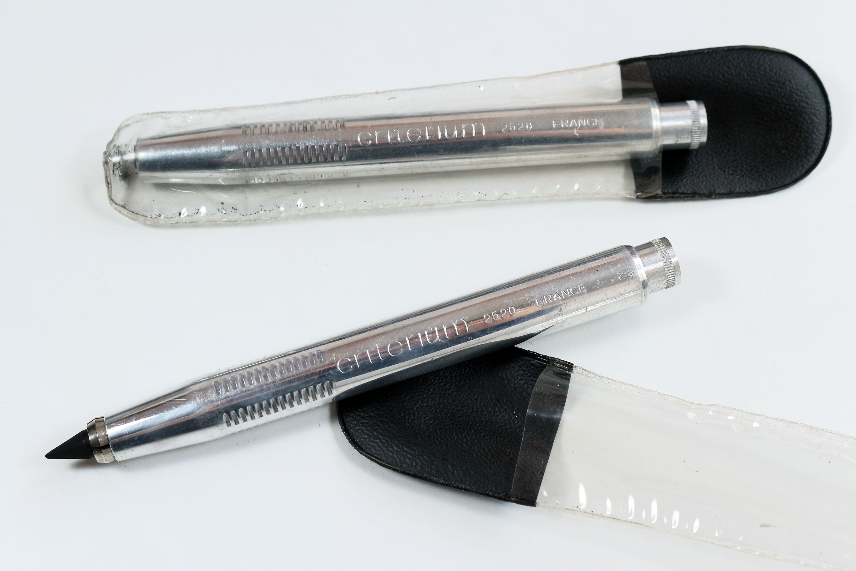
Here’s a few Criteriums to start with-
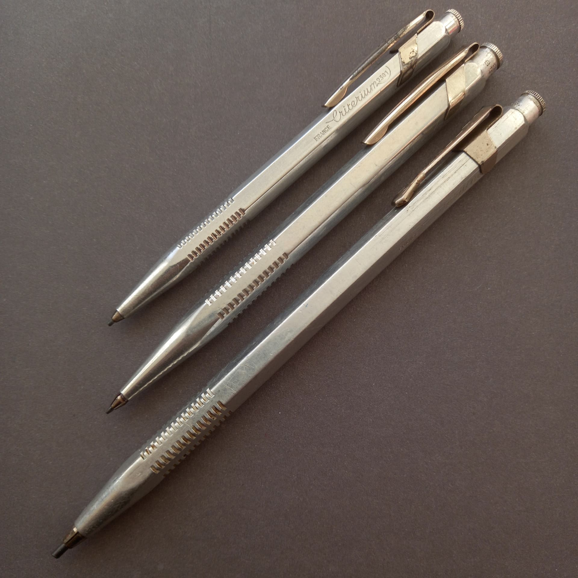
The first pencil to bear the Criterium name is their first iteration of the model 2301, shown here (bottom) alongside its second later iteration.


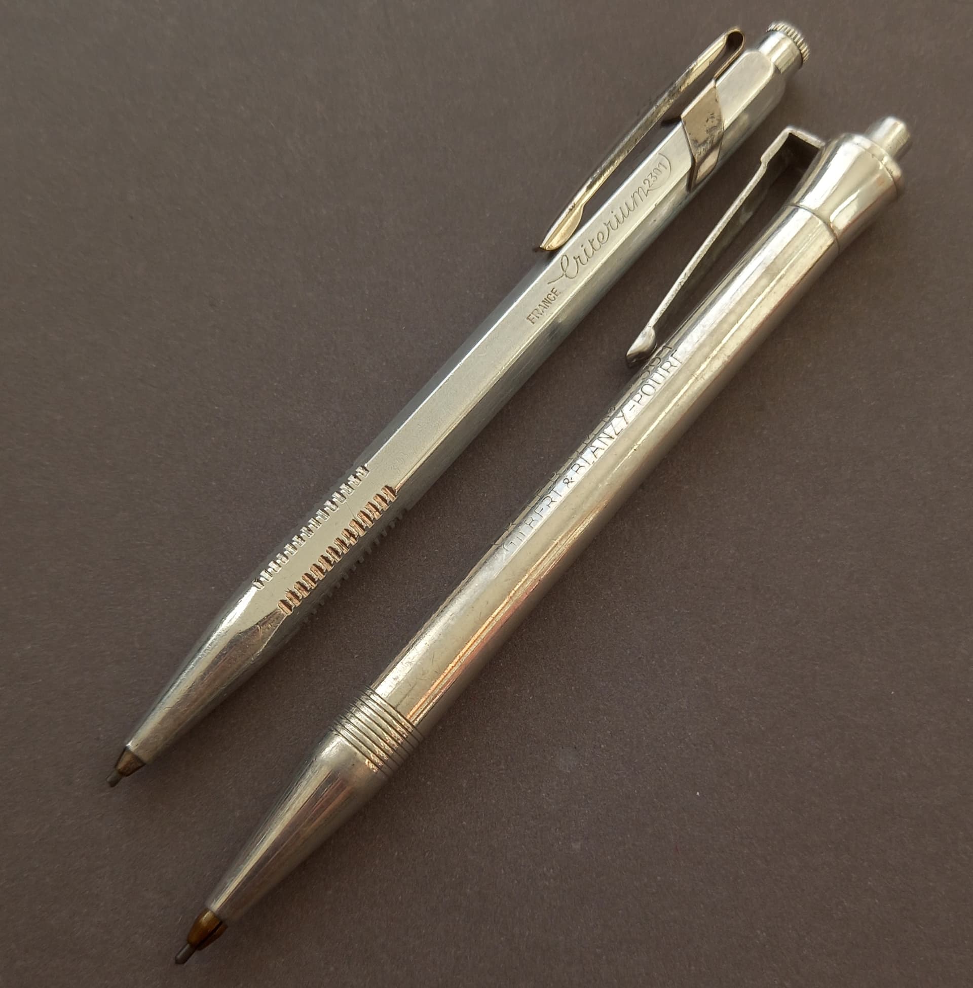
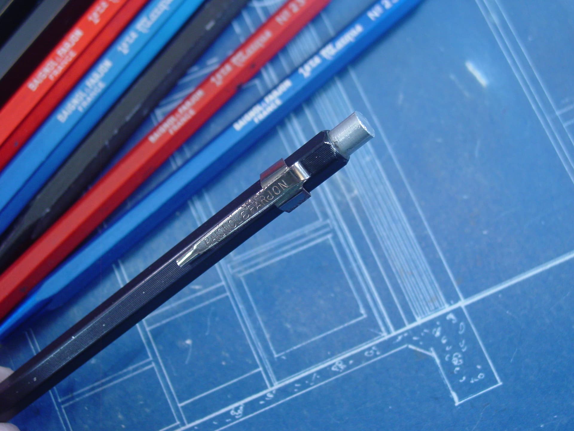
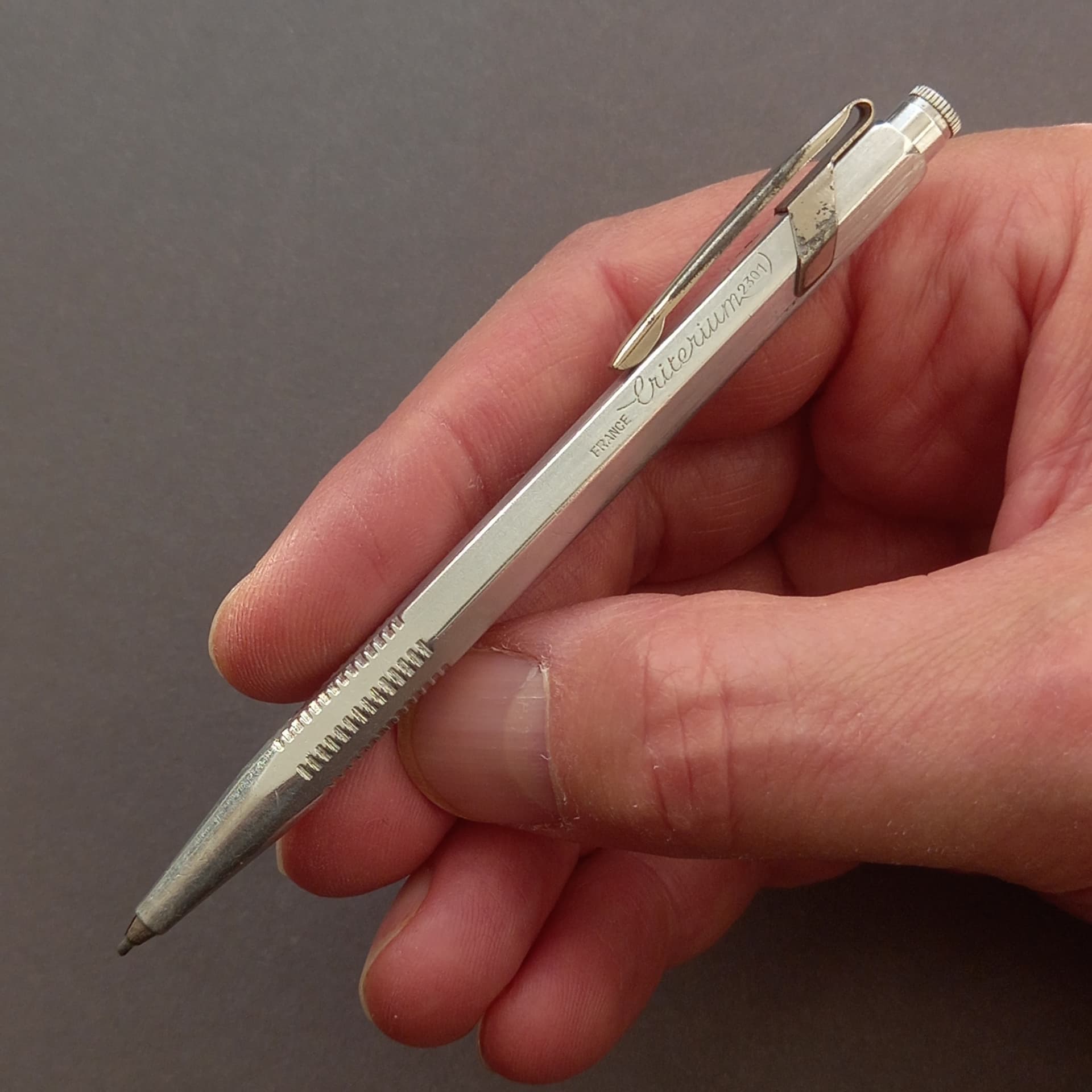
As far as I can see, the Criterium was launched in 1939 by Gilbert & Blanzy Pour of Boulogne-sur-Mer in the North West of France, after the Gilbert pencil company merged with ‘Blanzy Poure & Compagnie’. This initial design, with it’s push-button 3 jaw visible clutch holding a 1.18mm lead, survived the second world war which began that year, still appearing in print advertisements until at least 1950, 11 years after its launch. This is one of only two examples I’ve seen turn up in 10 years searching and this one is the only one I have found with its chunky angular clip still present, stamped with the round GBP logo. The clip is formed stamped aluminium alloy pressure cynched onto the body, meaning the clip often wore loose and came away from the barrel. All the metal Criterium models are made from a 4% copper, 96% aluminium alloy called ‘Dural’ to prevent oxidisation and corrosion, so it’s still in fairly decent condition, even after it’s 70 or 80 years of use. The other newer iteration is the more recogniseable Criterium form, though a tiny version of it.

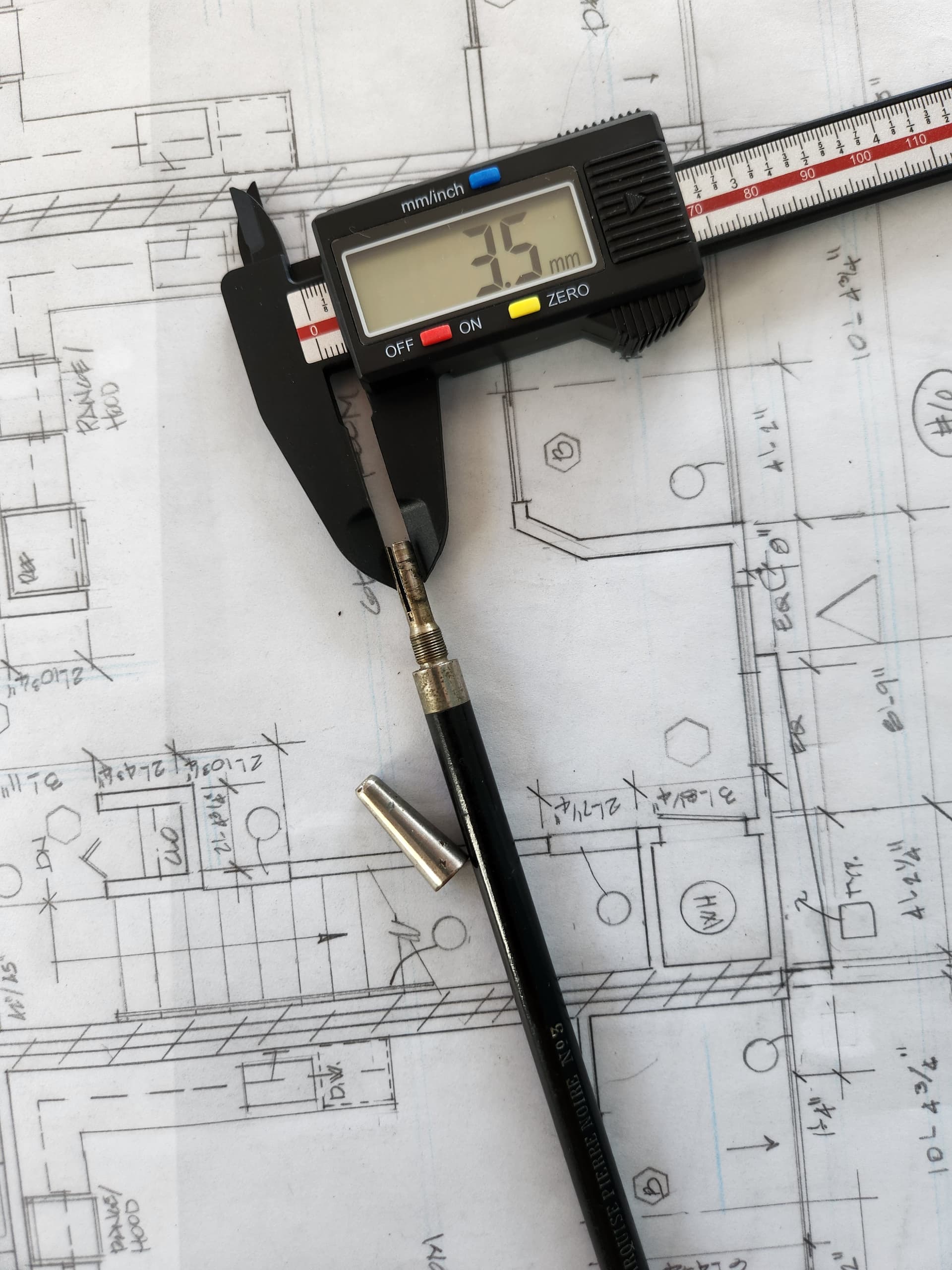
I have only ever seen this one example. It doesn’t apear in the excellent ‘Le criterium au fil du temps’ list… yet, though I note one commenter refers to it existing on that site. Again it’s a 3 jaw pushbutton clutch holding 1.18mm lead. In the other image I’ve thrown in the longer 2603 and midi sized 2403 for comparison.

I really love these holders and their historic role in French industrial design and architecture holds much mistique, for me.

11 Likes

I love the typography so much I always try to reposition the clips so that the markings are not at the ‘bottom’ :smiley:

2 Likes

And then there’s the Marquise company- a few from them here-


Some lovely pencils…

7 Likes

And those from Baignol Farjon, the prominent ‘1ere Marque’ line represented here

8 Likes


And some fairly early boxed Marquise No. 703 ‘Le Carbone’ Crayons D’Artiste A Mine Mobile (Artists pencil with moveable lead). A.W. Faber had a similar pencil with this cone shaped nose in their 1910 catalogue and with such a simple design these are likely a similar date, I’d say. There were 10 mostly full boxes of leads that came with these, so likely from a drawing office or busy individual originally and all the pencils have lighter stamping on the reverse that reads ‘Chemins De Fer P.L.M.’, which stands for ‘Chemins de fer de Paris à Lyon et à la Méditerranée’. This translates to “Paris, Lyon and Mediterranean Railroad’ and was one of Frances main train companies, that constructed and served the late 1850s-1860s built routes South-Eastwards from Paris to the French Riviera by way of Dijon, Lyon and Marseille . So this particular batch of pencils were likely part of a lucrative contract for the Marquise company, to supply the Chemins De Fer P.L.M. company with fine pencils to be used for building and maintaining their railways infrastructure. Whenever I find an earlier French pencil I always imagine it drew part of the eiffel tower or statue of liberty or some such - “nostalgie de l’époque” etc. The leads are interesting too, each die stamped at its tail with ‘MARQUISE No. 1’ or 2,3, etc. The lead packs have a grade table on the back, but at some point, this appears to have changed Making a No.1 lead the very softest at one point, it seems, in the Marquise scale… a devil in the details.

7 Likes

Though I’m drooling (not literally) over all of them. Those Marquise 703 are very much my favorite. I think because they are so simple and the probably look very nice in that box.

1 Like

Yes its a great box isnt it!? 6 or 7 typefaces, I count on it… hard to justify that these days…

Fantastic photos! Many of these are pencils that I have never seen before.

One of my favourite Criteriums (Criteria?) is the 2520 for thick leads:

I thought it was worth posting a picture here, as for some reason the big Criterium list only shows a grey silhouette for this model.

6 Likes

Nice to see the packaging for that one too!

1 Like

Yes - not particularly inspiring, but that’s how they used to come!

It seems that quite a few Faber-Castell leadholders were also supplied in plastic sleeves, most of which will have been thrown away or lost over time.

2 Likes

Les Francais…mais oui…
A few Conte a Paris


8 Likes

Les Francais…part deux
GILBERT


6 Likes

I like the font that they used for “ALASKA”

2 Likes

et le troisième..autre MARQUISE


5 Likes

Ah man, so so great, one and all. Never seen that Pierre Noire holder! Superb

Wait.. that marquise has 4 colors?

bien sur…

The French truly were good at making remarkable pencils, especially in the pre-heavy-industry era; all their designs and executions manage to find an interesting balance between grace, effectiveness, and sheer beauty.

I will not go fangirling/fanboying over your collections more than I already did elsewhere, even though the temptation is strong now; allow instead to place a few technical questions or personal remarks:

@TheGoodPhite That No.235 by B&F sports a pocket clip: is it removable? I think I have seen at least one picture of a model without the clip, and judging from the pencil design, seems to me the pocket clip could be easily removable; also, how long is it exactly? I’d like to compare it with some of my shorter pieces, to assess its practicality;

@Alan : indeed, I agree that the 2520 is extra-cool, one of the best 5.6mm holder I own; I also like a wooden-barrel piece by A.G. Splading I found in a pen shop in Udine a few years ago, but the proportions of the 2520 are superior, and the effect in the hand is that of the sketcher pencil, almost unbeatable;

@TheGoodPhite (again): how does that Marquise 703 operate? Knock advance, or falling-lead clutch? The tip seems to belong to a more modern design, whereas the barre feels more timeless; intriguing design. And by the way: how cool is that Marquise 704? Two-headed model, but shorter…

@lsd300 : Almost every time you post some pictures of older holders and pencils, I wonder why in the world did the manufacturer abandoned the cursive script for their imprints: it is so delightful, and makes any form factor ever so slightly lighter, and slimmer. Also, that Pierre Noir is so magnificent: essential, yet powerful. I wonder what is the outer diameter, to see whether it is closer to a thinner or girthy-ier model.

These shots do well deserve all the love and compliments you guys are gathering.

3 Likes

la famille B+F ( the ones I could get to show up…) … clip there was..


.

5 Likes

and he has a big mouth

2 Likes