Yep on Pentel’s official site they eventually changed the domestic orenz LOGO to the global one, which is dull, ugly and lacks any distinction. I just simply not like it and seems like everyone does.
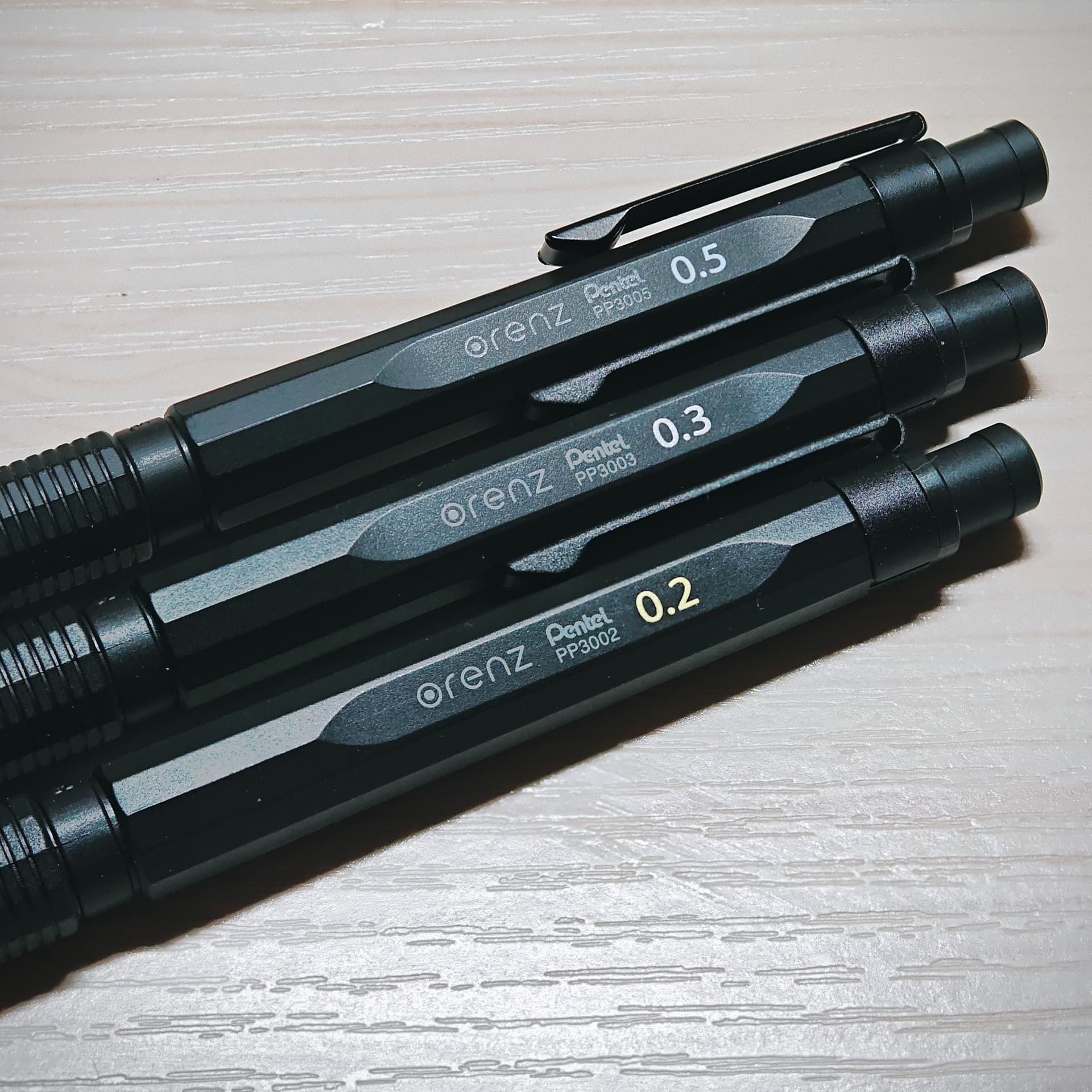
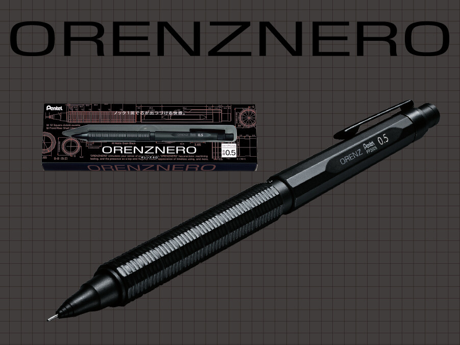
With Chinese Temu’s discount to less than 1800 yen per unit for each orenzneros, I finally decided to purchase both 0.2 and 0.3 mm ones, joining my daily driver 0.5mm nero.
The news of this logo change hadn’t reached me — somehow, I must live under a rock.
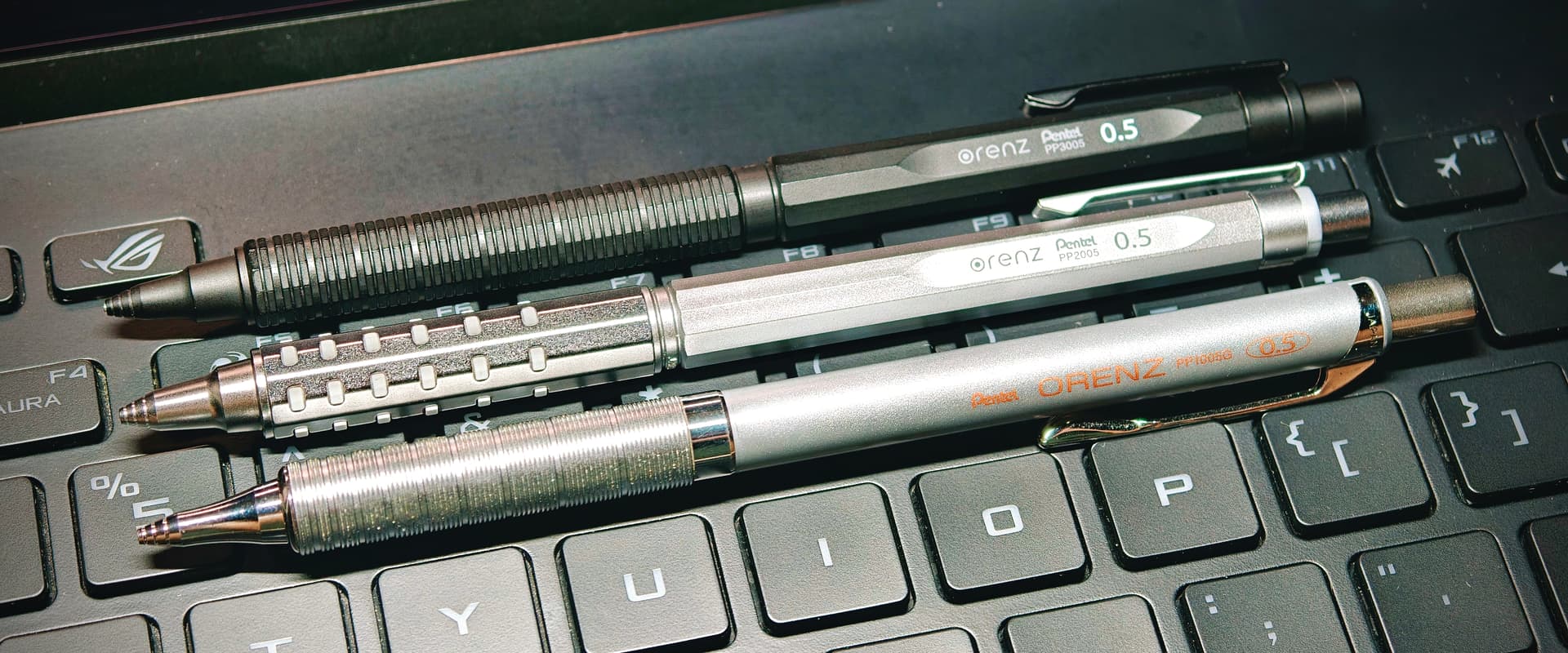
I find the classic logo much nicer, and I am happy I got my 0.2 and 0.5 long before this shift, on Jetpens; I cannot say I really have hard feelings against this new logo, I just prefer the shape and the details of the old one (both in terms of typeface choice and specific form of the initial, inside-dotted “O”).
Here’s a theory from Xhantos on Reddit: perhaps Pentel realised (or were made to acknowledge?) the similarity of the ‘⊙’ in ⊙renz with that in r⊙tring’s logo.
Just back from Japan where the Orenz rebrand is in full swing. The original logo had more character, but I can see why they’ve done it. It’s a challenge for us Pentel collectors. I have most of the Orenz AT variations, but only the orange Orenz AT Amazon Japan exclusive with the new logo. My nero orenz are all the original logo.
Probably never would have noticed this if it weren’t for @Jerry reviving this thread.
I wonder what the plans are for the AT. On the USA site they are either sold out or deeply discounted. Possible discontinuation or maybe just clearing out the stock with the old logo?
Hi @justin Yes - sorry to revive your thread rather than post a new one! I’m new here and it caught my eye.
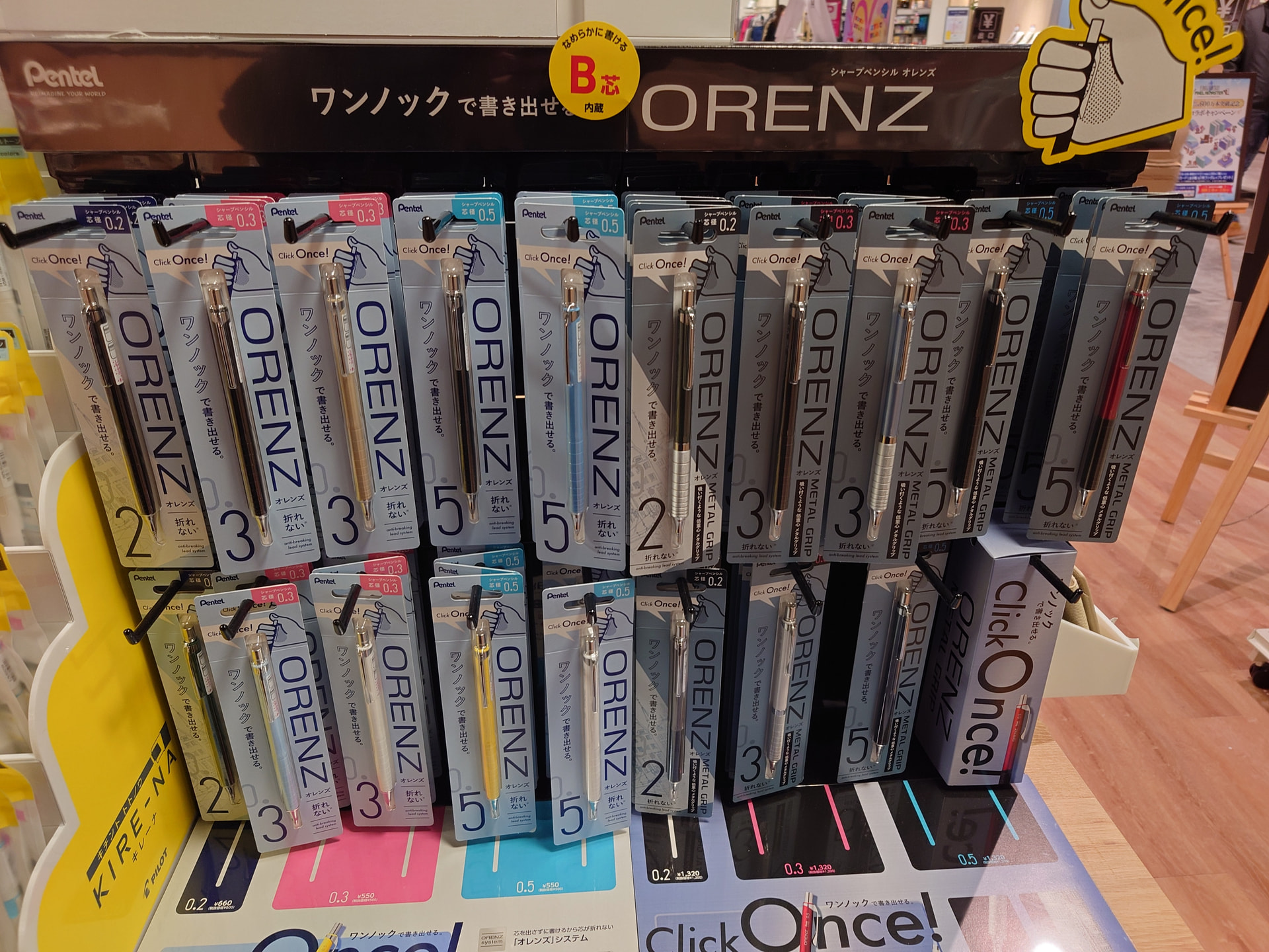
The original AT is discounted on Amazon US, the original 4 colours (red, blue, silver, grey) are discounted on Amazon JP too. I think they may be clearing old Orenz logo stock. The new ORENZ logo colours (metal orange, metal blue, gradient blue) on Amazon JP are not discounted.
Personally I like the ORENZ AT and prefer the grip to the ORENZ NERO. The AT grip design aligns more strongly with the Smash range (and graphgear 1000 and discontinued Graph 365) than with the original orenz or the metal orenz.
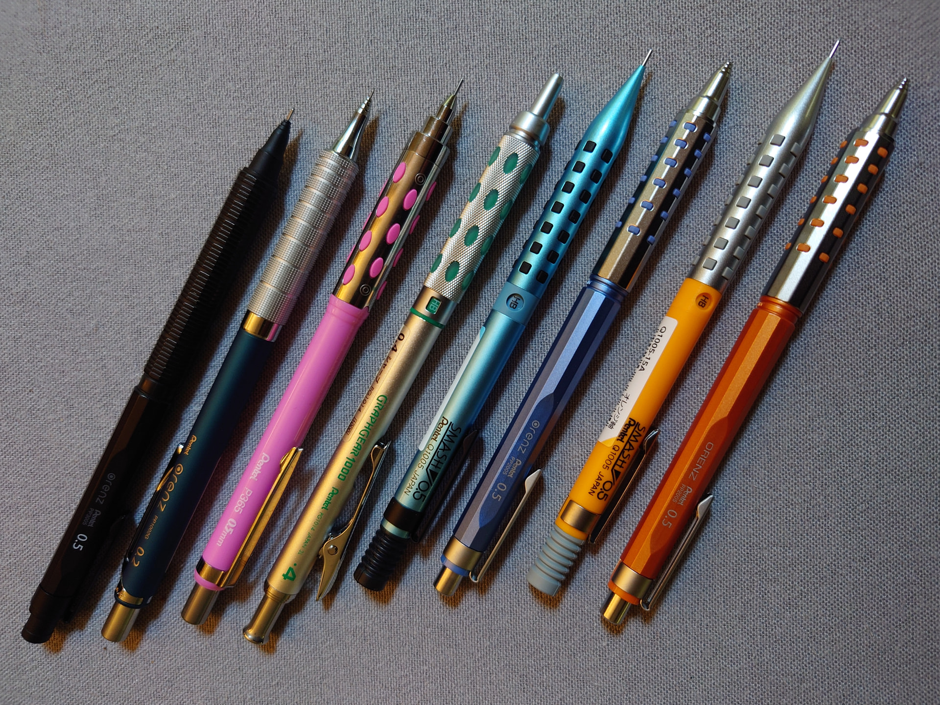
I’ve lined some up to reveal the connections. (Left ORENZ NERO, orenz metal, graph 365, graphgear 1000, Smash Limited Diamond Metallic Blue, Orenz AT Celeste Blue, Smash Q1005, ORENZ metal orange) Note the metal orange AT (Amazon JP exclusive) has the new ORENZ logo while the cool nuance celeste blue has the original lower case orenz style logo.
Incidentally I bought the Limited Diamond Metallic blue Smash on release in Japan while there (and the other matching range but didn’t get lucky with the metallic lead case treasure chest - it is on sale on Amazon JP for ¥1530 yen down from ¥1800 - plus shipping!).
The price point of the AT seems to be a problem for Pentel. The AT is more expensive at ¥2000 + tax than the Smash (from ¥1000 + ) and the Graphgear 1000 (¥1200 +). That might be the consumer resistance. The Nero Orenz is a more obviously premium model with its ¥3000 + tax design and boxing.
I don’t think the ORENZ AT is going anywhere - there have been new colours very recently and the logo style change is further evidence.
The Orenz AT is down to $3.50 on the US site. Plus, there are 20% coupons all about, and if you spend $30, you get another one as a gift and free shipping, bringing the price down to about $2.50 per unit. It is not my favorite pencil - not even in the running - but I’m doing a bit of hoarding.