While TOMBOW had long been the “king” of bizarre writing instrument designs, some laughably impractical (what were they thinking, a shape like a fish?), rOtring had a moment that you could say gave TOMBOW a run for its money. The CORE line.
I don’t think I’ve seen a more peculiar range of design decisions. Just look at that fountain pen with its offset grip. It actually is remarkably ergonomic as the nib tip ends up acting like a direct extension of your finger tip–as if you’re pointing with your finger the exact spot where the nib lays down the line. Sadly, the rest of the pen is rather comical, with it’s immensely oversized cap. rOtring designed it purposefully to be posted… but when you do that, the pen is very back-heavy.
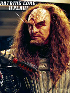
The pencil is a clutch forward design. No pipe. The mechanism works fine, though there is a bit of rattle, and lead advancement is way too generous, having 2 examples to compare. The body shape is so steeply tapered, with a flared grip. It’s weird. But fun. And then there’s that huge clip. The contour of the body is filled with ridges and bumps. It makes me think of something a Klingon would write with. And yeah, it’s not a long writing session pencil. The real butt of the joke is the eraser. You have this ENORMOUS girth at the back of the pencil, and inside the shaft is actually a fairly modest eraser. It’s workable except that the plastic frame is a failure. There’s a set of plastic prongs that tighten around the eraser at the extension you want, but it just doesn’t hold. Also, the material ossifies over time (mine is like a stick of wood). That’s probably the iconic “joke” of the whole pencil design.
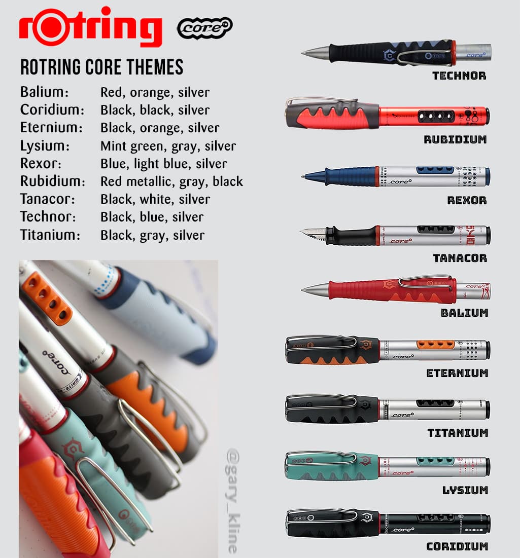
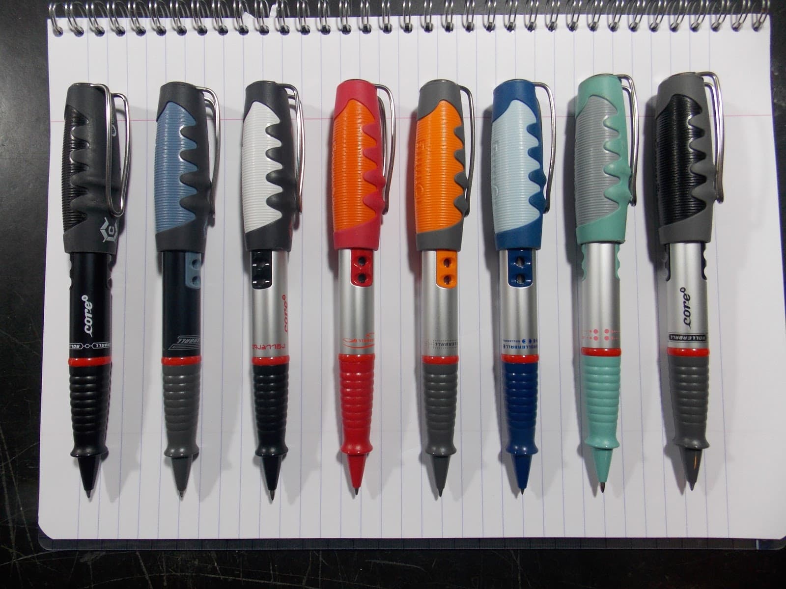
rOtring went to town on themes. I think there were about 9 of them. Most of the names were based on an “ism” suffix. Balium, Lysium, Coridium, Rubidium, Eternium, Titanium… then Technor, Tanakor… and Rexor.
You would think that this really wacky and quirky writing instrument line would have at least one or more devotees who collected the whole lot… but I’ve yet to stumble across a gallery showing off such a collection. Anyway, anyone here own a Core?
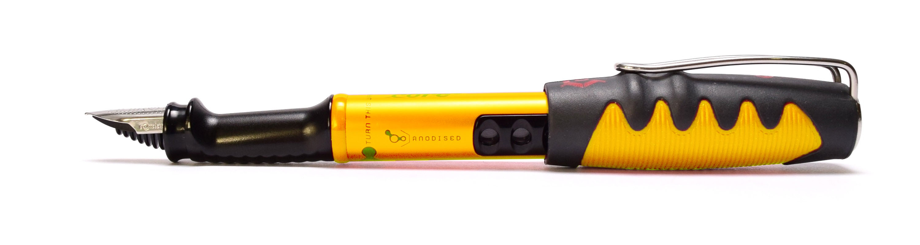
EDIT: You know, seems they were totally neglectful of the color yellow. And I have just the name: Potassium! ![]()
![]() (you know, bananas). Or, Sulphurium.
(you know, bananas). Or, Sulphurium.